I can dig that.
what about grand-master?
don't you think they'd look much better if they weren't a single stone slab/ thinner?
![]()
and then you would have two axi of progression : color and thickness, grandmaster being the full block.
@IDontKnow said in Graphic Artist Wanted:
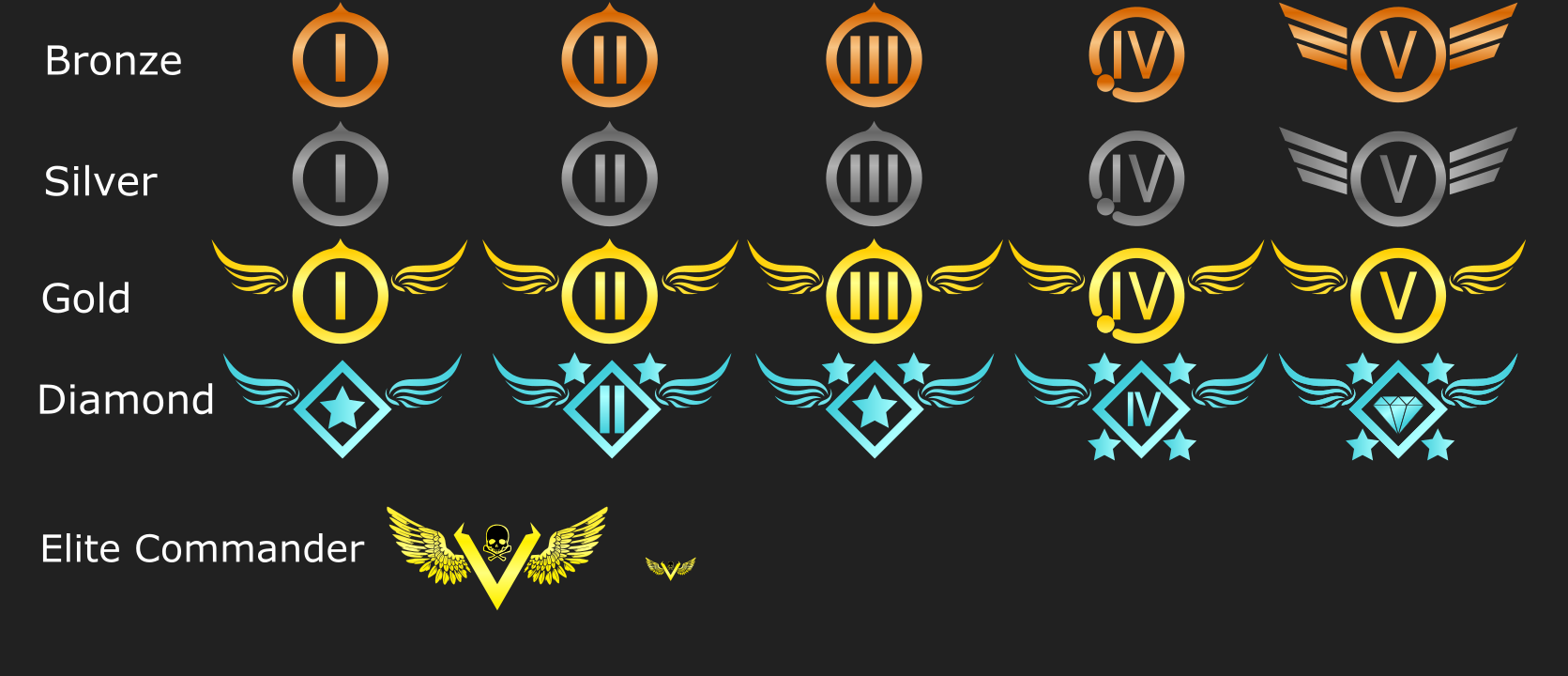
I do like Petrics Desgin but for me the Gold and Broze look a bit too simular from a quick glanse
I don't get that feeling at all. bronze (or rather copper) clearly looks like copper and gold clearly looks like gold, look:
![]()
![]()
maybe gold could be a brighter hue, a bit more reflective? copper looks fine to me though.