Highlighting the alternative to ASI: Brewlan UI!
-
As a shout out to the revamped icon support in combination with the work of Balthazar on creating an excellent icon set as an alternative to ASI.
Default icons
Classic icons
Highlighted (small) icons

Highlighted (large) icons
An overview of the names of the mods in the vault:
- BrewLAN UI Strategic Icon Overhaul Classic
- BrewLAN UI Strategic Icon Overhaul Large
- BrewLAN UI Strategic Icon Overhaul Small
And if you'd like to convert your own icon set to the new system you can use this guide to help you get started.
-
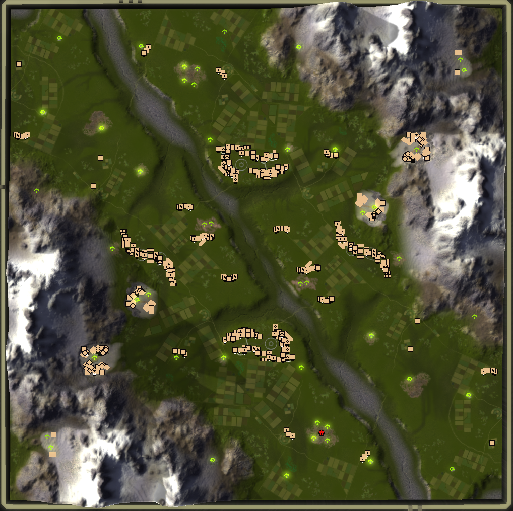
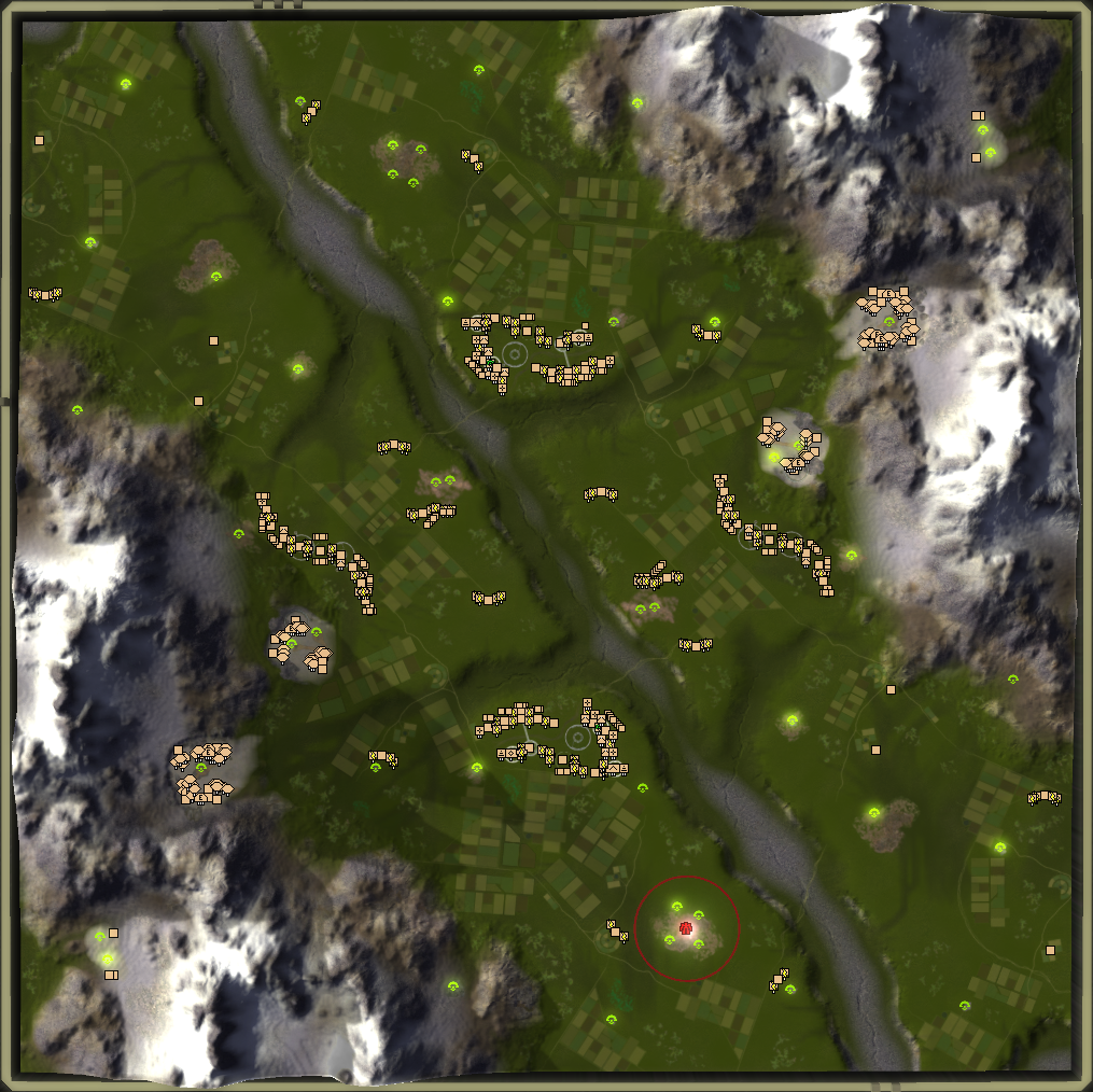
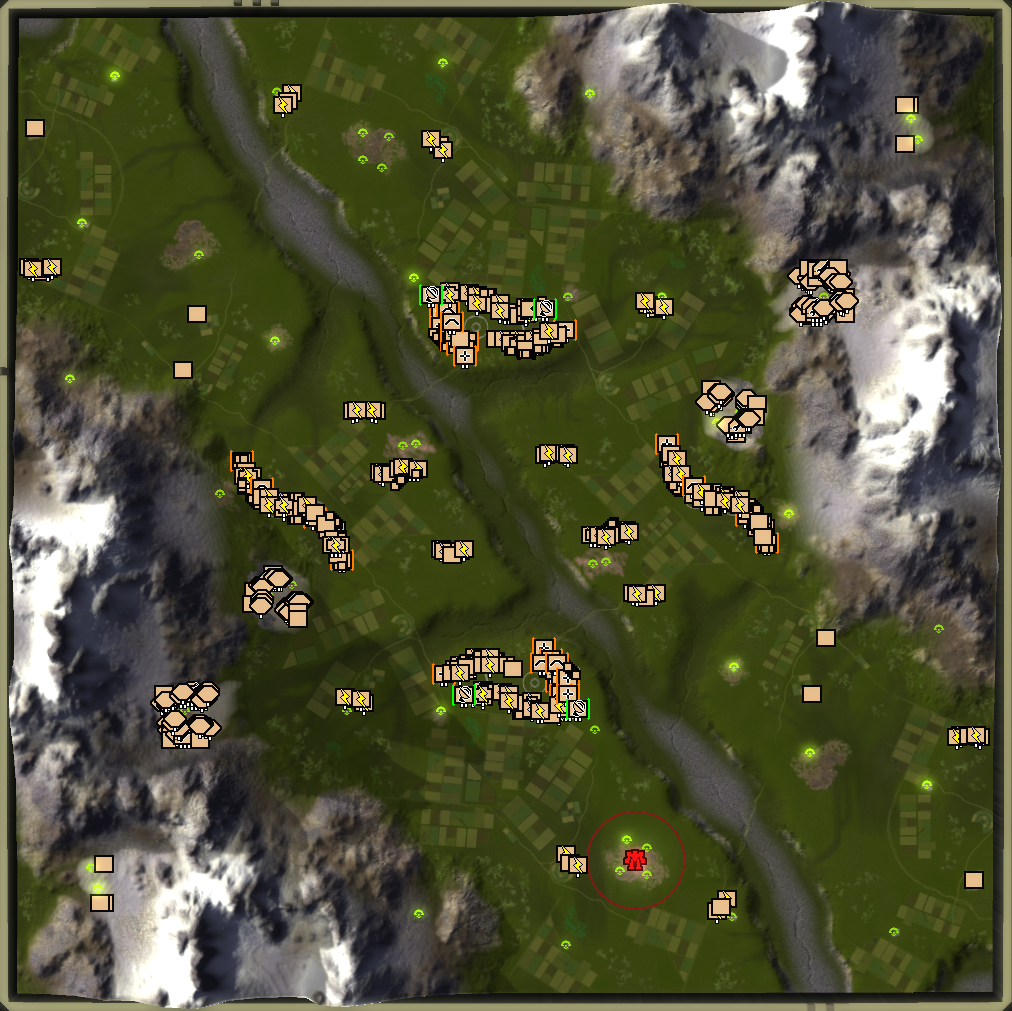
Aha, there's a thread about the mods! And you had to choose that map, didn't you?

I already left some feedback as mod-reviews:
It's good, but too busy. All these colours are distracting.
When I look at an army, the first thing I want to know is whether it's mostly T1/T2/T3. This information is harder to determine than the types of units on screen. Possibly using different icon sizes for T1/T2/T3 would be a good way to convey this information. (With stock icons the pips below are a little more obvious, possibly because icons are smaller and with fewer distractions, though this also isn't perfect.)
The same goes for engineers: I can't find T2 engies among a swarm of T1 (which also applies to the stock icons).
Back to the type of unit: it's actually hard to determine a tank from an assault bot with these icons since both get red outlines and the icons overlap enough that the full shape is less apparent. This is important information (more so than highlighting the artillery).
Colours on mex/pgen icons are just pointless distractions in my opinion, though I respect that others may disagree.
In my opinion, only a few things are worth highlighting: nuke, SMD, TML, ACU, shields, and maybe intel (maybe only static intel). Simplifying the other icons would make the result easier to read?
Regarding sizes: for 28" 4k screens the stock icons are too small, but 50% larger would probably be enough (I still want lots of information on the screen). Others may prefer 100% larger of course.
Regarding the engy icon shape: not a bad idea making it unique, but I don't really like the shape (too big).
(I hope this doesn't come across as too negative! I criticize lots because I think it's good, but could be better!)
-
Aha, there's a thread about the mods! And you had to choose that map, didn't you?
Easiest map to show case them all
These icons are as a replacement for ASI for those that want it - therefore they're not picture perfect. I'll discuss your feedback with Balthazar and see if there is anything we can do.
(I hope this doesn't come across as too negative! I criticize lots because I think it's good, but could be better!)
No worries")
-
@Jip I installed the large BrewlanUI and used it for a number of games, the large Icons are absolutely great for my poor eyes
They look great and modern too. -
@cyborg16 Besides color highlighting tech 3 / tech 2 engineers we can also adjust their strategic icon sorting order. That way, they always get rendered on top of tech 1 engineers.
It appears this should already be the case (as the value of t3 engineers is 85 and those of t1 is 105) but it doesn't always happen.
Value of 40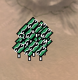
Value of 85I think adjusting these values accordingly may help fix at least the engineer situation you described.
-
@Jip good! But personally I would still like another icon (perhaps that double-spanner for T2, single spanner for T1 and triple for T3?).
-
What do you mean with double-spanner / triple spanner?
-
That icon you just used for the engies is a double-ended spanner... sorry, "wrench" in American.
-
I seem to misjudge army size dramatically since using the large icons.
Think I need to stop using them.
One problem is that the radar blips remain small, so an army reinforced from the back basically has invisible reinforcements.
-
That is one of the counter arguments against ASI too - and this doesn't change a bit in that regard. It is useful for 4k displays or people with poor sight.
A work of art is never finished, merely abandoned
-
@valki
i too find large icons on normal resolution beeing way too big. The normal/small size is in that regard considerably better imo. One thing i want to add is that you dont have to use all icons. Just use the icons which seem useful too you and delete the rest. E.g i deleted nearly all T1 unit icons and most T1 building icons except radar. With this setup I feel the assesment of T1 army sizes is not obscured but you also see mixed in T2/T3 units much better.To do that, you can open the icon file with a file-archiver program like win rar or 7-zip and delete the icons you dont wanna use. You can also open the icons within using e.g. irfanview with a plugin to see whats what.
-
@jip said in Highlighting the alternative to ASI: Brewlan UI!:
poor sight
As said that is my problem. With highlighted large icons I gained a lot in being able to identify most units at a glance without putting my eyes close to the screen. However, ultimately, it seems accurately seeing the amount of units might be more important than seeing the type.
I will try the highlighted small icons now. The colors seem useful I will let you know in a week or so.
-
I assume that making a medium highlighted icon set would have been another heavy pixel-precise drawing job?
First impressions are that the colors are extremely helpful. Despite the icons being smaller identifying tanks from artillery is now easy and immediate.
-
-
@jip said in Highlighting the alternative to ASI: Brewlan UI!:
After discussing your suggestions with Balthazar we decided that they're not trivial time-wise to implement
Thank you for discussing it.
If the small icons turn out inadequate for me I will try ASI. So far though, my conclusion is that colors are better than pixels. They are definitely better than classic symbols despite their small size.
If you are going to do anything, I would suggest expanding on the color highlighting.
-
@Jip thanks for discussing it at least, but no, I'm decided not to use the ASI/Brewlan icon mods. They are too busy; even the Classic version. Blackheart wrote some thoughts on the ASI icons in this thread which is worth a read.
Currently I'm using a 150% upscaled version of the stock icons + Penguin's icons. Unfortunately it seems whatever processing is done in game does not work well with blended pixels, so I applied a sharpen filter which makes the result usable but still disgusting. I'm playing on 4k/28" screen so upscaling is a must (but personally I don't want 200%).
Hello! It looks like you're interested in this conversation, but you don't have an account yet.
Getting fed up of having to scroll through the same posts each visit? When you register for an account, you'll always come back to exactly where you were before, and choose to be notified of new replies (either via email, or push notification). You'll also be able to save bookmarks and upvote posts to show your appreciation to other community members.
With your input, this post could be even better 💗
Register Login