Lots 2022 Promotion Work Prep
-
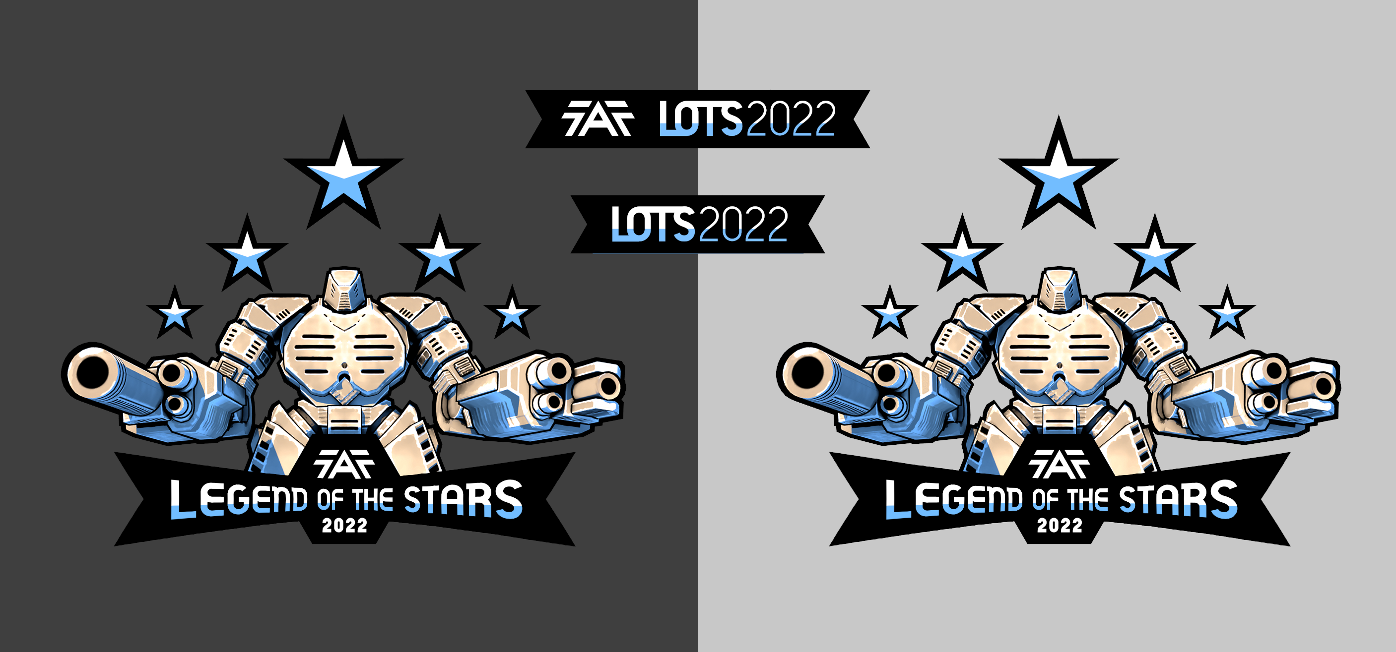
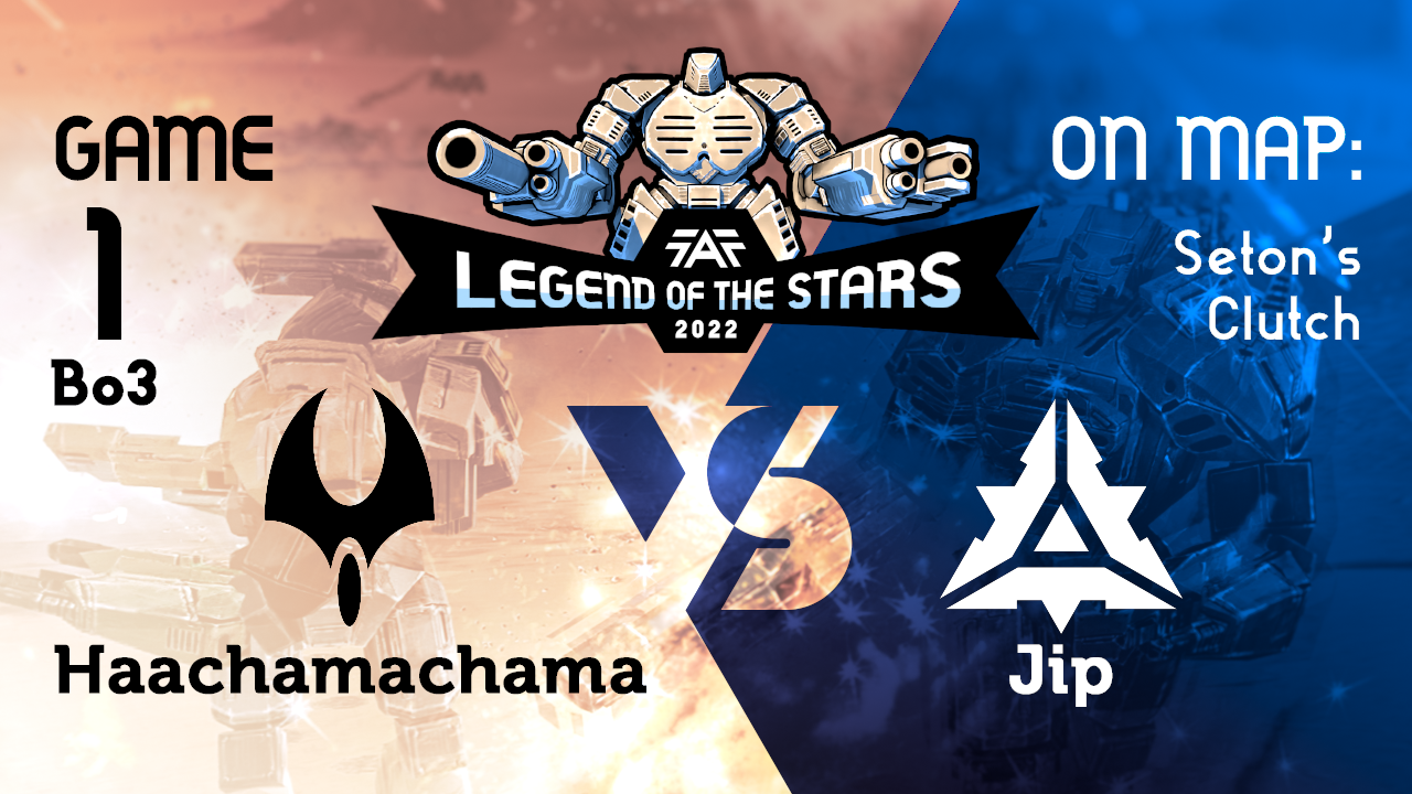
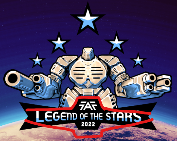
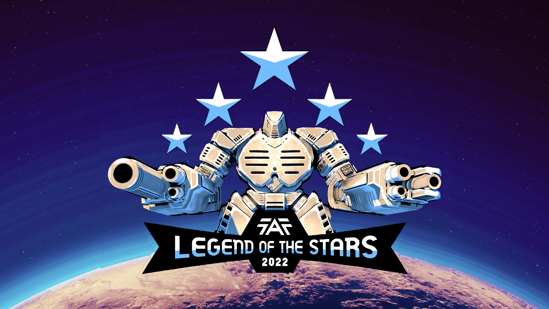
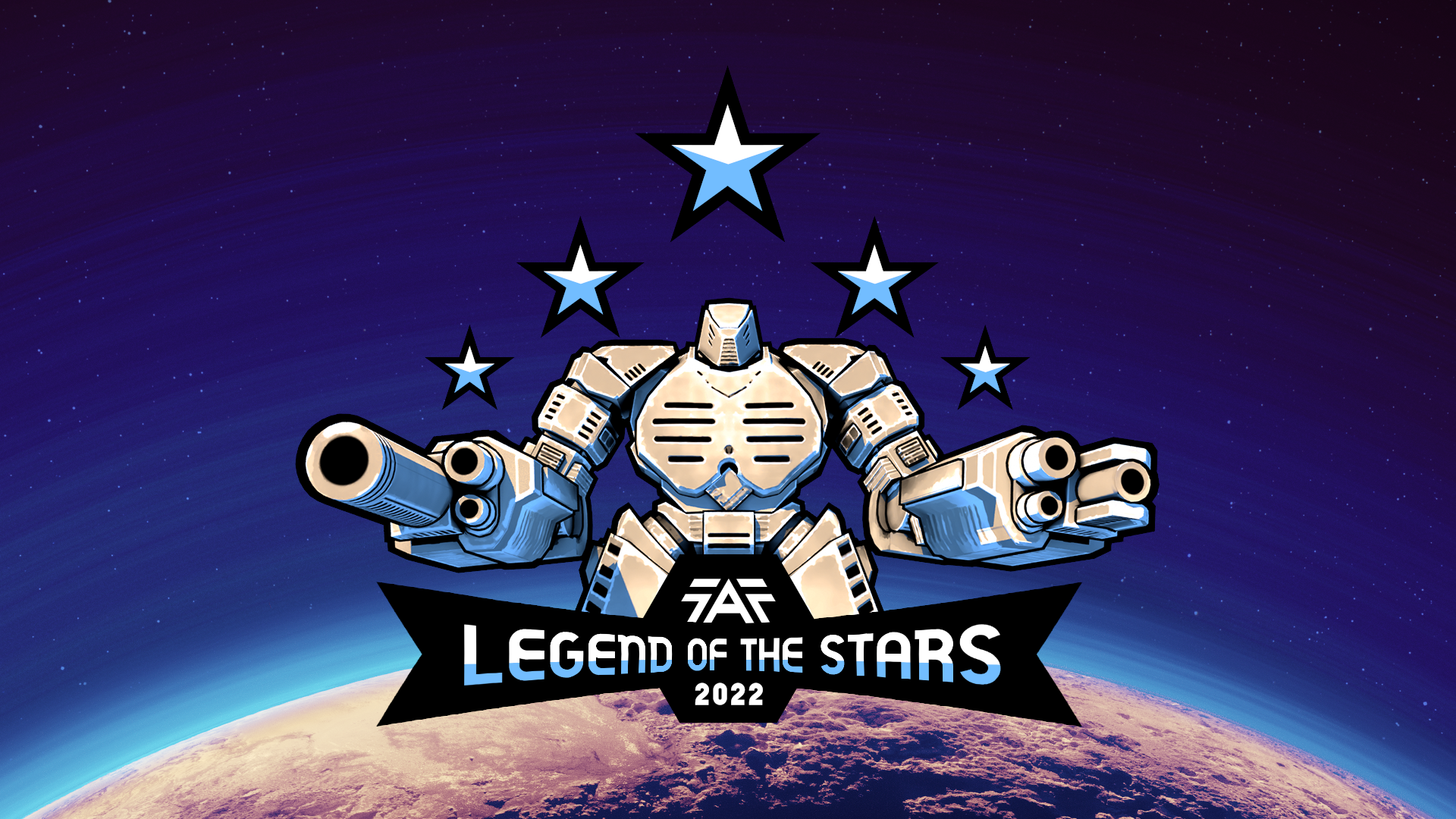
Its that time of year when the Promotion Team is at work prepping all the materials for the Legends of the Stars Tournament and to kick thing off id like to extend the credit of the work to Promotions Team Associate Member Phong for using the style of older lots images to create a new and clean logo which we will be able to use beyond this years tournament.
Here are the Assets that have been created. If you have any feedback I'm sure @phong would appreciate it.
Icons and Banners
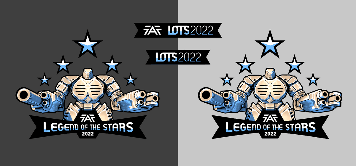
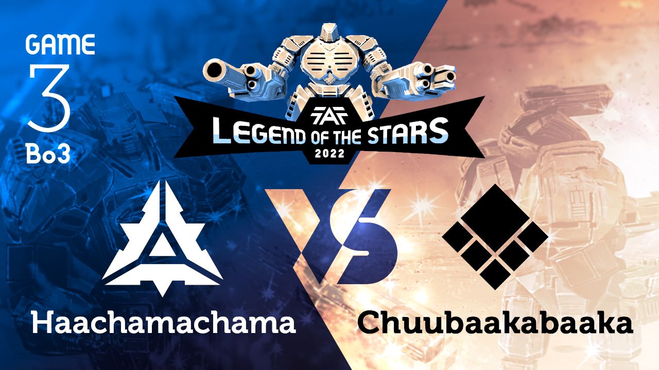
YouTube Thumbnail
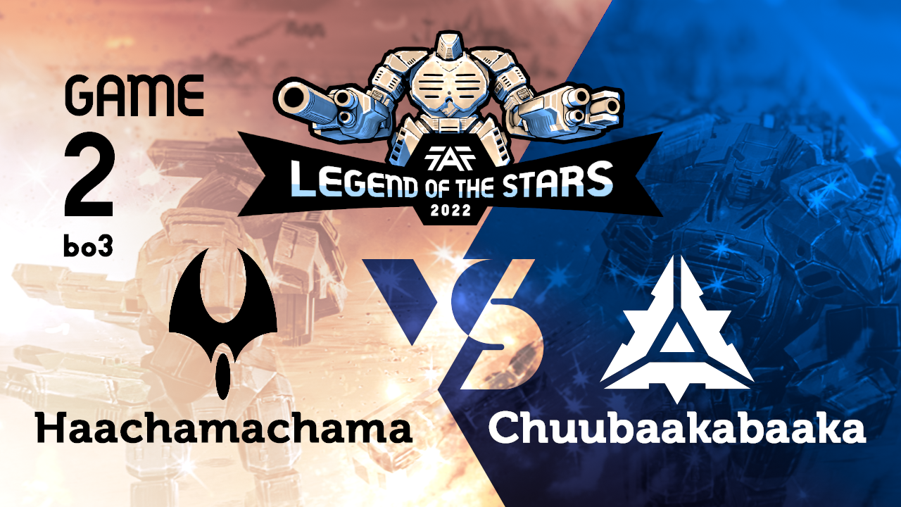
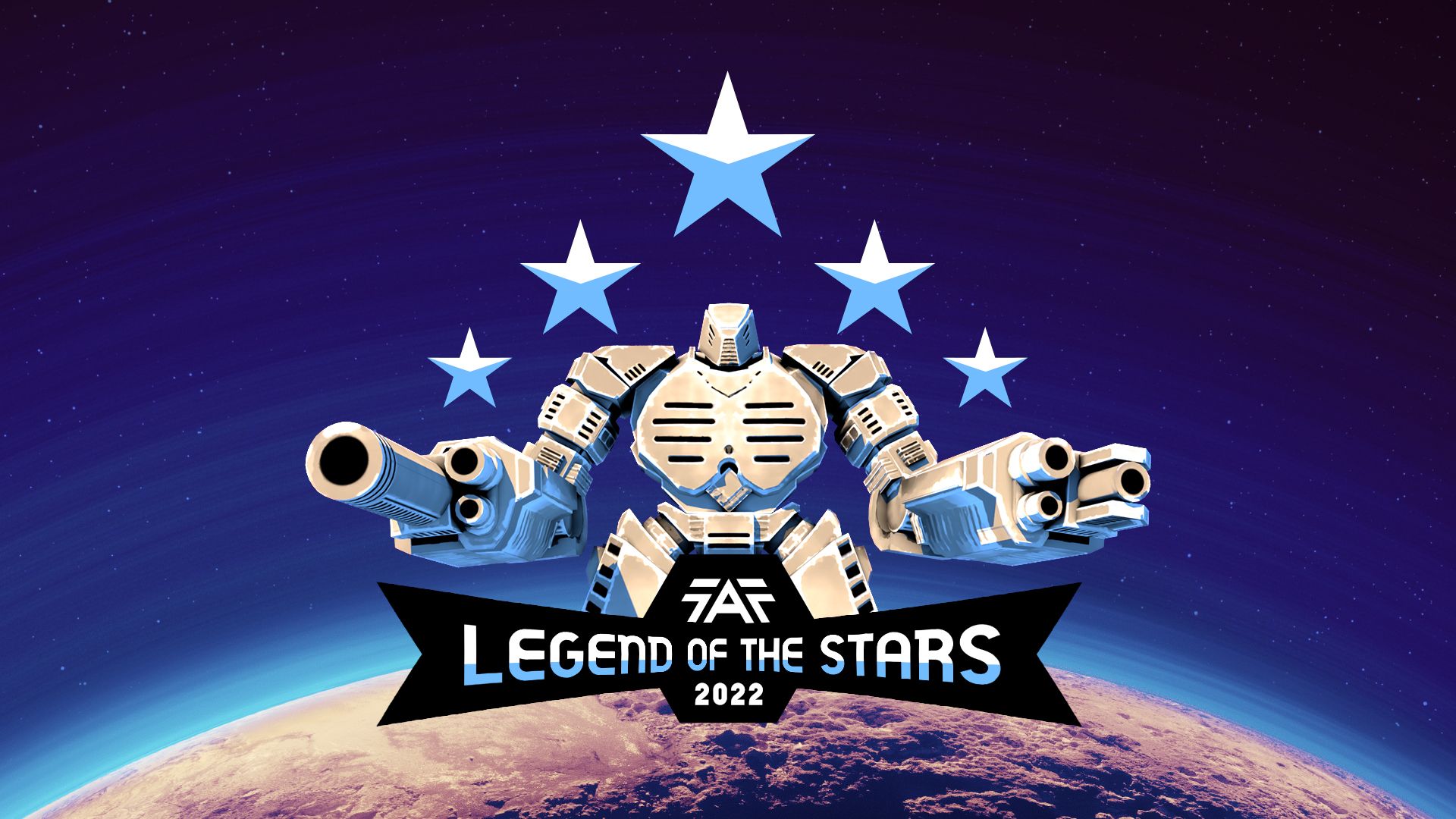
Stream Splash Art

-
-
I think the "ON MAP: Seton's Clutch" will be very hard to see in thumbnail form, my suggestion would be to convey the map information with the image of the map as the background instead, currently that one image with two colors looks cool but doesn't convey any information beyond the fact that this is supcom fa.
-
Another lover of strokes
Why not make it otherwise? More readable
Example without strokes:
splash screens no strokes (they knew something):

-
@archsimkat I think your suggestion, properly implemented, could make the thumbnails a lot more varied and interesting, but I'm put off by the amount of work that would require.
Let me explain. To do this right, I couldn't really focus on showing the map. I tried this and failed and here's why: most maps are square when zoomed out so either don't fit a 16/9 rectangle or get trimmed, which makes them a lot less recognizable. They also come in a dizzying array of colors which at some point will clash with other elements of the thumbnail but can't be altered because color pallettes are central characteristics of maps.
I came to the conclusion this might even be counter-productive. Map images just can't compete with robot battles and explosions when it comes to how visually interesting they are. To you, a map image might be meaningful, but not to any viewer unfamiliar with faf, and that's a wasted opportunity to make the thumbnail attractive to them, which is the whole point of doing promo work.
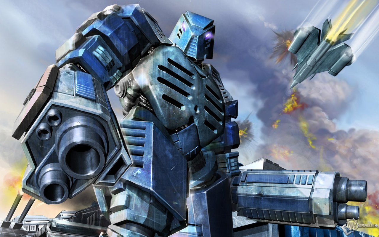
What about zoomed in, heavily recolored beauty shots? Going this route could potentially show off some interesting action that happened in that particular game. Unfortunately, there's no chance the twitch video of the game in question contains even one frame that achieves this potential and is uncluttered by unit icons or UI and framed such that the action is visible in the final thumbnail. That means I would have to hunt down each replay and make screenshots for this purpose.
In addition to finding good action (hard when you can't rewind the replay), I'd have to find a camera angle that works well after all the other text and logos are added. I'd have to then adapt the color and exposure corrections for each image.
I'm confident this would look great and would make the YouTube feed as a whole look a lot more interesting, but it's more than I'm willing to do in my spare time, partly because I'm nowhere near as good as Sid at wrestling with the game's camera so that aspect would feel very tedious to me. If there are any volunteers out there that are willing to help with capturing the screenshots, let me know. If I had help with that, and only had to do the Photoshop work, I might be up for it.
-
-
@eternal your suggestion in red lines would put more emphasis on the words "OF THE" and less emphasis on the words "LEGENDS" and "STARS" so I am not a big fan of it for that reason
-
@phong Just make font size the same
-
@Eternal while working on the logo, I started out with a constant font size and after failing to fit the elements together to my satisfaction with that constant font size, I came to this solution. If you could make your suggestion more concrete I'd love to see it, especially how the text fits in with the faf logo and "2022" and how they relate to the ACU's crotch and arms
-
 R Rowey referenced this topic on
Hello! It looks like you're interested in this conversation, but you don't have an account yet.
Getting fed up of having to scroll through the same posts each visit? When you register for an account, you'll always come back to exactly where you were before, and choose to be notified of new replies (either via email, or push notification). You'll also be able to save bookmarks and upvote posts to show your appreciation to other community members.
With your input, this post could be even better 💗
Register Login