What do you think? Sexy right?
-
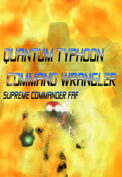 What do you think ? I couldn't find any of the original concept art so I used fraps to capture jpg's which I isolated in photoshop and added.....
What are the size limits for forum signatures? There's no tool tip that explains what code is needed to display signature..
-
-
This would be pretty impressive if you were 6-8 years old!
-
And if it was year 1998
-
Display that shit as a signature and I’ll ban your account.
-
looks like a straight to dvd film box cover
-
I mean I only had to pour a very moderate amount of bleach into my eyes, so you can call this a rousing success!
-
Well you tried, but you need some practise. The color scheme is kinda disturbing. Together with the font the image makes it look like a cheap 80's scy fy movie poster. Search on Google for 80's movie posters. You'll see some resemblance. But man, the good once use way less colors and use good fonts / font spacing, you need to get some rest in that image. Kinda cliché, but, really: less is more. Maybe make part of the image an orange cloud (the rest black?), get a font with bigger letters (maybe make them white). Also experiment with font sizes and spacing
-
I think its beautiful and interpret biass&ftx's remarks as jealousy
-
@Kenosis said in What do you think? Sexy right?:
maybe make them white

https://mega.nz/folder/Z1kRhBDC#IGMME02K5eJUDl0m10Br3w
This mutiple year old link is an archive to a number of design related books. I never read them, but if you're starting at this level you might find some value in having a look.
FULL-POWER-BENIS said in What do you think? Sexy right?:
I think its beautiful and interpret biass&ftx's remarks as jealousy
yeah when was that mate
-
-
Is probably MEME eligible, as such, signature requirements should be reasonable.
-
@biass nice meme, but read and use brain
-
ok beast
-
It's not by far the best or my best. Who here has made their own signatures avatars. I'm surprised no one noticed I used the fonts that came packed with the game, I think the signature is fine without the letters.
-
I've made signatures, tried to find a disc I had with a bunch on it. Loads of psd files. But couldn't find it yesterday.
Made an entire unit signature just with smudging once. Turned out ok.The font did look familiar but I was thinking something else.
Thanks
-
@Kenosis said in What do you think? Sexy right?:
@biass nice meme, but read and use brain
Surely the eyes are employed first?
-
@QuantumTyphoon said in What do you think? Sexy right?:
It's not by far the best or my best. Who here has made their own signatures avatars.
I'm happy to not have one sentence posts inflated in size due to very large signature images honestly.
The last thing I made was that promotional logo for LOTS.
@QuantumTyphoon said in What do you think? Sexy right?:
I'm surprised no one noticed I used the fonts that came packed with the game
The supcom typefaces only work in supcom because it is a 9 year old strategy game. You can find better familes for any other use. try fonts.google.com


Hello! It looks like you're interested in this conversation, but you don't have an account yet.
Getting fed up of having to scroll through the same posts each visit? When you register for an account, you'll always come back to exactly where you were before, and choose to be notified of new replies (either via email, or push notification). You'll also be able to save bookmarks and upvote posts to show your appreciation to other community members.
With your input, this post could be even better 💗
Register Login