A community effort on a map layout
-
@arma473 what would be your suggestion?
-
@Leto_II Primarily, it would be: for a 2v2 map, you want to have more openness than just 3 narrow choke points. The more players you have, the more avenues you need to have open.
And if you intended it to be played as a 1v1 map, removing most of the reclaim in the middle would allow players to have more options for where to send their ACU. For example, on Williamson's bridge, the middle path has basically only a single mex (and maybe a couple rocks). So if you rush through the middle, you're not securing economy, it's just pure aggression.
Also, it's basically impossible to use early air to stop the ACU from reclaiming, so if there's big reclaim in the center, there's no point in rushing a bomber. But if there is no reclaim in the middle, an early bomber could be used to pick off engineers trying to scoop the north/south.
-
Hi everyone - as a note: I'll be doing more than one designs from those provided. I hope this creates an incentive to provide more designs and to have more discussion. As an example, here is the map
Center of Tatsubased on the design of Tatsu: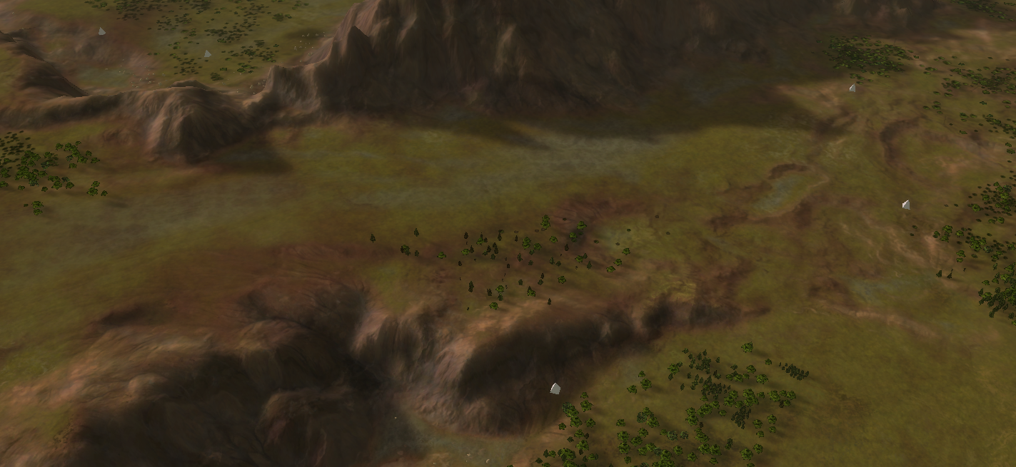
It will be in the vault this weekend after I finished up the easter egg in the center
 .
.Next to that, I found a great visual example as to how you can think about an extractor layout:
@Fremy_Speeddraw thank you for writing that out.
Similarly I wrote this a while back in the LOUD discord:
That depends on your layout. Personally I like to think in safe extractors, which should be at least 4 / player. Having less is unusual and requires a special build order. Next in line are expandable extractors, which are part of an expansion which should be at least 3 / player (have at least one clear expansion with 3 or more extractors somewhere for each player). This should reward expanding. Then I think about raidable extractors, which can be between 2 - 6 / player depending on your layout. These should be relative far from a base and easy to raid if left unprotected. This rewards having presence and radar / intel. And last contestable extractors which can be between 1 - 2 / player depending on your layout again. This last category is all about map control and rewarding it by having a slight advantage in mass.
This is made with the LOUD balance in mind, so it's not entirely applicable to FAF. But the names (safe, expanding, contesting, etc) are still very applicable and can convey a lot of information in your design as to how it would play out.
edit:
And thank you for your submission @Leto_II ! Perhaps @archsimkat can join in the discussion and provide some feedback too. I think the design has merit (10x10 is rather big, they're quickly not chokepoints because of this - Archsimkat and I were mistaken in how big it was too for the Valley map) but that the reclaim may be poorly positioned enforcing a certain type of gameplay.
-
Thanks @arma473 and @Jip for the feedback. I've checked the actual t1 and t2 pd ranges and opened up the Map a little. The Mexes are now mainly located more towards the back but remain raidable. I've also added a few other minor Details (such as the small path at the Beach / Cliff next to the Fast Lane) and removed most of the song lyrics.
Let me know if you have further suggestions.
-
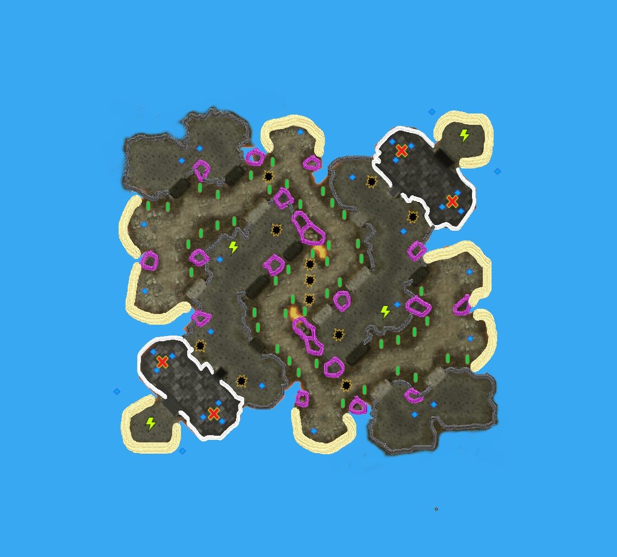
This is a FAF interpretation of the Starcraft 2 2v2 ladder map "Heavy Artillery LE" by Themusic246
For the picture I extracted the height level and terrain from the Starcraft 2 map editor.For FAF, all Starcraft 2 maps have too many chokes, but of all the Starcraft 2 maps I really like I think this one could work for FAF.
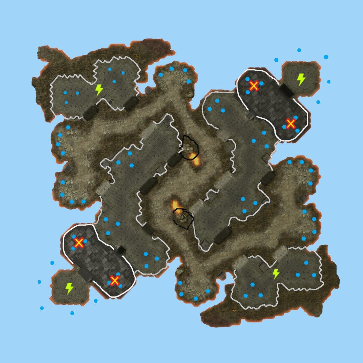
The main and natural expansion are well shielded from attack with a narrow choke, but offer somewhat limited resources. There is a natural expansion forward that is still well protected for FAF, and a back expansion with lots of water mexes for quick income.
Further forward there is another "second" expansion that enjoys some protection but can be attacked from 3 sides. On sea level there are many rich expansions that are very vulnerable to T1 naval attack. Top left and bottom right there are expansion sites with decent protection from cliffs also safe from T1 navy.
The black rocks in the middle should offer protect against fire bases shooting the natural expansions while protecting the second expand a bit too efficiently.
Legend:
- Grey lines: low cliffs (impassable)
- White lines: high cliffs
- Black lines: extreme cliffs (blocks most fire)
- Lightning: hydrocarbon
- Blue hex: mass points
- Red X: Spawn points
-
@Valki I'm a bit skeptic because the topic states that I won't remake a map. Given, this is not a Supreme Commander map (yet) but it does open the gate to other remakes of maps of other games and I'm not too fan of doing remakes.
Therefore I'm giving a heads up: if I do the map then it won't be a 100% perfect match with the original. The layout will of course be representative to the original.
With that said, I'll leave it to the others to give their feedback as to whether they agree if it is competitively interesting or not
 . I appreciate that @arma473 is using up some of his time to join the discussion!
edit: and please provide a name or it will quite likely be something with your name in it because I lack inspiration on that part. With any map name - don't make them too serious. You can look up other maps of mine and compare their seriousness with your own map name.
-
@Jip said in A community effort on a map layout:
@Valki I'm a bit skeptic because the topic states that I won't remake a map. Given, this is not a Supreme Commander map (yet) but it does open the gate to other remakes of maps of other games and I'm not too fan of doing remakes.
Therefore I'm giving a heads up: if I do the map then it won't be a 100% perfect match with the original. The layout will of course be representative to the original.
I'm sorry for missing that, otherwise I would have acknowledged it and made the point that importing a different meta can be very interesting.
I have been thinking on Starcraft 2 and FAF meta a lot recently, and I have been examining maps and that's when I concluded this is closest. IF you do this map then by all means deviate significantly to make sure it does actually work for FAF

@Jip said in A community effort on a map layout:
With that said, I'll leave it to the others to give their feedback as to whether they agree if it is competitively interesting or not
 . I appreciate that @arma473 is using up some of his time to join the discussion!
I would be very interesting to hear that as well.
-
@tatsu your map suggestion is extremely reminiscent of the gpg map Ian's Cross, however your different spawns and overall structure should play somewhat differently.
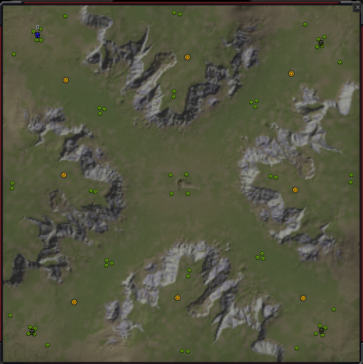
I would say that the map is a good first effort, but the land rush distance seems to be extremely long, especially for 1v1, and there are a very high quantity of very safe mexes, so I think it would lead to very turtle-y gameplay. My suggestion to improve the map layout would be to create more passages from the lower to the upper ground area and group mexes into more distinct expansions.
@signal_2 As a 5x5, your map has the issue of making hover far too OP. The main base can be directly attacked by hover with very little recourse for the non-hover factions, and as a 5x5 there won't likely be the time or resources to get navy up. You would need to make the water areas have cliffs to prevent hover from entering, but at that point why have the water even? As a 10x10, your map layout becomes more viable, with likely fast action in the middle with some raiding down the flanks, but still the issue of an advantage for hover factions exists, who just have a lot more options to raid. The first suggestion that comes to mind perhaps would be to add a land path around the edges of the map, but that doesn't seem to good either.
@Blodir Generally your map concept seems very well thought out. The reclaim in the middle is distributed in a straight line towards each player, so some of it is "safe" for each player, which is certainly desirable in a 1v1. After going mid, there are multiple seemingly equally viable paths for the player to expand and contest - the safer option in the closer medium reclaim field, the opponent's reclaim field (using the water as safety), and the opponent's forward mexes (again using the water as a safe retreat point), which is good for diversity on a 1v1 map. The 4 mex expansion is also interesting - they are spaced far out like on Emerald Crater, which makes them more difficult to defend with a single PD, but is on raised terrain which imparts a defenders advantage. The back mexes also have a nice mix of safety (if the tight chokes can be secured) and raidability (if units can slip past/air). The cliff area has an interesting dynamic too - one player gets to cliff build up from a location close to his main, but the other player can contest via the ramps that go up to the cliff area, which risks
@Valki it seems to me your map layout has just way too many mexes, and since that's mainly what you've done I won't comment too much further on your specific layout beyond saying that you should reduce the amount of mexes in play. I've thought about using sc2 maps as layouts for maps in faf as well, because it seems like a reasonable idea, but I've found that in general, sc2 maps have far too many chokepoints and tight passageways to be ported over to supcom well. Compare any classic sc2 ladder map with a classic supcom ladder map, and draw the impassable areas onto both. If you look at a map like Open Palms, the actual playable area is very open, with the only impassable areas being the raised central area, the plateaus at the sides, and the mountains behind the base. If you look at Heavy Artillery for example, the map has many impassable walls which form tight narrow passageways. The nature of the games and the unit interactions are just fundamentally different, so the maps in general are fundamentally different, which make them unfit for supcom.
-
As a quick note to anyone submitting designs: no design made in this topic will be part of any (map) tournament.
-
@archsimkat said in A community effort on a map layout:
@Valki it seems to me your map layout has just way too many mexes, and since that's mainly what you've done I won't comment too much further on your specific layout beyond saying that you should reduce the amount of mexes in play. I've thought about using sc2 maps as layouts for maps in faf as well, because it seems like a reasonable idea, but I've found that in general, sc2 maps have far too many chokepoints and tight passageways to be ported over to supcom well. Compare any classic sc2 ladder map with a classic supcom ladder map, and draw the impassable areas onto both. If you look at a map like Open Palms, the actual playable area is very open, with the only impassable areas being the raised central area, the plateaus at the sides, and the mountains behind the base. If you look at Heavy Artillery for example, the map has many impassable walls which form tight narrow passageways. The nature of the games and the unit interactions are just fundamentally different, so the maps in general are fundamentally different, which make them unfit for supcom.
Yes, too many mexes. - I was too busy dealing with Paint 3D (first time) to think properly.
However, the map layout not working for supcom is kind of the point. There are very few good maps without chokes like Starcraft 2, maybe they are impossible, but then again maybe not. Having fewer discrete defendable expansions to fight over might be interesting gameplay.
I am also introducing a friend to FAF right now, from Starcraft 2, and he is uncomfortable playing on maps without ramps and chokes. 2v2 Sandbox is his favorite. Maybe more new and even existing players like this "ramp and choke" meta. Maybe a "7 chokes of Rohan" will be popular just because some people need gaps and chokes. That's why I think it is interesting to try, but normally I just pick out some existing ramp and choke maps and host 2v2 with that.
But... this topic asks, I answer
-
And that is what this topic is about
 . I do like how navy is - as that is typically either extremely dominant, or irrelevant on a map of this size. But in this case it feels it matters, but doesn't necessarily mean you win. Could you re-look at the layout of your map and come up with another version? Perhaps look at:
- Mass / hydro layout
- Reclaim (trees, rocks, wrecks)
- Amph ramps (where can amph units get in the water?)
After looking at the map again, I do think some of the ramps are too small. They'd become a tad bigger, but that doesn't hurt the complexity of the map.
-
Legend:
- Pink lines: high cliffs blocking most attacks
- White lines: level 2 cliffs (safe from direct fire like T3 battleships)
- Grey lines: level 1 cliffs
- Yellow lines: beach suitable for amphibian units
- Blue diamonds: mass point
- Yellow lightning: hydrocarbon
- Red cross: commander spawn
- Black explosion: wrecks reclaim worth fighting over
- Green capsules: trees
Mass significantly reduced. The big challenge for the desired meta is that expansion sites need to somehow stay relevant as discrete expansions to fight over, despite having little mass. Expansions are now:
- Main base: 3 mex
- Natural expansion: 1 mex but rich reclaim to get battle going
- Forward expansion: 1 mex 1 hydro
- Back expansion: 2 water mex 1 hydro, good for early eco but requires defense vs navy
- Side expansions: 2 mex but vulnerable to T1 frigates
- Corner expansions: 2 mex and protected with ramps and from T1 navy
- Bottom/top beach expansions: 1 mex, long land route from closest players
Ramps should be enough to choke the gameplay, but yes, very small now, impossible for supcom pathfinding now

-
@archsimkat thanks for the feedback!
yeah it probably shows that I know utterly nothing about mapmaking

-
You can no longer submit a design. Archsimkat and I will look over them and we'll make a choice or two this weekend
 .
. -
I'm happy to announce that I'm going to try to make three of the four remaining designs, of which one is under condition.
Throughout this week I'll be making at least two preliminary designs. This will have all the fancy bits you'd desire, including prop placement, markers setup, etc. Over the weekend (6th and 7th of March) we'll discuss the progress.
I hope to talk to @Blodir and @Leto_II during that weekend. Feel free to send me a message on the forums or on Discord to make an appointment for a meeting. You can also find me in the creative channel if you prefer talking over Discord. I live in Amsterdam which I believe is GMT + 1. Please keep that in mind.
The last design is from @Valki and the reason it is under condition is because it is not your design. To avoid conflict I'd like you to contact the original maker (from Starctaft II) and ask for permission to use his design in a different game. I hope to receive a written confirmation on it, can be in any format that you desire as long as I can read it
 .
.There are two reasons for this:
- It is not your design
- The finest form of flattery is imitation
As a fellow content creator I'd love to hear if my content is used for another game in a non-profit manner. Just to be aware of it and the impact that the content apparently had. When this happens it is a compliment and that is always nice to receive. Whether or not you agree to it being used is another matter - one that I'd like confirmation on in this case
 .
.And last but not least: please keep in mind that all of this is best-effort. That entails that if anything happens that has to take priority the process will either slow down, or in the worst case, will be halted indefinitely. I will always inform you if that happens.
I'd like to thank everyone for their inspiration and the short discussions in this topic
 .
. -
Update 1: 'Initial commit', here we go

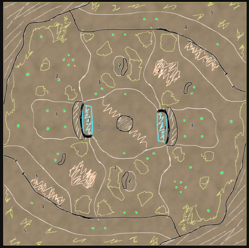
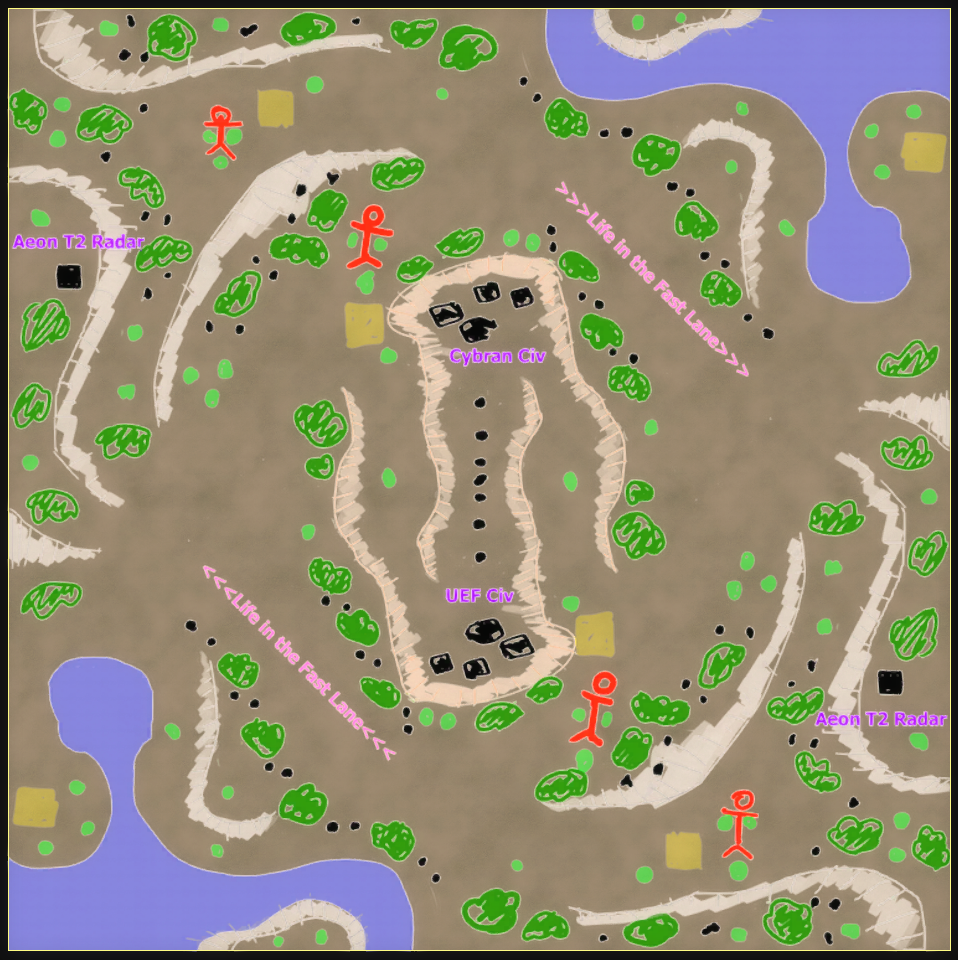
For those that have not opened the editor before: I've turned the design into a decal to ensure I stick to it as truthfully as possible. Of course - edits are welcome and the design is not written in stone. But as an initial setup this works pretty nicely.
From this point onwards its about generating the rough version of the map where I 'abuse' the ozone editor to create a symmetrical heightmap and 'paint on' properties that I can use in the procedural pipeline. I can paint properties via the stratum layers - these are masks that you can export. A few common properties are:
- Where you want more or less natural noise (think of mountains that need to look natural)
- Where you want more or less blur (think of expansions that need to be flat)
- Where you want more or less erosion (think of mountains that need to look epic)
- Where you want an erosion sink for sediment (to prevent the piling of sediment)
- ....
A technical note on the decal:
The designs are generally white where nothing is expected. In turn, I can use that as an inverted mask. White becomes black and black means its completely transparent. Via the decal templates templates for the GPG editor I can position the design exactly over the entire map without me having to manually fiddle with it. -
Update 2: An initial heightmap
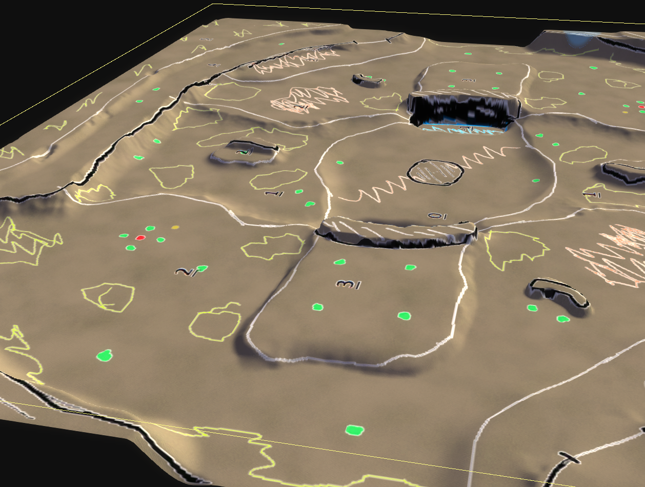
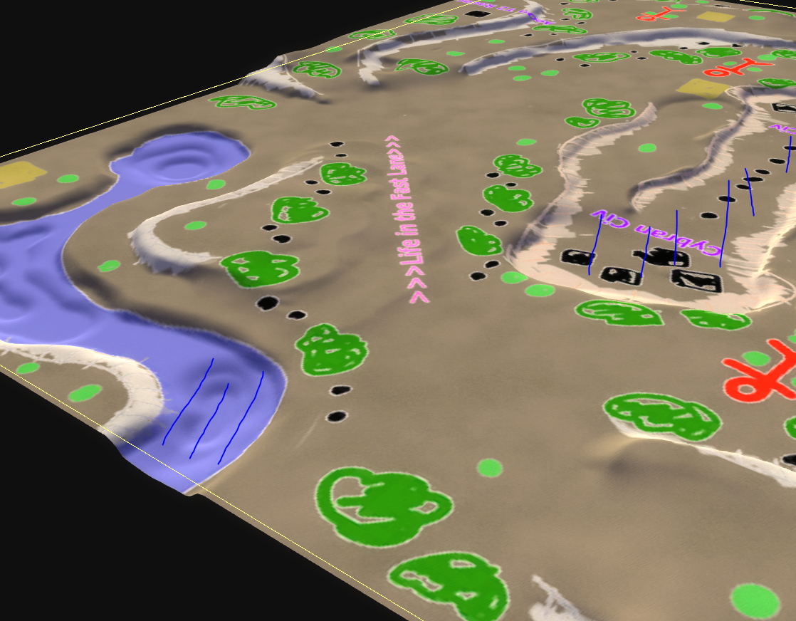
An initial interpretation of the heightmap! In the case of Blodirs map everything was quite smooth. Due to the height numbering it was easy to interpret and make an initial draft.
Ironically it also shows how hard it is to make a design that works out of the box. In the case my interpretation of Leto's design I ended it with the center being underwater. There are a few easy fixes to this, but it requires more ramps to be introduced.
@Leto_II I am hoping you could make a design similar to that of Blodir with numbering at what height you expect something to be at. Otherwise Archsimkat and I will make an interpretation that may be different than what you intended. Specifically we're talking about the center here
 .
. -
Update 3.1: An initial draft
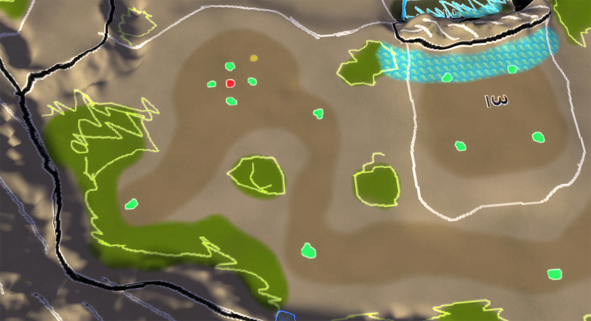
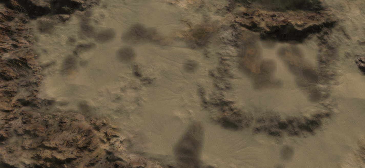
An initial draft of the procedural content of the world machine template for this map. I've (ab)used the ozone editor to paint properties on the map which is input for the template. Can you guess which is what?

In turn, the template chews for a bit and spews out three decals: an albedo, normal and lighting decal. The specular decal is a bit more tricky and is not part of this draft yet. However the main idea is already there. There is still loads to do:
- Generate sane masks for the stratum layers
- Speaking of stratum layers - determine what textures to use for what layer
- Improve the hardness mask as some cliffs are eroded a tad too strong
- Improve the erosion mask as some parts have sediment piling up
- Change up the coloring of the mountains
- Add tree area's into the main decals
- Add road / flat area's into the main decals
- Add color cue's for terrain height
And last but not least the typical map things like props, extractors, etc. Looking forward to the discussion this weekend @Blodir.
I intended to have an initial draft for the map of @Leto_II too but that is postponed to tomorrow
 . We had a short chat and the design has been adjusted to account for height differences.
On top of that I've had contact with @Valki and I hope to hear from the original author soon so that I can start the progress on his map too.
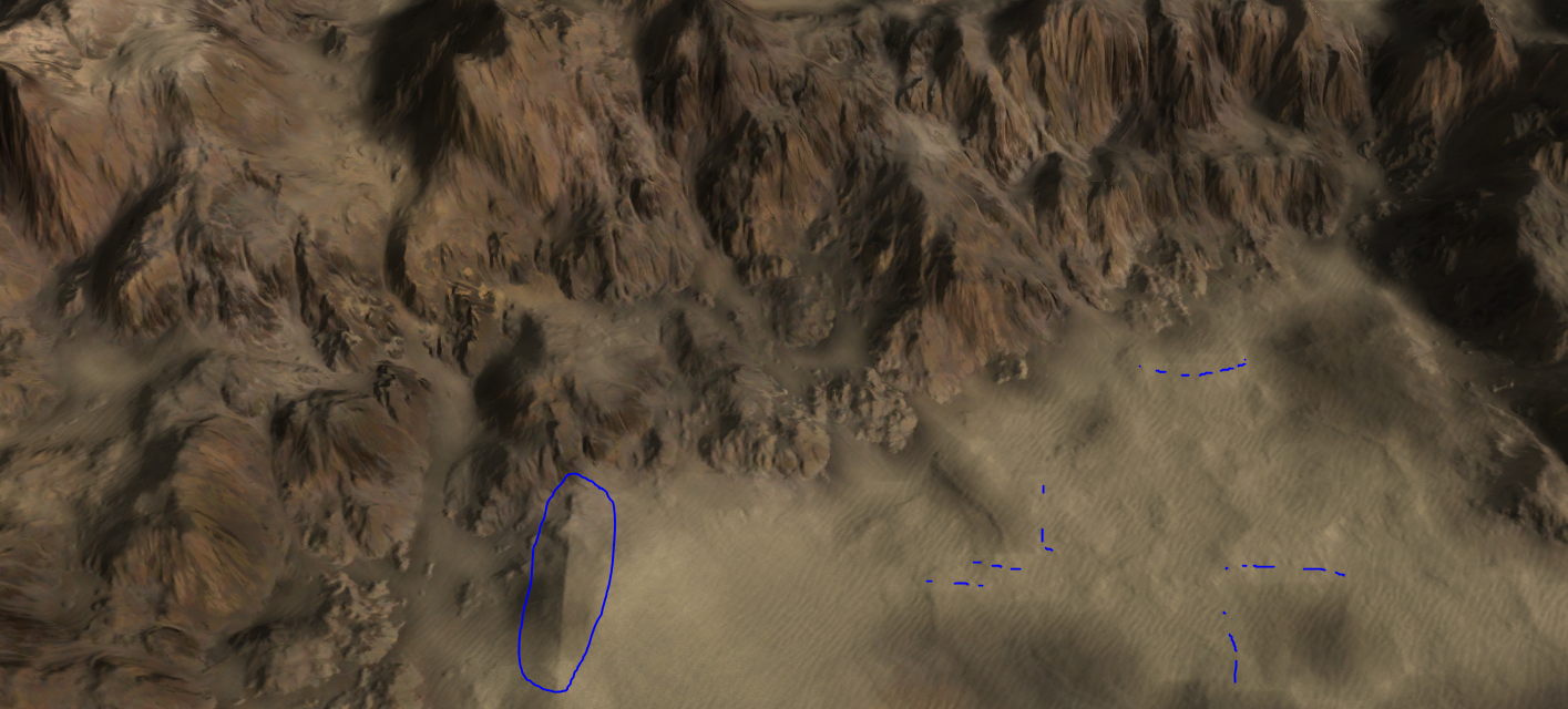
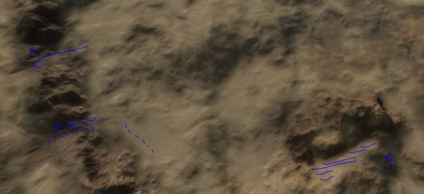
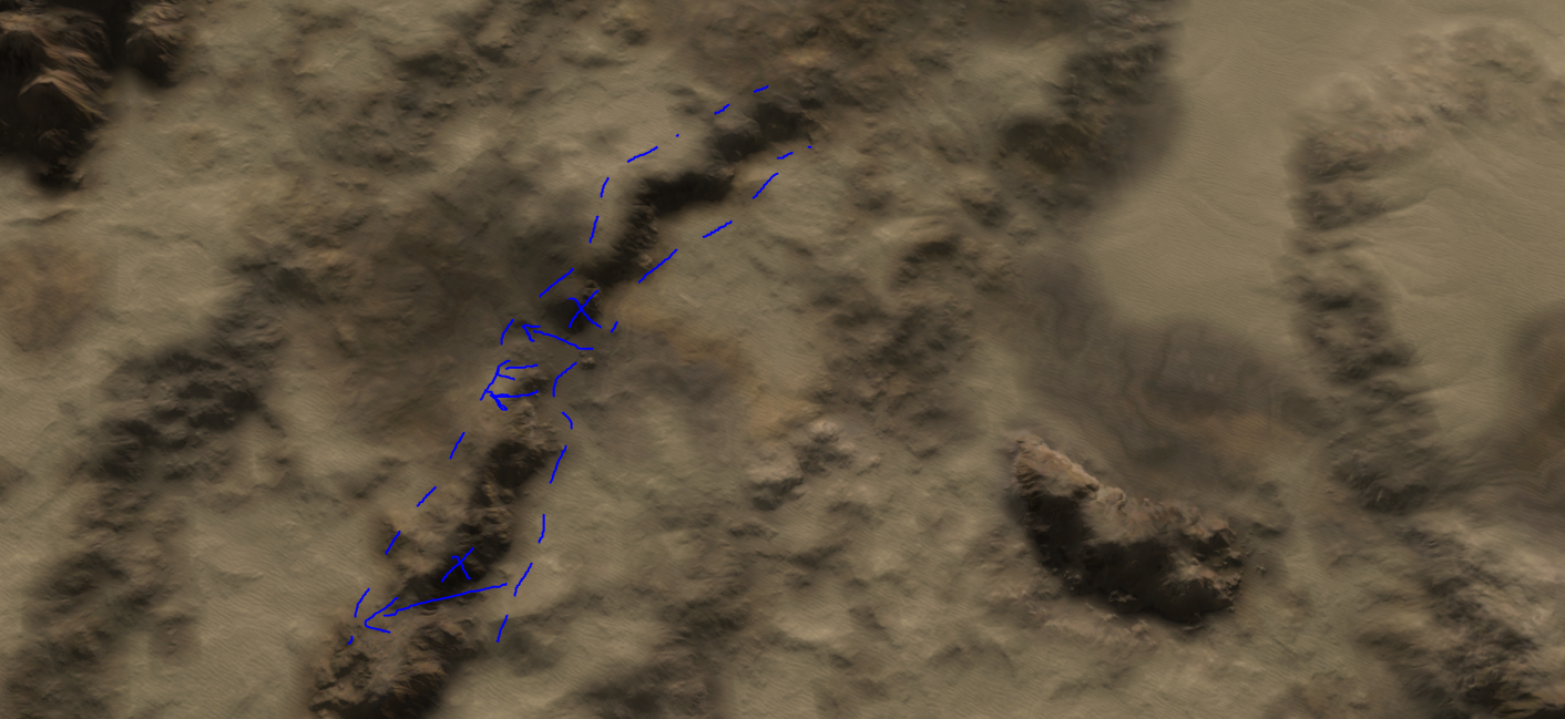
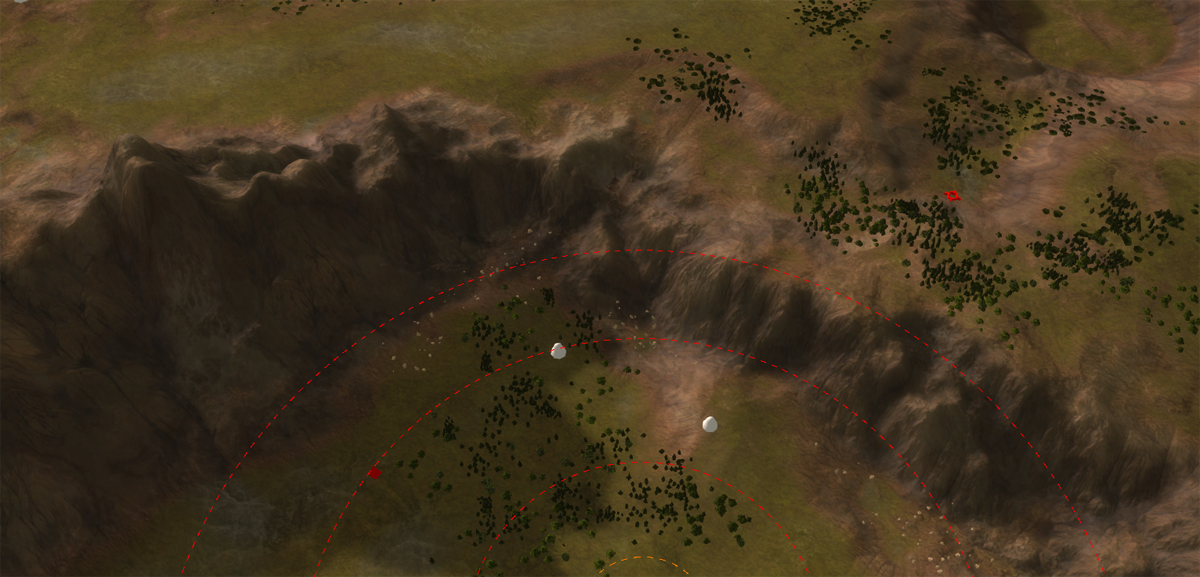
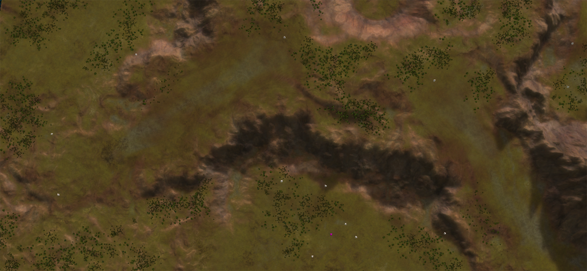
And to give an idea of the process - a few images of me just starting at the terrain to look for issues. There area a few, some are easy to fix and others require some semi-manual (read: more procedural) tweaking to fix.
Typically the issues are:
- A ramp that appears
- A ramp that disappears
- Plateau's that disappear
- Piled sediment
- Rough pixels in the transparency channel of the decal
-
Update 3.2: More work on that initial draft
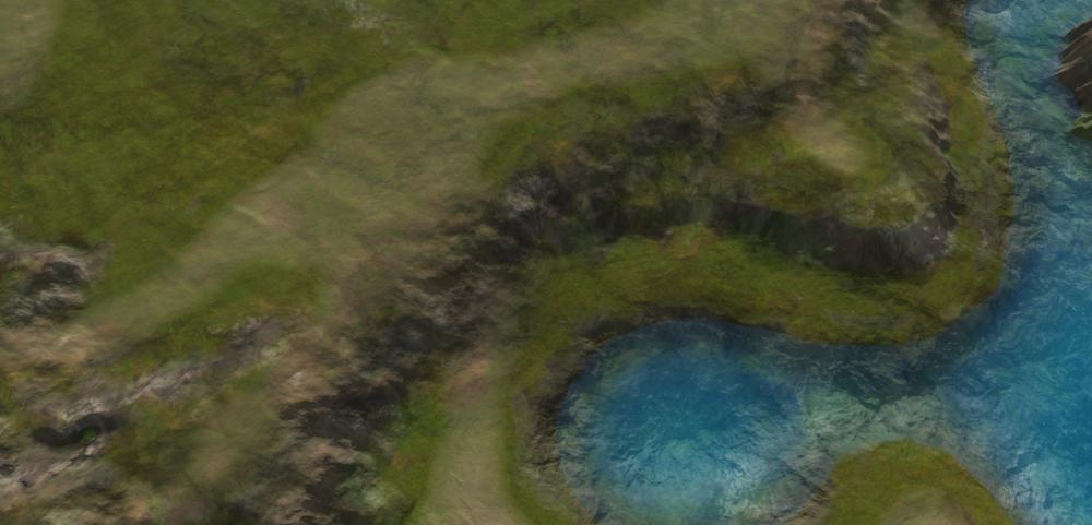
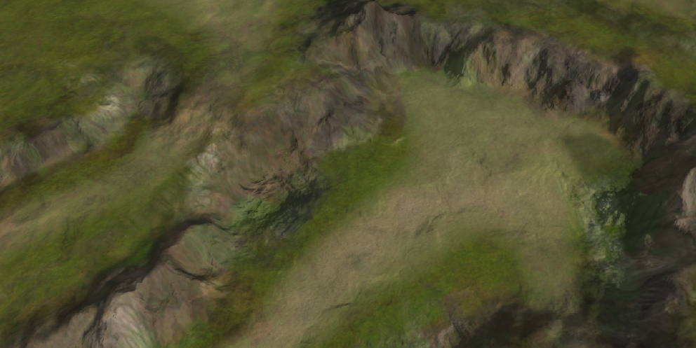
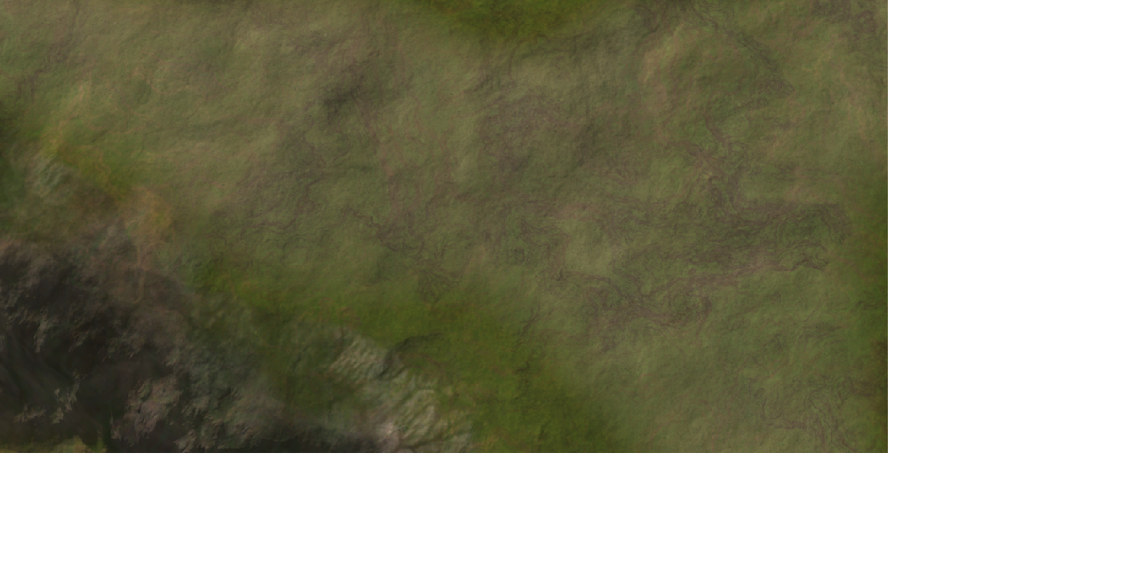
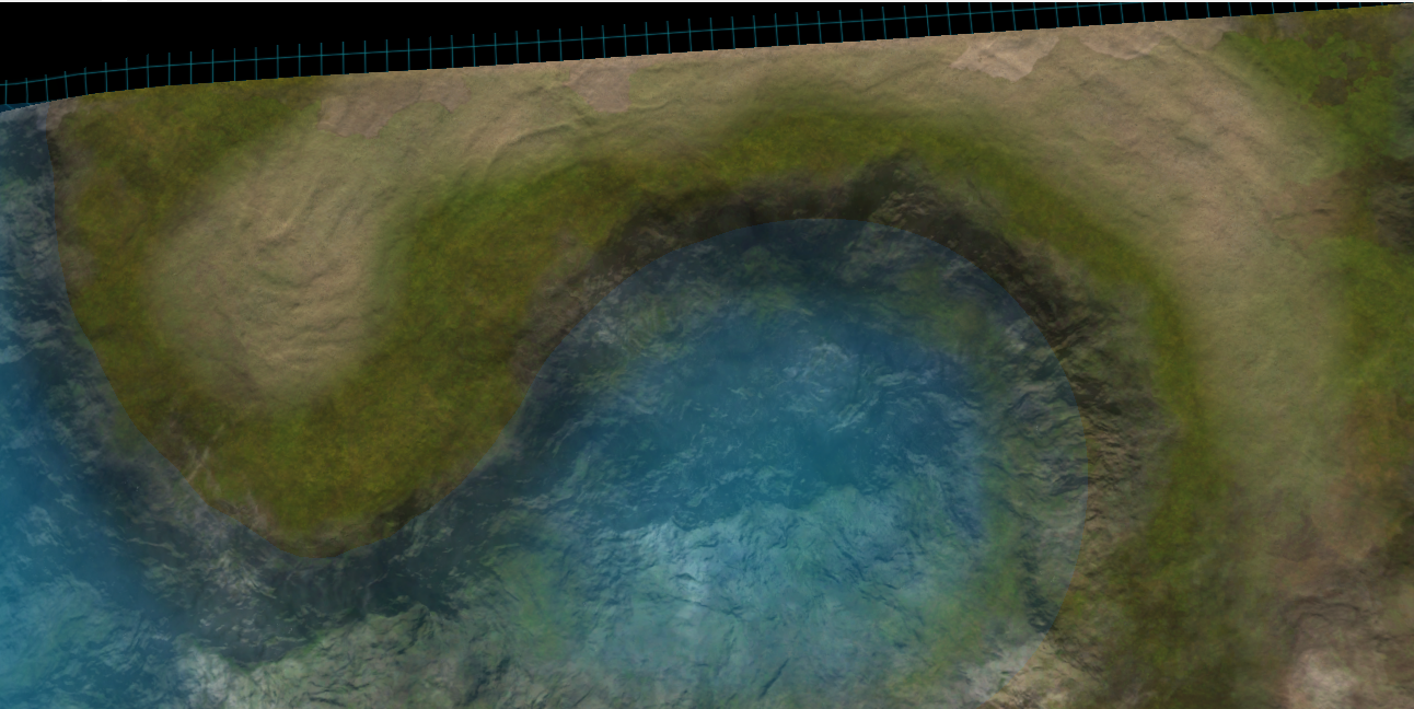
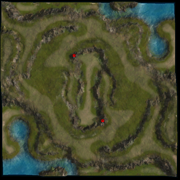
A bit later than anticipated! Started working on the design of Leto. We had a short chat and he changed up his design to take into account the ramps.
One particular aim for Leto's design was to create 'dunes' near the coast This didn't work particularly well yet, but the results (on the last image) are a promising start.
Things to still look at:
- The hills are a bit flat, e.g., the normal map is not showing up nicely.
- The normals in the water are waaaaayyyy so strong
- The dunes are not visible enough
- Use more stratum layers
- Fix up the albedo decal: its too shallow / invisible near the mountains
- props
- units
- markers
And to tip it off: I ran into what I think (and still think) is a bug:
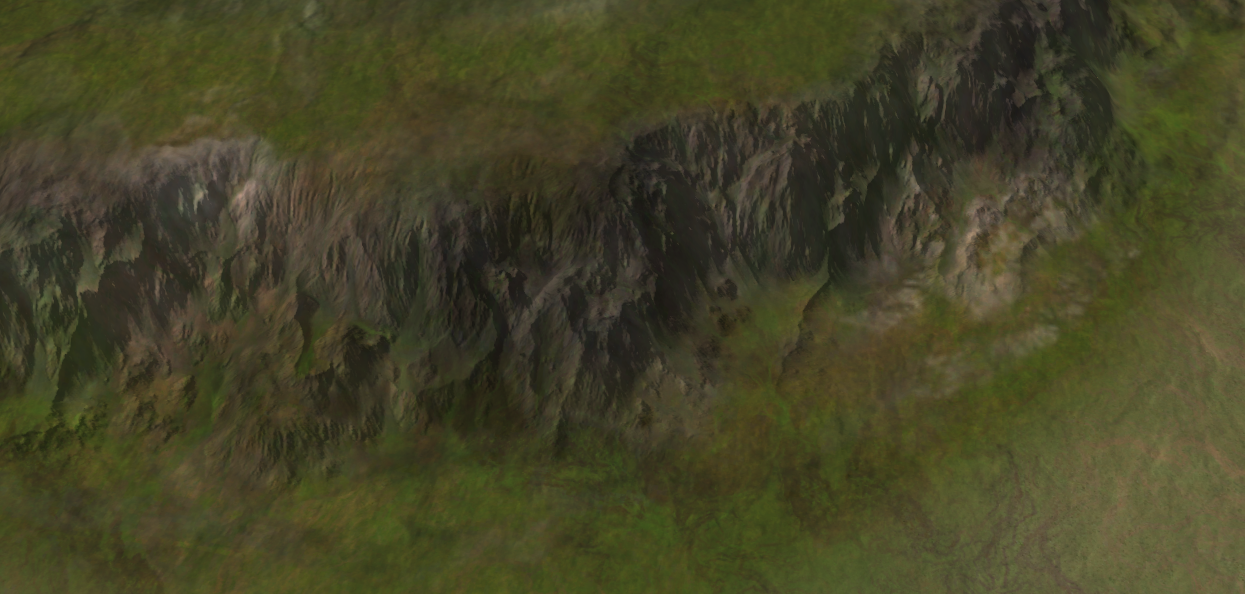
Luckily, I've already started working on the first issue with normals
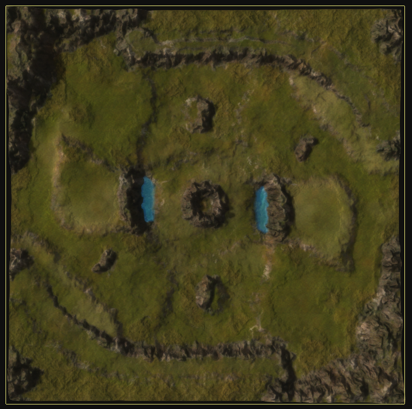
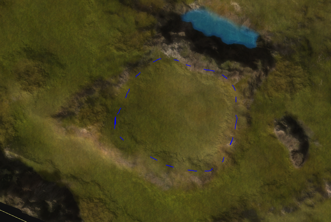
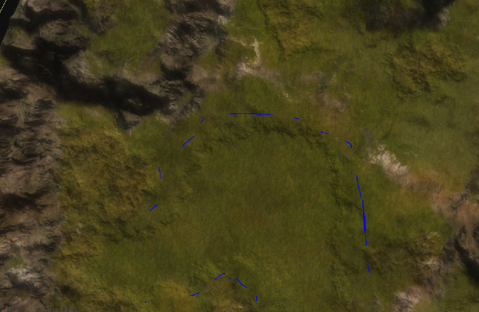
One experiment on this map was to clearly identify area's that are flat for buildings. The last two screenshots depict this progress.
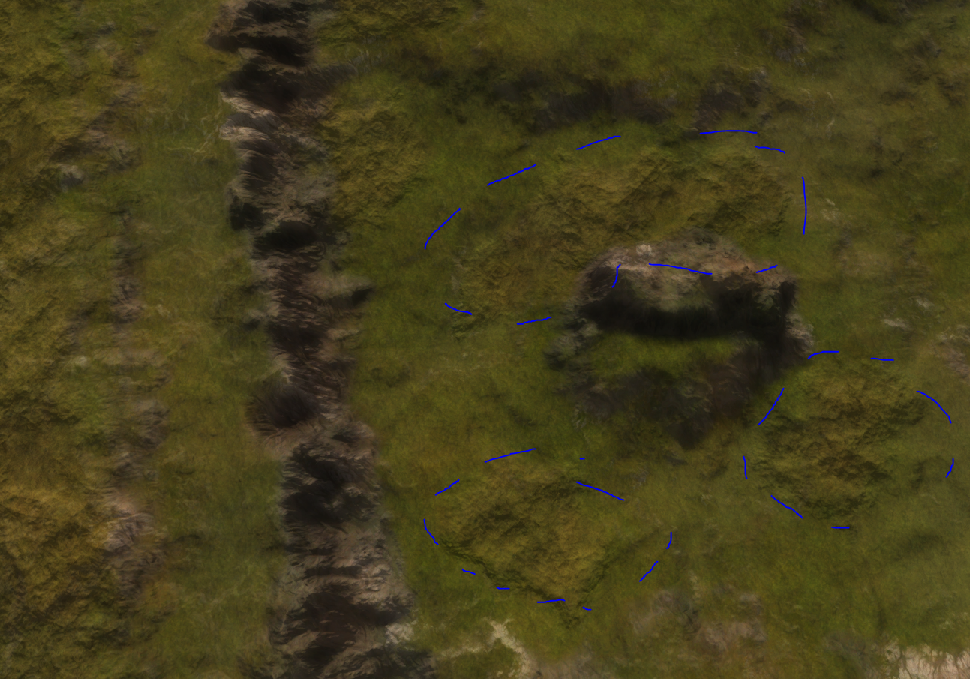
Another experiment was to clearly identify where trees are. I tried to do this via the normals decal at the moment, but I've got work in place to embed them via the color decal too and in a much more realistic manner.
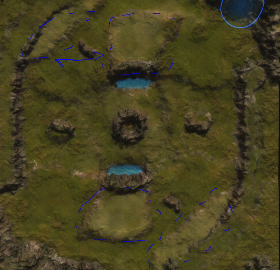
And last but not least - as part of a misinterpretation I've tried to color-cue the various plateau heights. Ironically, the result is actually quite good and it allows you to understand the map a lot better at a glance.
One major difference between both maps is how artificial their design appears to be. Especially the design of Blodir may work very well for the desired gameplay, but it is hard to get aesthetically 'right'. Especially the plateau to the right / left of the bottom / top spawn is hurting my eyes a bit.
The more I work on both maps the more I start running into hardware limitations. As I type this my computer runs at roughly 5 fps causing all kinds of weirdness to happen. Luckily, I'm working on scripts to automate even more tasks so I don't have to click anything anymore. At some point the ideal pipeline is of course one script to rule all scripts, but we're not there (yet).
For now I've automated the creation of stratum layers, decals and other kind of magic - all with the help of a script and some inspiration from other people in the faf creative discord.
-
I like the colour cue height map. I wish all maps were like this / the engine did this / a mod could do this. A long time ago I proposed making a decal with colour based of height, making walls with red, embedding it in the map, hiding it until you were completely zoomed out. Did a period of concept that worked: just needed to rewrite the map vault.
