A community effort on a map layout
-
After speaking about it with a bunch of people I agree that the red hills are too hard on the aesthetics. While at the same time the rock texture (or any other similar texture that clearly depicts the impassable terrain) is already having a similar function.
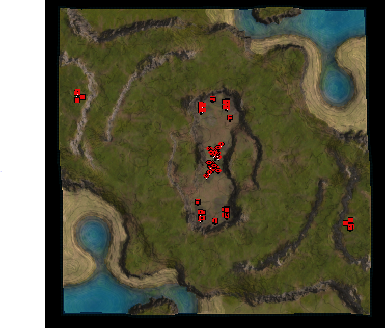
I would personally find something like this useful - just to indicate where the terrain is bumpy and to determine whether there is a slope. It is only visible when you are completely zoomed out.
It is a bit hard to see due to the resolution of the image, but once in-game it is well readable while not taking away too much attention.
edit: more screenshots
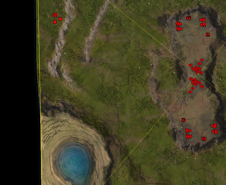
fully visible
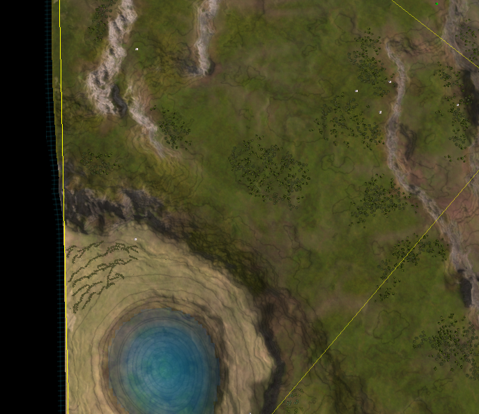
partially visible
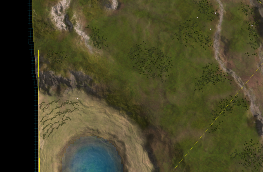
and gone
Another edit:
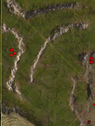
Excluding the hills, to keep them as bright as teeth
-
Is there a way to toggle these red lines? As in: I could press "F10" and the red lines come on, press it again and they disappear? Or alternatively, when I hold down F10 I can see the red lines, and when I let go of the key, they disappear? Better if they fade in and out smoothly, over time, even if it's just half a second.
I wouldn't need to see these red lines all day long. I would probably only need to see them once or twice during the match.
If I had to choose between never getting red lines, or they are always in my face whenever I zoom out, I would prefer never seeing them.
And if they were toggleable, we could see them even when we are zoomed in more. You wouldn't have to zoom out just to check if a passage was walkable.
-
In my opinion the best one is the "no transparency" one. I realise it is ugly, but it is very functional. The idea is that people would glance at it, then turn it off. Decal visibility would be toggled by code ... there could be options for
- when it is visible, what is the opacity (default to maybe 80% or whatever)
- only display it at a certain user defined zoom distance (or never)
- keyboard shortcut to toggle it on or off (in which case it would be on at any render distance).
with these settings anyone who didnt like it could basically get rid of it, or bring it back on demand only. For me I would experiment by having it on when the game starts then i'd dismiss it manually after a few seconds.
where the Strategic Overlay idea will shine is in mapgen where its not possible to know the map in advance, and also perhaps the map itself isnt that clear since it was generated not hand crafted for visual clarity.
but here's the hard part -> it would be nice if this feature was available for all maps. I don't know how (at runtime) create a decal based off a heightmap. I guess the java client could do it... it would read the heightmap, inject an image into the map folder, then rewrite the map file to include the new decal. That should be totally doable. Or, if someone was very clever maybe they could rewrite the cartographic shader to do everything we talked about it. It does have the heightmap after all.
-
" For me I would experiment by having it on when the game starts then i'd dismiss it manually after a few seconds."
If the system is built to support it, you could probably even set up a UI mod to have it on by default iff it's a mapgen map.
Perhaps the map generator itself could generate the decal. Custom maps shouldn't need this. People should just make them with legibility in mind.
-
If the goal is to dismiss it manually in the first few seconds of the game then there is no need for a toggle. I can just make the decal disappear after a given time, say 30 seconds, while you're building your first factory.
Having a toggle is possible if I make a PR for FAF that on pressing some key combination it checks the map folder for the decal in question. If it is there, it creates it. If not, it ignores the keyboard combination and adds a message in the logs indicating that it doesn't exist. One issue here is that a typical decal would be visible for everyone. E.g., an opponent toggling it to annoy the enemy. Creating a decal for person A and not person B will cause a desync. There are UI decals, but I haven't worked with them before.
Generating a decal at startup is something @Sheikah could do, especially for map gen maps. The node network is not complicated and is done in under a second. Generating and inserting them for non-map gen maps is a bit of a stretch in my opinion.
-
Update 4.0:
Meanwhile I've been working on both maps. Mauve is waiting on the final checks - after another discussion with @Leto_II the map will shortly be available in both the FAF and LOUD map vault. Once that happens there will be another post with all the PR pictures to make it shine.
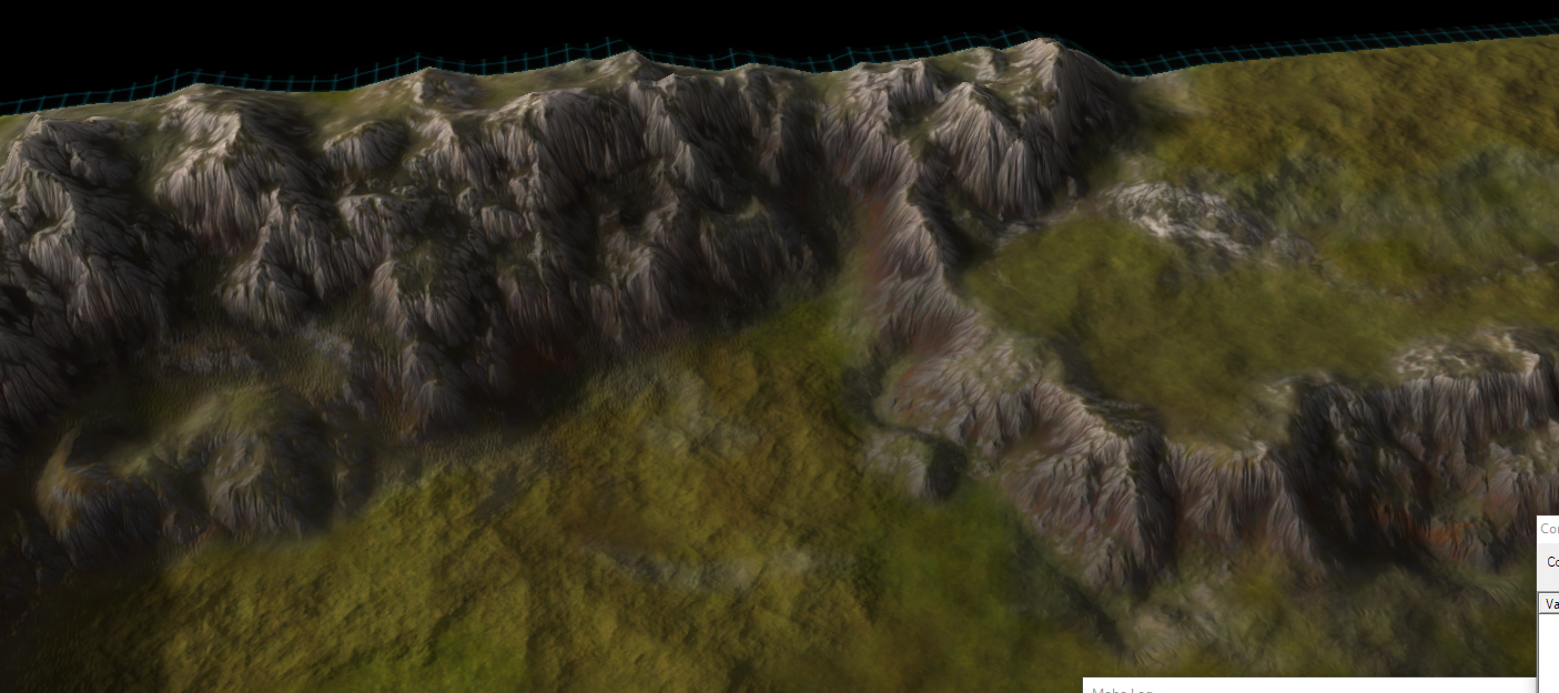
In Autumn, the map of Blodir, I've been studying the color nodes of World Machine. Add some experimentation to that and we have a breakthrough.
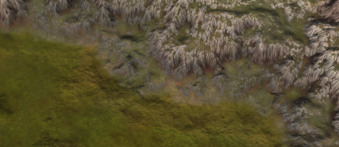
My understanding has increased a lot - these rocks are made out of a new color network that provide more control and flexibility. It is now a lot easier to fine-tune the colors. Throughout the week I'll be experimenting with various other places to add in colors such as for area's with rocks, trees, or roads.
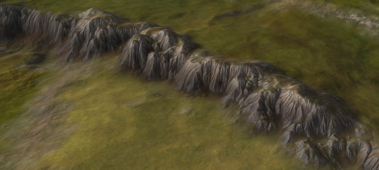
This will allow me to tune the map a lot more - area's that have trees on them will have a different color pattern / properties than area's that had rocks on them. It will be easier to add visual cue's to critical gameplay elements, such as ramps.
edit: all the images taken are from the GPG editor, not the Ozone that makes them look slightly better.
-
absolutely gorgeous results. this is earth under it's best light.
-
Leto's submission is looking scenic and natural, but also immediately readable. Nice work Jip, I am excited to play some 1v1s there!
-
I think the preview would be great for all maps, not just mapgen. Loki with and without the preview.
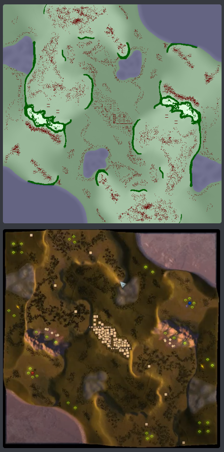
I think options and settings are a must, not some 30 second hardcoded thing. People will (quite rightly) object massively unless they can control it.
-
Then it is a bit out of scope for this topic - I don't have the time to make such an extensive PR
 .
. -
yes of course, i have derailed this entirely sorry
-
With pride I present Mauve designed by @Leto_II - the second of a series of maps in this topic! The map is available in both the FAF and LOUD vault. For more information:
edit: apparently there was a map name in the post of Leto and I overlooked that. Apologies again!

disclaimer: the map in the vault doesn't have any heightlines


-
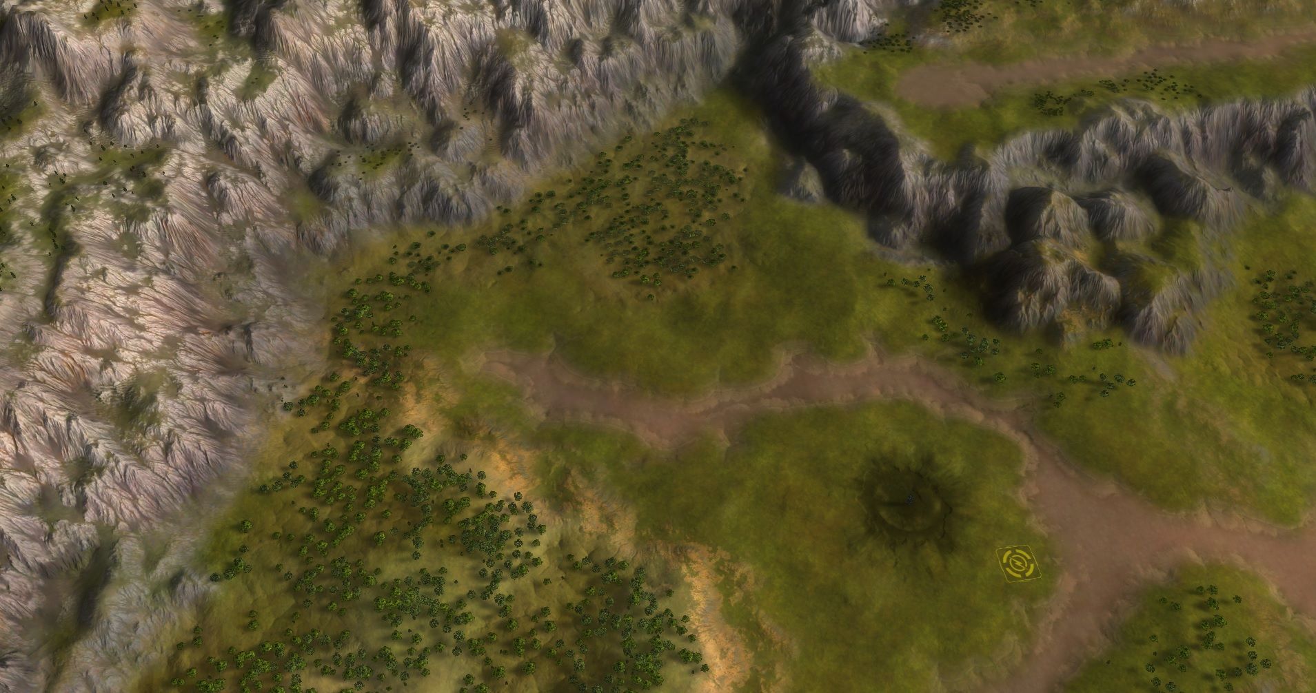
Its been a while but lets get back at it
 .
.
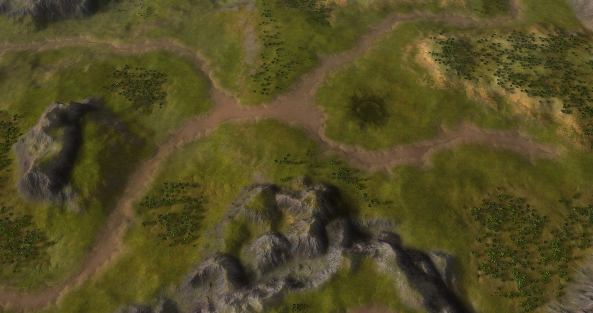
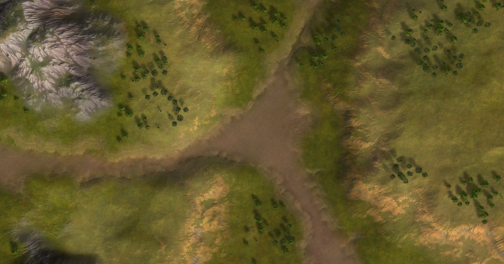
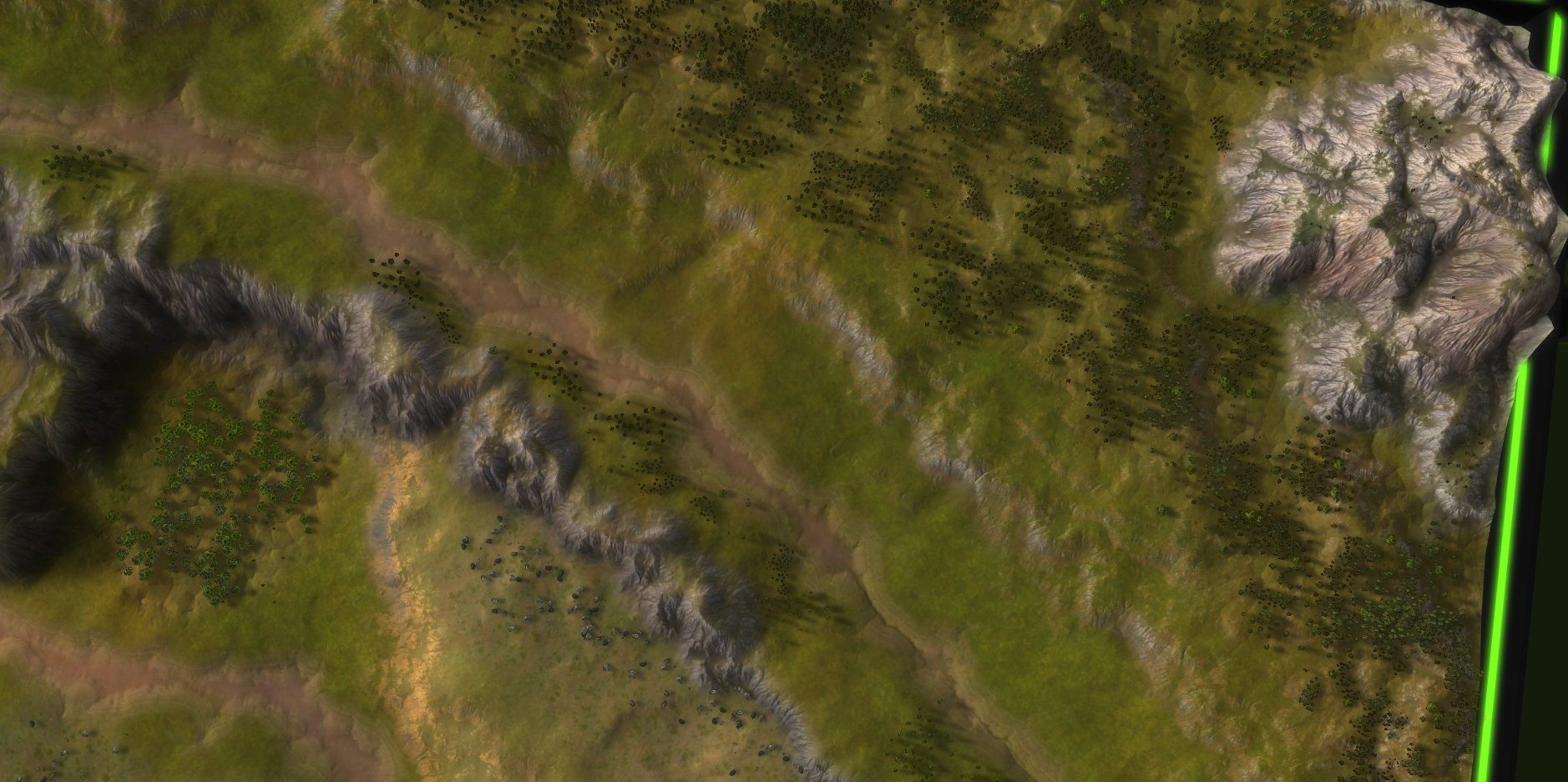
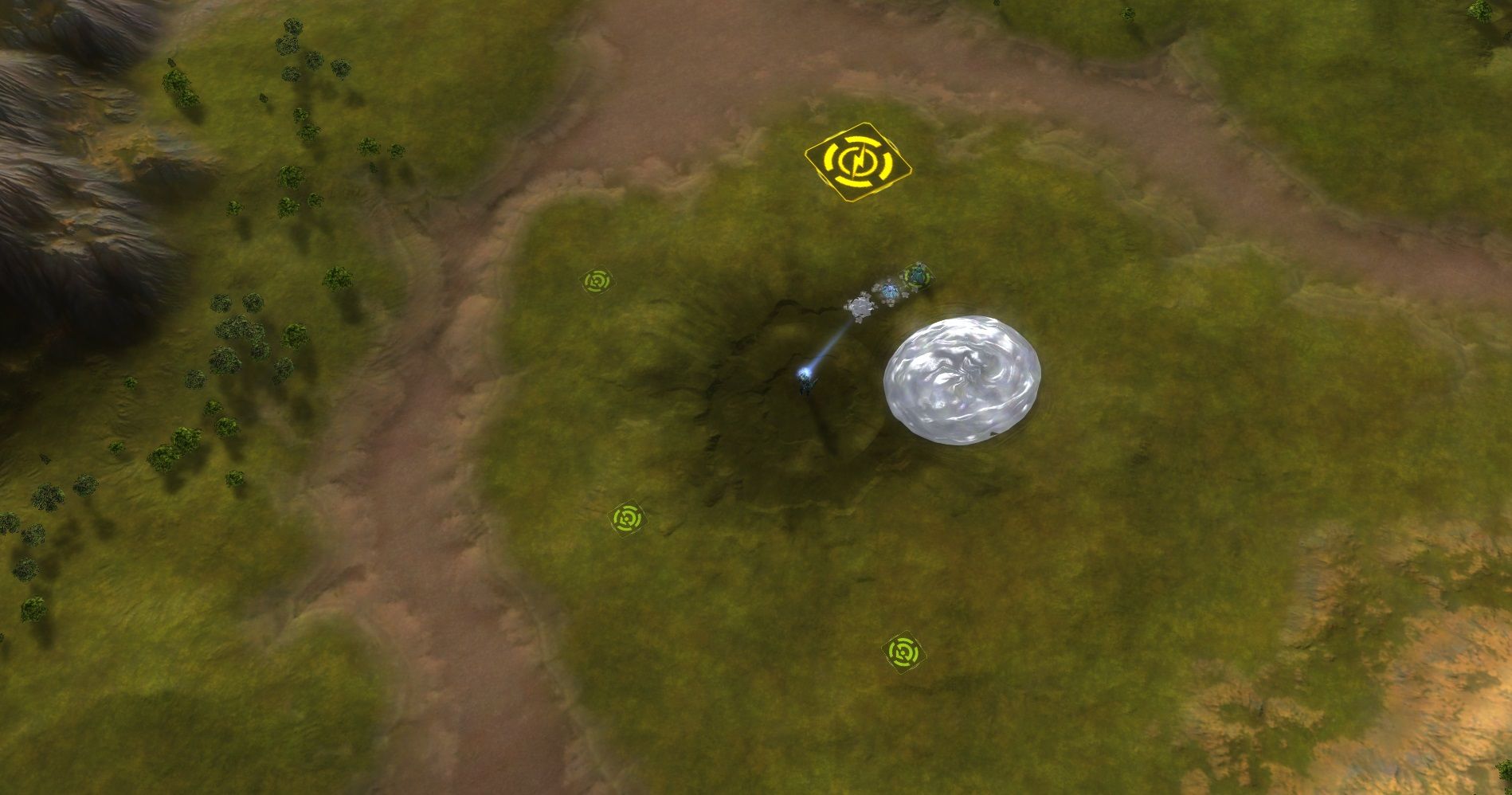
Looking at Autumn - an implementation of the design from @Blodir . We've had two sessions and the last one will probably emerge somewhere this weekend when the map will become available in the vault.
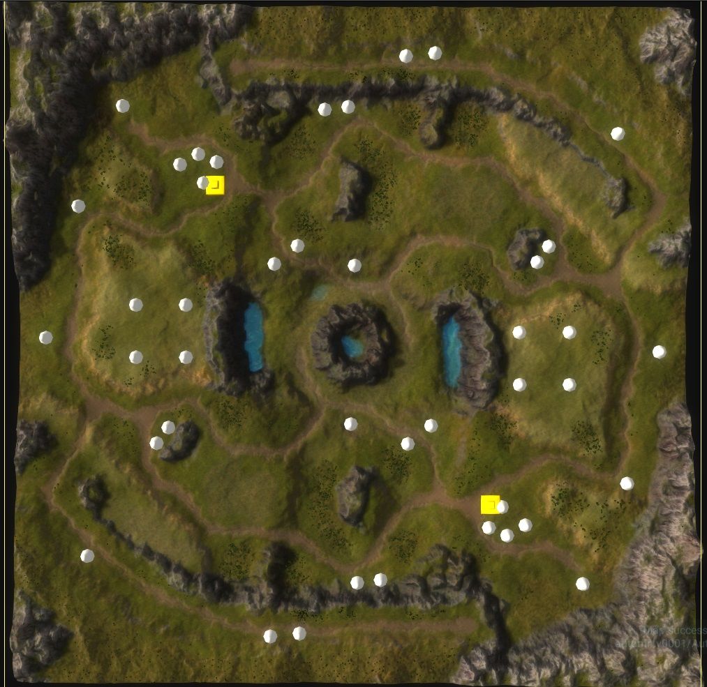
The layout is quite similar to the original design. It still requires a bit of tweaking where the extractors will be located exactly. I hope to finish that up this weekend. At the moment the big quest is 'filling the gaps'. There are some open area's in the map that I don't want to fill with trees, but there isn't much else to fill it with. Therefore I'm experimenting with how Blizzard designed the Starcraft II maps - small patches of detail in larger area's of nothing.
The focus since last iteration:
- The roads are now nicely marked with a combination of a stratum layer and decals
- The cliffs are properly color-tuned
- Color cue's are more correct
- Props / marker placement
Things that still need to be done:
- Further prop placement
- The center
- The rocky areas
And last but not least - after talking to @Valki he wasn't able to contact the original author. Therefore he made his own design and I'll soon be implementing that. Its a design based on Starcraft II meta / balance. More about that map later
 .
. -
Autumn is available in the vault
 !
!I'd like to provide @Blodir and @Leto_II an additional month for feedback on small changes, such as flattening terrain, moving an extractor slightly or adding / removing a few props. Once April ends the maps will be as they are.
On top of that - I'm intending to making a trailer similar to the trailer for Archsimkats Valley for both maps:
If you have a replay that you think is epic feel free to message me the replay!
Last but not least - time for a few adjustments for the map of @Tatsu and then onto the last design from @Valki .
-
@Jip said in A community effort on a map layout:
On top of that - I'm intending to making a trailer similar to the trailer for Archsimkats Valley for both maps:
If you have a replay that you think is epic feel free to message me the replay!
Last but not least - time for a few adjustments for the map of @Tatsu and then onto the last design from @Valki .
That is a great idea!
However if I might, I think a scripted game will do more to make a good video. You discussed the intended and expected strategies with @archsimkat and the draft creators, maybe take that as a starting point.
Have, for example, the draft creator and archsimkat list the key attack paths etc. Have the draft creator and someone, preferably archsimkat or a pro, run a "cheating enabled" game where those key attacks are made. Then make a video from elements of that replay.
-
There's no rush - over time a good replay will emerge and I'll go with that. As anything else will either take up time from me or from Archsimkat and I'll already be spending a few hours to make the trailer anyhow
 .
. -
As part of the update for Tatsu and his map
Two Step Shufflethere has been some updates!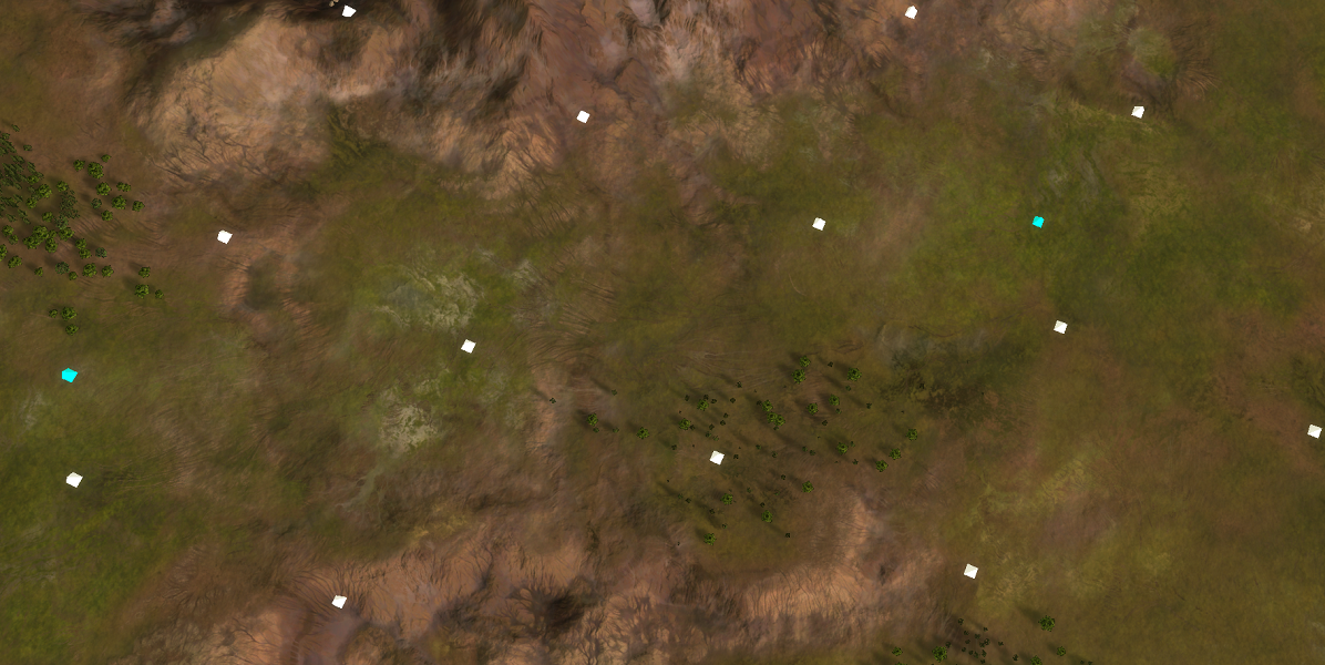
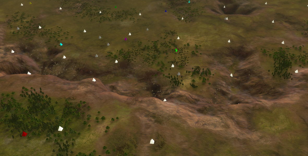
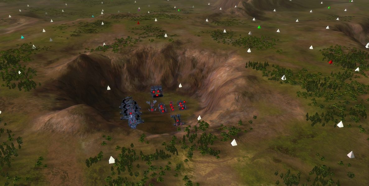
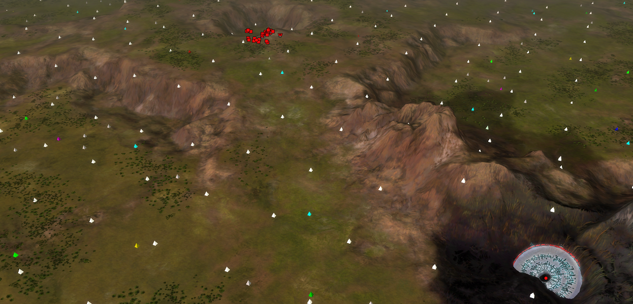
There are numerous updates:
- The ramps are now more 'rampy' with swirls all over it. The idea is to visualize that the terrain is going downwards.
- The terrain overall has more detail. Not due to a higher resolution but because of using that resolution better.
- The center is no longer super-smooth and is now like the rest of the terrain. Including the Atlantis dry dock
 .
.
Also, did anyone spot the CZAR crash and that you can walk underneath it?

As with the others - @Tatsu has until the end of April to provide feedback. After that the map will be considered done.
The map of @Valki will be started after my exams and other duties - you can expect the first drafts in about two to three weeks!
edit: and Two Step Shuffle is in the vault

-
With thanks to @KolmarEye for helping out with a graphical bug.
It appears that a map can end up being partially downloaded / unzipped. Causing you to miss assets, causing a graphical bug. This bug makes it really hard to play one of these maps.
To solve this issue:
- Uninstall the map in question via the vault
- Install the map in question via the vault. Let it finish as it can take a long time: each map is about 200mb!
Then, once finished, it should it all be good. If this isn't the case, please contact me.
-
 J Jip referenced this topic on
-
 J Jip referenced this topic on