New Improved Onboarding Feedback
-
Looks good, on the bit about windows not letting you install it ("If your Windows computer stops you from running FAF, click on "More info" and you'll be able to run it."), I wonder if it'd be worth expanding slightly to explain why this happens, e.g. "Windows may try to prevent you from running FAF with the below message - this is because FAF cant afford to pay Microsoft a monthly fee. However clicking the "More info" button should allow you to run FAF: [screenshot of the error with more info circled in red]"? Would lengthen things a bit but might help explain to people why they get the error/make them more likely to believe that FAF is safe to run.
On the 'Reigster for a FAF account' I'd suggest having some text in bold red noting something like 'Gmail has taken to periodically blocking FAF registration emails so if you don't receive a registration email shortly afterwards, try using an email with an alternative provider'
M27AI and M28AI developer:
https://forum.faforever.com/topic/2373/ai-development-guide-and-m27ai-v81-devlog
https://forum.faforever.com/topic/5331/m28ai-devlog-v294
M28 trophy holders: Radde, Yew (Radde trophy, v285) and Zwaffel (Sladow trophy, v284) -
I think the items should all use the imperative mood. For example:
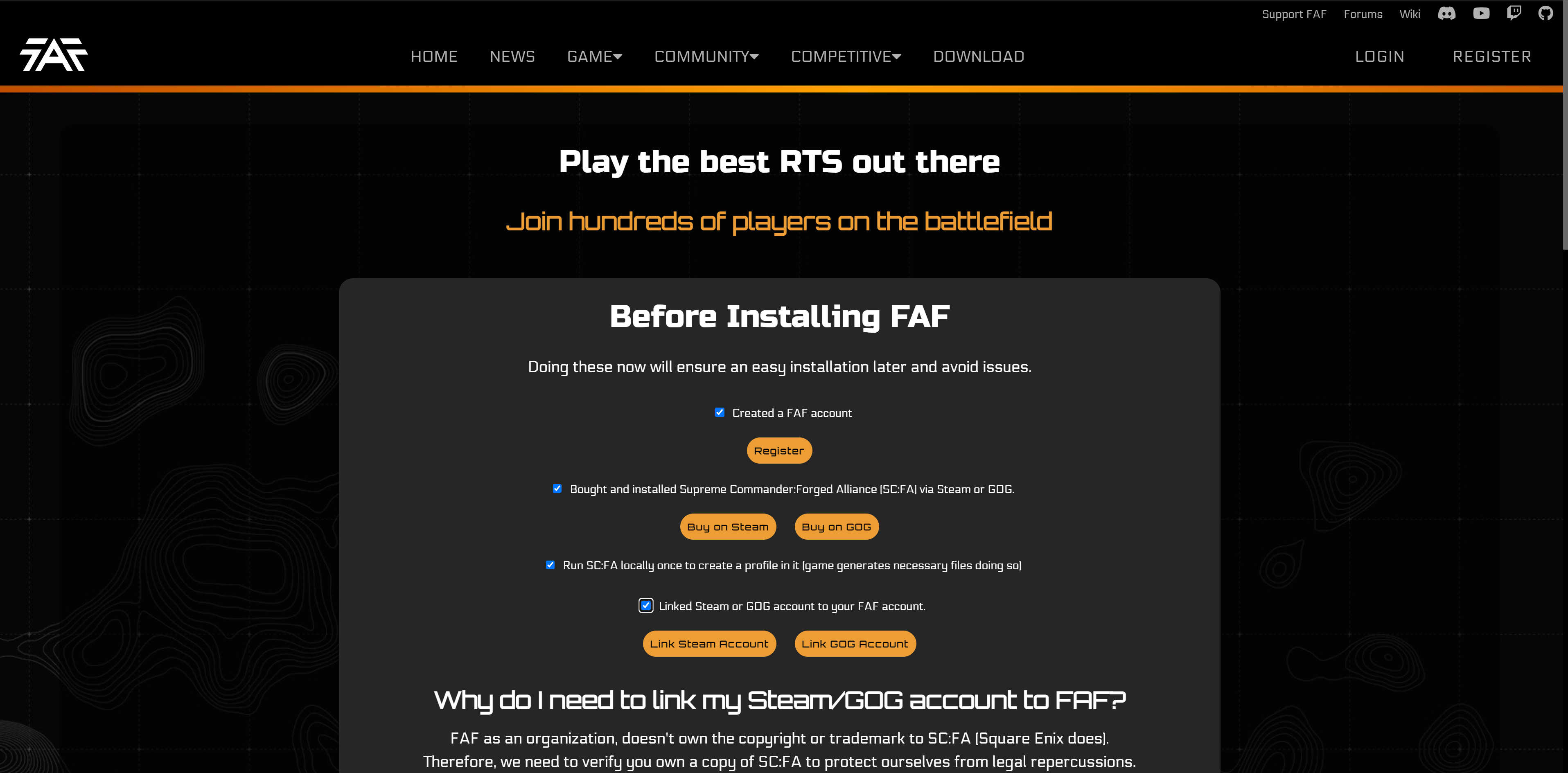
- Create a FAF account
- Buy and install…
-
@maudlin27 I might do that, since it already seems very compact.
I'm also working on flash messages so we can have a message at the top bar that people can see (and be done automatically).
@Eternal I forgot I could change the checkboxes xd, I'll style them a bit
@Askaholic You are right, that sounds more natural/better.
Thanks for the feedback everyone
-
Why at point 3 you link again to discord but not to the forums? I demand equality!
Jokes aside, good work!
Step 2 is perfectly useless to the less tech-savvy users: they won't have any idea about a steamapps/common folder or a /GOG folder; consider adding a short guide on how to actually find said folder on both platforms.
-
Rant about Fonts
-
Can we remove font Orbitron from all FAF related things? Its horrible to read for me, painfully wide, my eyes just glaze over the letters. The main font seems to be "Electrolize" anyway, which while im not a fan, Eletrolize has better readability.
-
Can we look into some other futuristic, but better readable fonts as well maybe? Some proposals:
- Electrolize (for comparison)
- Chakra Petch
- Sunflower (language support is a bit meh)
- Titillium Web
I think all of these have better readability, Chakra Petch is highly stylistic similar to Electrolize with worse readability than Sunflower and Titillium, which in my opinion would be good for normal text paragraphs while keeping the headers in one of the more stylized fonts.
Of course this is just the result of single Google search for "fonts similar to Electrolize", so there might be much better ones. Imho a professional looking font that has good readability makes an extrely big difference between a page that looks like it comes from people that know what they are doing and a page that looks like a random blog/fanpage from 2010 that was made to look as "cool" as possible by a 13 year old.
-
-
I just uploaded the new changes . Please make sure to check again https://www.test.faforever.com/play
@Katharsas I see, I originally used Orbitron since I needed an extra futuristic font. I believe it has okay readability and a lot of style but I do see how it could be difficult for some to read. I really liked Chakra Petch so I might switch Orbitron for it. Thanks for your feedback
However, I completely disagree with you. I believe judging a website or a book by its cover is quite superficial. Specially a website which is much more complex than one font. The current website has fonts with very good readability and its a hot mess of code and lack of functionality. So I'd recommend not judging websites based on fonts unless you want to make an erroneous assessment.
-
If a site author prefers heavily stylized fonts over readable fonts, that just gives me a negative impression, feels kinda like "style over substance". Sure, its far from the only important thing a site should get right. Thanks for all the hard work on improving the user experience.
-
@katharsas thanks to you for providing me with more fonts of high quality. I'm switching Orbitron for Chakra Petch thanks to your feedback. Looks much cleaner
New - Chakra
Old - Orbitron
-
Btw. do you do all the styling by yourself? Do you need any help? Is there a Github?
-
@katharsas yes I do the styling myself. A good chunk of the new website is mostly just me. The only parts that don’t have much of my influence are the GET and POST requests of the account/clan management.
https://github.com/FAForever/website
That’s the github. Develop branch is the current website/production and New-Frontend is the new website/test branch. Any help is appreciated.
Hello! It looks like you're interested in this conversation, but you don't have an account yet.
Getting fed up of having to scroll through the same posts each visit? When you register for an account, you'll always come back to exactly where you were before, and choose to be notified of new replies (either via email, or push notification). You'll also be able to save bookmarks and upvote posts to show your appreciation to other community members.
With your input, this post could be even better 💗
Register Login