New Client Newshub Coming Next Week
-
Hello everyone! Now after some time and tests, I have finished developing the new version of the client newshub! I'd appreciate some feedback before it is implemented. We are thinking (me and Rowey) about probably putting it on the next week with the new batch of news.
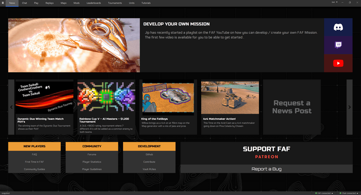
Here is also the live version on the test server https://www.test.faforever.com/newshub
Here is a list of improvements coming with the new newshub!
No more slowdowns
The previous newshub was calling the API everytime a user came (as far as I understand the outdated techniques previously used) causing users to wait about 5 seconds for the page to load (both in client and on the website).
The new client newshub caches the newshub in a json file. Meaning users dont have to wait since all the data is already loaded in the website.
Flexible Image Sizing
Now all image sizes are supported! No need to make your images 145x97 or other cumbersome sizes. Now images are automatically re-sized.
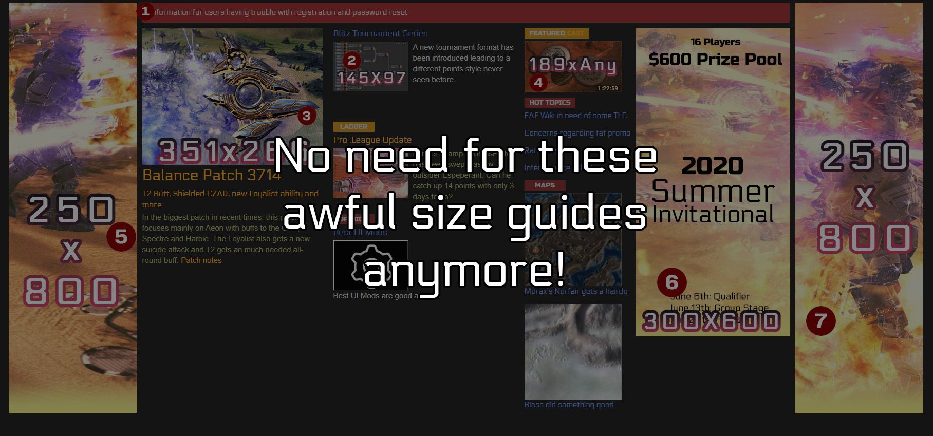
Images with a 16:9 ratio (2560x1440, 1920x1080, 1280x720 or anything "rectangular") will fit perfectly. Other non-rectangular images will still adjust correctly but might receive a cut-off.
Unlimited Articles
Since now the articles are on a "slider", we dont have a limit with how many articles we can have without sacrificing design. So 5, 7 or 12 articles will all display equally well!
Responsiveness
This design has media queries and responsive unit sizes (such as vw) to always adjust to the users preferences. Therefore, the news will display adequately whether it's on a full screen window or 1/4 of the monitor screen.
More Information Less Clutter
The new design also provides more links for the user. With buttons for discord, twitch or youtube being one click away, plus new sections with useful links for new players, community tools/spaces and devs and a Support FAF button and a report a bug button all in one compact and clean design! Now Users can have an easier time accessing FAF tools and spaces from the client News!
If you have any feedback, I'd appreciate it alot!
-
Just an idea:
Can we have two rows of articles so clicking right/left is required less often? -
@katharsas
If I understood Javi properly yesterday then yes it is possible. And I myself would love to see it happen as I feel like it would make the page feel a little bit more filled as currently there is a little bit to much empty space left in standard 16:9 ratio. Especially at the bottom.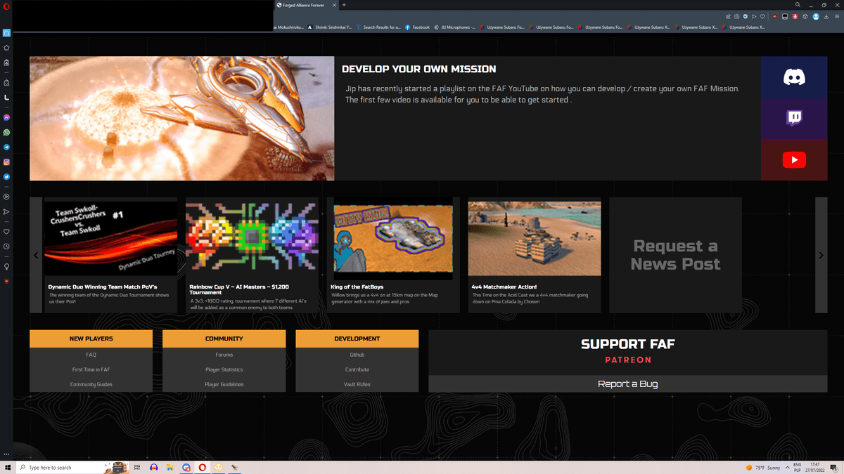
Otherwise I really don't mind this design.
-
I think the new layout is very eye pleasing and I really appreciate the responsive aspect. Hopefully the row (or one of the multiple rows) of news items can scroll back a few weeks. It might be useful for users that want to revisit something and find other ways of reaching that content too tedious. It's also good filler

-
@i_forgorthescene yes this can be done (pretty much every possible design can be done. The only limitation is how much time/effort it takes, but unless its something very complex (putting the news on a checkerboard and make them move as chesspieces for example), its usually easy to achieve).
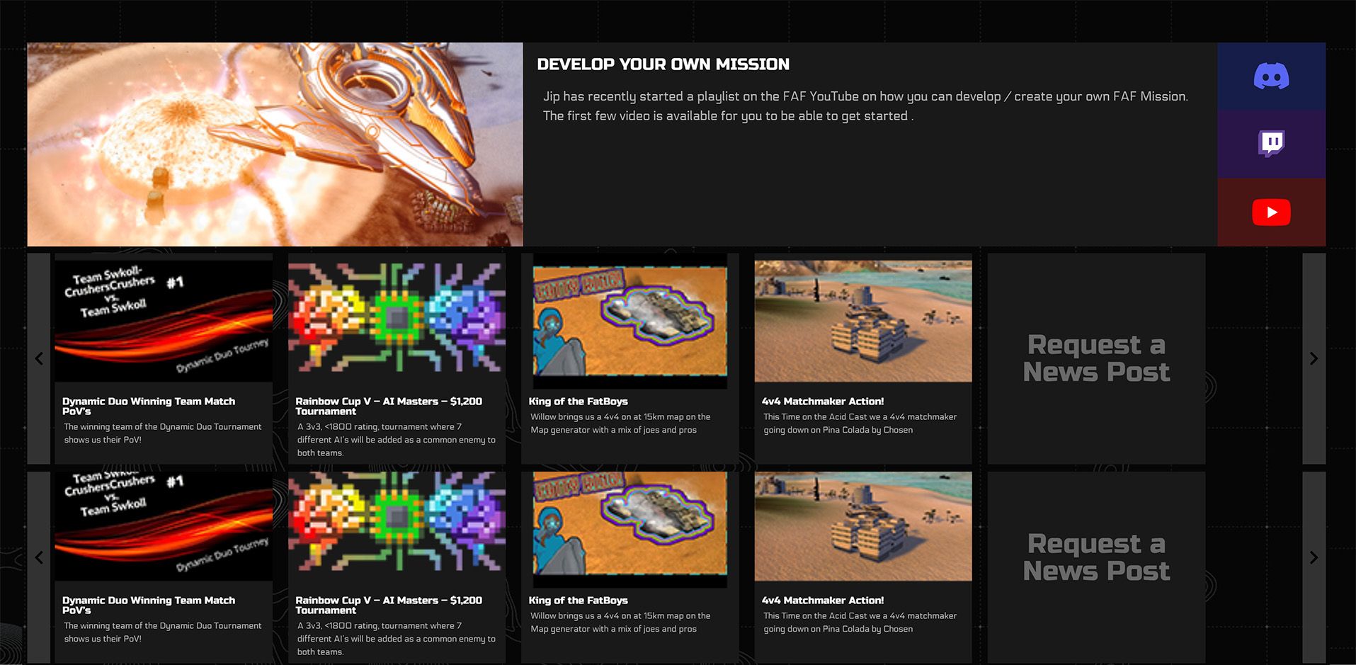
The issue with two rows is space.
If I make two rows, then the "useful links" part either needs to go or go to the bottom (which will only be seen through scrolling).
Other solutions are making the featured news article smaller (not so featured anymore), making font sizes smaller (harder to read) or/and making the images sizes smaller.
Now let me present you another issue with double rows
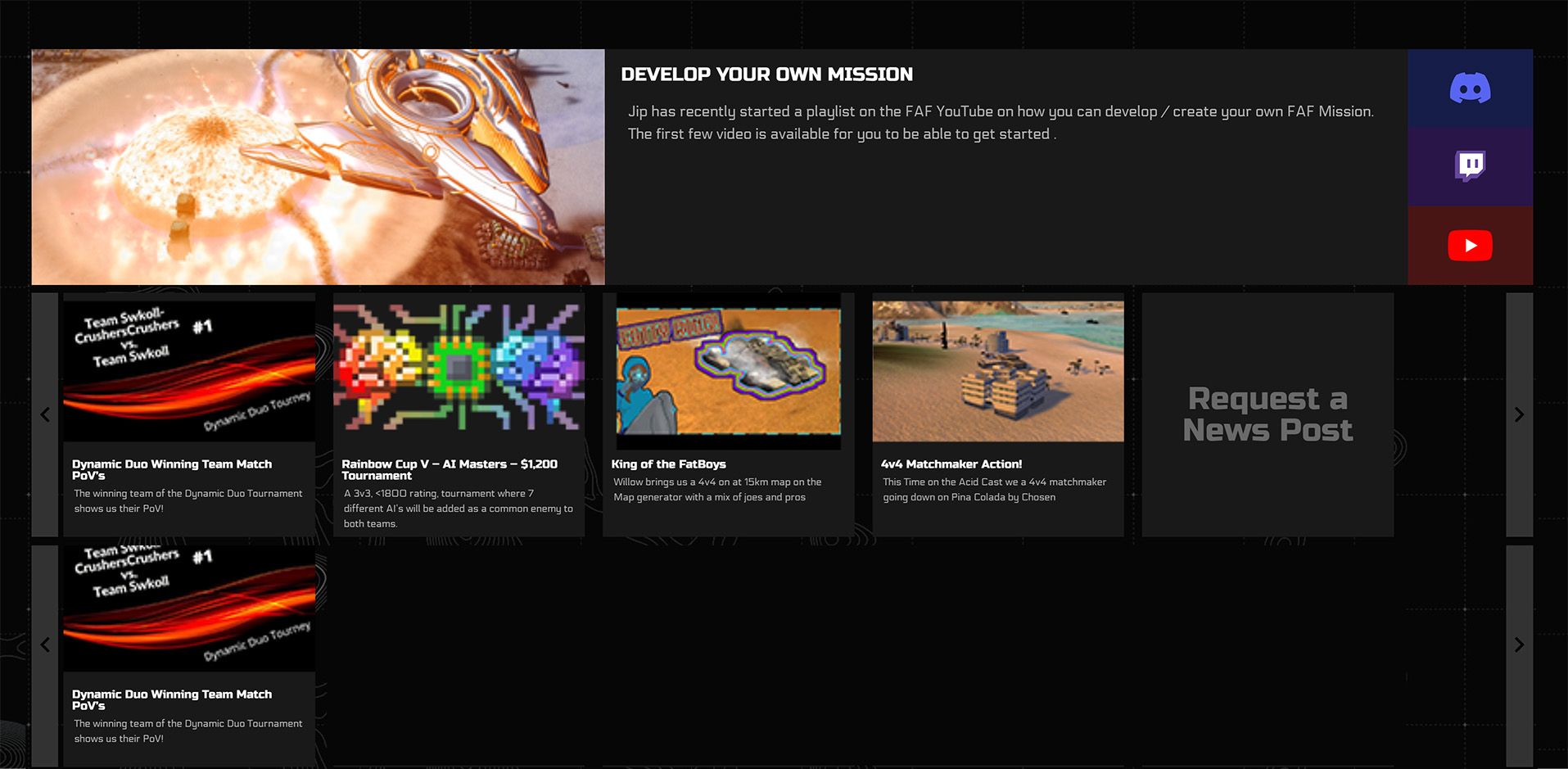
What do we do if we just have enough articles for there to be just 1 article in the 2nd row? Like lets say we have 6 articles, five on the fist row and one on the second row. Now we have alot of dead space to cover. Do we just put old news on it or leave it empty?
A solution we could do is making the news "slide" automatically, stopping when the user hovers on them. But this might be annoying if someone is reading the news and then the article moves.
-
A couple of ideas:
FIrst I wanted to put the patreon badge in the top row to make the extremely long hero post a bit less wide, like this:
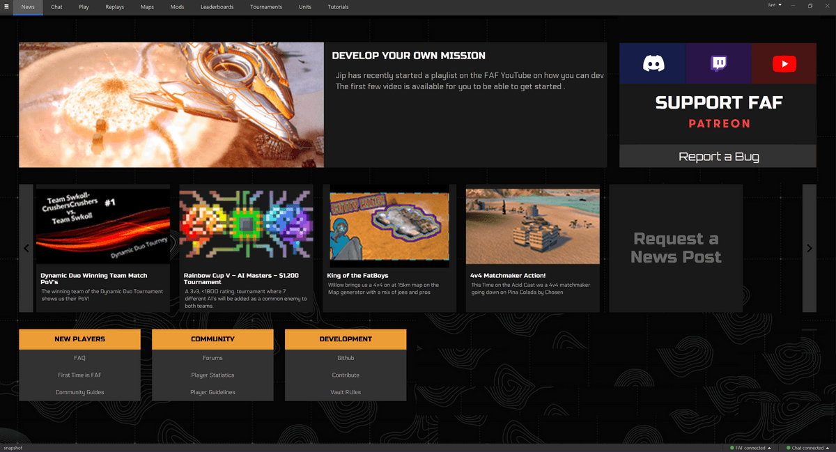
Then I realized that it is still so wide we could actually fit two posts there, by putting the text under the image. This could have a number of advantages. Now that we have two slots we can justify keeping these for more than a week, like for tournament promotions, and use the scrolling row as a timeline. Then we could finally have easy access to older posts again.
This would also use a bit more vertical space in 16:9, so we should get a filled screen without needing to scroll.I noticed that that there are some links in the old newshub that are not present in the new one, like the cast playlist and the list of casters and streamers. We could put them in a fourth box at the bottom.
I realize that having two main posts that may stay for longer significantly alters the workflow how we use hero posts, but I think it is worth thinking about this.
-
@blackyps I think the image on top of text fits better for the smaller posts rather than the main article. Having the main article have the image on top of the text would also result in either even smaller image/font sizes to avoid a scroll and I'm not sure how responsive is it going to be. Plus I'm not sure we want to have two main articles fighting for the spotlight.
Older links are not missing., they have simply taken another shape. Rather than linking to an outdated lists of casters and streamers (that demands constant maintenance from someone to update the list), now you have two buttons to see live streams on twitch and on youtube (0 maintenance needed).
I'm open to changes but I also want the newshub to be simplified and to not scroll. If you have an idea and you can do a draft, it might be easier for me to see its plausibility.
-
To me it seems like with some moving around it is possible to have 2 rows of news, but considering I'm running on 2k display it might look way worse on standard FHD or when trying to fit it to custom window ratios.
Also liked moving the faf patreon and bug report to the top in mockup done by Blackyps so used it here.
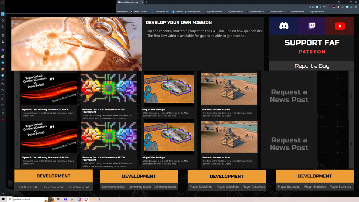
Another idea is simply having a way to unfold the news into 2/3 rows instead of scrolling them sideways, something like this poor ass shit:
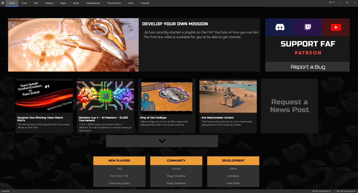
Obvious disclaimer I'm not a designer so I know fuck all lmao.
Like yeah, I hate the idea of side scrolling news. -
Another idea is simply having a way to unfold the news into 2/3 rows instead of scrolling them sideways, something like this poor ass shit:
I really like that one (last one by @I_FORGORtheSCENE)
You could maybe even remove the button, fix the footer (or move that stuff to the right) and make it infinite scrolling to see more posts.