Kaali
which probably references the group of nine meteorite craters in the village of Kaali.
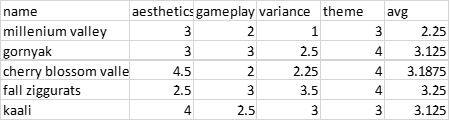
Aesthetics: 4.1
My opinions on this map are the same as my opinions on Cherry Blossom Valley. Ultimately they're derived from the same method, and thus I still have the same concerns.
Furthermore as this might be regarded as a "higher quality" world machine output - rightfully so as you're the one who created the method, the concerns grow with it.
Of course, the map wide decals provide a far superior output compared to what can be done with the limited resolution on a regular sup com mask file. You'll not find anyone who can outpaint this when you can export files at 8 times the resolution. It was possible when WM use went as far as erosion, because it still had to be added to the same old sup com layer file. But it won't be the same for decals like these. It even forced me to budge from my old man biass "wm is bad" hill.
But you've still relied on them to the detriment of all other factors, and that's why despite such high praise for the WM files, the aesthetic score is not as high as it really could be.
Now I might be aware that some other competing interests may perhaps incline you to focus on certain factors rather than others. You've still posted this map to a tournament regardless, and I expect all factors of a map to be taken care of with love and attention.
The first thing I want to point out the attention of is the theme of the map, this will begin my series of thoughts relating to "things dealt with after the fact". Items that look like they were afterthoughts and that damage the map as a whole.
The map supposedly is that some sort of alien pathogen, meaning either a bio weapon or some kind of invasive flora as "infected this map" from the impact of a meteorite. This meteorite impacted the ground at a dead right angle to the surface and thus has left a perfectly circular hole in the exact map centre.
It looks like it was supposed to have killed off the grassy areas, leaving the majority of the map in a gray tone. This would imply that that area is a "reservoir" as the theme implies. But why would the previously underwater area have growing trees on the surface? Where did the water go exactly? Why are the tress still standing around there when the meteor did enough damage to alter the terrain a foot next to them? What i'm trying to get at here is that the centre hole looks like an afterthought to the rest of the map. As if the terrain was made and then something needed to be added to the middle afterwards.
Thematic elements only tend to work well when tied into the map as a whole. That's why on something like Fall Ziggurats, the cube pyramids that look like they were made in 5 seconds gain points because they have a purpose and that purpose is multiplied by the primitive buildings etc.
I understand that I asked for an evergreen map but if you're going to have a theme like this it should have an impact. That or you choose a different idea entirely. Right now is not well communicated, and lacks confidence.
Second, the edge building. Or more specifically the methods used to indicate them. You may have differing opinions on if it should really be added at all. It is technically an exploit and is a far inferior game mechanic than transports.
It's also really fucking buggy, and thus I do have a video I want to show you where my engineer just drives up the side of a mountain. https://www.youtube.com/watch?v=O2PNHEXuAXM
This isn't the only place where this is possible. Ensure the mountain is thin enough to allow edge building without breaking into "exploit" territory. It also doesn't entirely correspond to the actual range ring of the engineer. Which is why I assume these elements needed to be created in the first place. As for their execution? It looks like an afterthought.
A lot of visual communication relies on the premise that you should "show, not tell" things to your audience. For example instead of writing "apple juice" it's better to put an image of an apple and the customer can figure it out. Now it's not that you've used literal text to indicate the edge build spots, but you've essentially "told" me where they were. You haven't done anything to the map itself to "show me" that an edge build might be possible here. The mountains in those areas are the same as everywhere else, and no extra thematic elements are around to drive the point home. Many people have mentioned using civs to show it off and I do agree with them.
Decals, same as in cherry blossom valley, are nil. Outside of the map wide decals of course. My critique there still applies to this map, as the methods are still the same. Lacking any form of hand placed decals is extremely noticeable on the top of plateau areas, where world machine notices the angle is not high enough to continue with it's texturing process and then cuts out.
This leaves a very uncanny difference in detailing that normally is not a huge problem in maps of lesser mountain quality. This also has a negative impact on ramps, wherein either the ramp is too steep and the mountain texture is applied, or it's too shallow and nothing is placed there at all.
Tree groups, as is also a problem on Mauve, are often entirely floating in the air due to the erratic changes in elevation due to world machine. The rocks too are the same single rock placed in 90% of the cases. And with no real extra elements around them tieing them into the map. A lot of them are also floating off the ground entirely.
The lighting is also very dark, and I struggle to classify this as a map that follows the "vibrant" themes asked for. Like CBV, it also contains a light map and like CBV, your lighting setup is very boring. I think things like these should be stretched to their limit but right now it's hard to really say it's added any value.
The civilians on this map are extremely weak. They also appear like an afterthought, and maps such as Adaptive Gornyak have absolutely decimated you in this department, regardless of their impact on gameplay. AA guns don't need to be walled as they don't profit much from the wall bug. It looks stupid for the ai to be abusing a hitbox bug anyway, as this is supposed to be a depiction of reality.
Also, a texture layer isn't even used, and I don't understand why.
My closing thoughts are really as follows. It's clear you've skyrocketed above a lot of map creators because of your work on technical artistry. However that is only one aspect of creating a map. Make sure you spend the time to ensure all elements of your work are up to the standard you've set with worldmachine, or they'll prove to be a massive bottleneck. The road is long and there is still a lot more to go.
After all these world machine outputs are above what a lot of people can run, and when they need to remove them in order to play - what are they left with?
Make sure to not create an over reliance and make sure you check your map in the game engine.

You should also experiment with more maps that are not evergreen.
Gameplay: 2.9
The concept of "what makes a good map" in the higher level playing community is not a consensus. Certain sects of players enjoy different things and thus consulting with the same players may result in similar maps.
I'm not a fan of placing only 3 mexes in your spawn because with less resources available, you need to be very careful with how they're spent. This means having a build order means a lot, and with everyone "claiming" that they want to play mapgen due to this, it seems like a strange idea to do it here.
Other than that, it's very consistent with every other map in this tourney that you move up to a natural expansion and then you contest things of little value. The bottom left will be a race for those two mexes on the side. Whoever owns them owns the other two on the plat and the bottom left spawn could not possibly want to enter that terrain - which is so much better for the top right player - to claim a single mex and a hydrocarbon. Edge building seems irrelevant here and I argue that it should not exist here at all. The mid mass and reclaim in general seems fine, at least only because the competition has sent me 5v5 maps with some spawns cut out.
I've also seen the 3rd version (this is version 2) because the client forced me to play on it. I would suggest that instead of gimping the map to have nothing to contest, create different choices of equal value. This creates variance.
Ultimately I think this was made almost like it was done by a system of checks rather than taking an idea and pushing it. It will go into TMM and people will like it or hate it depending on if suits their skillset.
Variance: 2.9
I don't really have anything to say about this. You'll probably find that a lot of the games on TMM will be decided on who played the map beforehand rather than any form of strategic choices that are dominant for this map specifically.
Theme: 4.3
Full marks for no custom props as indicated in AMV.
It's good, but considering your history I don't think this was particularly creative. Maybe this map was being made in reality for another game entirely, but maybe I would feel better if you were really testing how far you could go.
 .
.") .
.
 !
!