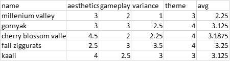
Fall Ziggurats
very literal.
Aesthetics: 2.7
Im going to come out and say that I think it looks like you made this with some sort of script, or tool perhaps. All is not lost however, and the theme keeps the map in check enough to be a flawed, yet acceptable map with some good points.
In lieu of any real focal points i'm just going to go over the good points and then the bad points first.
First is the top of the plateaus themselves, which have had albedo decals applied to them. They're not of any particularly high quality, they're spammed down at random, and they're all pointing in the same rotation, the same area has all manners of trees applied, including trees of different colors, and some rocks on mud.
This has the benefit of creating a level of detail due to nothing other than noise. I suppose that's fine, but it's still far off any form of level of detail. It also contrasts itself from the ground layer, which is also fine.
Second is the building props, which if i understand correctly are unskinned sup com props with a texture applied to them, and tied into some sort of general idea of this area being previously occupied by some form of primitive civilization.
Half made props are not good, of course but their placement is done well enough, and dirt trails lead back to an eon base in the center, which is also fine enough. Wall art typically completes civilian bases and none exists here, but it's otherwise not so egregious to take any points away, which is good.
Ziggurats? Or Pyramids are common on maps because they're sometimes easy to make and fill space, but tieing them together into that overarching theme provides them with a sense of purpose and improves their situation. The only thing to do from here is attempt to make them look like you didn't "place" them from the heavens.
That's tough to do, so these are currently also "fine" as it is. The tie-in to the theme of the map takes a number of "fine" elements and makes them better.
The trees have their upsides and their downsides, they're in a range of different colors and are more or less distributed around the map in groups according to their colour. This means that there might be a section that looks red and orange and then fades out to a meek yellow and green. This looks great.
The downside is that the trees are more or less distributed in a linear pattern with no solid level of detail in their application. Which is subpar. I would also suggest that the trees get more green near the small random bodies of water instead of at random. But this is a nitpick.
The fallen leaves texture is also fine here, but once the trees vanish you'll find it probably doesn't look too good.
As for the downsides. Ramps, are indicated well enough but look particularly ugly. I would argue a location where many things attempt to climb through and slip and fall - shouldn't be the most vibrant green grass on the entire map.
The choice of decals on the ramps, and on the rest of the map in general, are poor. Probably the weakest showing of the tournament. No care has been taken to the placement to ensure they actually stand out on the map with the lighting setup, so much so that one will probably not know of their entire existence unless they open the map in the editor.
This is very terrible, because there wouldn't be a point to placing them if they cannot be seen.
Regarding the mountains, the overall shapes used on the map appear very square, this is why in the beginning I said the map looked like it was done by a tool. I'm not sure is this is because of that, or if it's due to perhaps using a square brush, but it looks very uncanny.
They have a custom texture applied in a linear pattern on it, with no variance. The point of a seamless texture is that you can't see where one "square" of the texture ends and the other begins, removing the pattern caused by applying it to the map.
This texture, which I've seen you use on a couple of maps now, has a strange circular pattern in the middle of the "square" which makes a pattern easily visible and voids the purpose of the seamless texture. Making the choice poor.
The way it's applied to the map is also weak, as it's done with a brush that is transparent on the sides and not in the middle, I wouldn't be able to see the exact rock pattern at half the transparency over the millions of layers of dirt and grass on top of it, so it looks very unnatural for use on rock specifically.
The pattern problem is also on the other rock texture used, I would just find better choices, do be careful because as you know, snow maps are often so bright white that it becomes hard to see resource markers. White rock does the same thing. This is a nitpick though.
The water ponds are a strange choice, I would have tried to tie them into the map more, and decalled them. The mountains are also not the best in this same fashion.
There are a couple of rocks with custom textures that fit the map well, but still have the textures from before that have the issues. This doesn't really count as a downside because the pros and cons balance out.
Overall this map is "okay". There isn't really a huge negative to comment on, but it's not got anything that propels it into being "good" without an attention to fine detailing.
Gameplay: 2.7
I need to explain this first part here, the trees. This map has custom tree props that are both at the regular size, and then a larger size too. This larger sized tree has a larger reclaim value due to its size, which makes it viable as an in between if you don't want to use a full tree group.
The map is mostly covered in the larger trees, so the map is a few points off being covered entirely in tree groups, in a flat linear application like I discussed in the aesthetics section.
Furthermore, we reduced the reclaim value of an oak tree 8 or so years ago. They used to be 1.5 mass and 15 energy before, and we lowered it to 0.8 and 8. But if you pull the blueprints from an unmodified installation, you can see the old values.
So, you take those large values and then you multiply them to suit the larger size of these "jumbo trees", and then you apply them all over your map. Suddenly you have 131,172 energy reclaim from mostly single trees. But only 30k or so mass.
This isn't so much a design flaw than it is a mistake, but the map would still not be good if you covered the map in trees either. It is saved by not particularly being all in mid, but it will still damage gameplay in my opinion.
You also have 4 large rocks around the Ziggurat which are about 140 mass each, except one spawn gets them right outside their base and the other player needs to contest his in the far map corner, or make it up with other large rocks, that the first player can also get.
After this you take your two inherently natural expansions and then figure it out yourself, one player has an expansion on a plateau which is defended from raids, but the enemy on that side who got the reclaim would have enough of an advantage to steamroll your other one.
The mid mass is in different groups and not so insane, which is good.
I don't think the ponds add anything besides hiding your ACU from attack. It might be annoying to torpedo an ACU out of them if they hit the ground, which is why small hiding ponds like these are not advisable.
It's a shame that the map gets penalized because of a slight mistake, but it's not particularly fair to judge the map if it gets fixed however many days after the submission date.
Variance: 3
I don't really see this map being so restrictive to deny any real plays here, nor do I think anything will be entirely dominant either. You'll probably see some edge builds instead of airplay here to claim the plateaus, and it would be funny if the small ponds were big enough to allow a factory.
Theme: 5
Trees are good and fit the theme.
Overall again, an okay map. You might find your score to be better than others because you haven't done anything so horribly wrong as to impact it. It's not like your old maps wherein the entire ground surface was covered in invisible terrain bumps that made it unplayable, so we can both breathe a sigh of relief.
If you fix the issues with the trees and perhaps be a bit more sparse and detailed in their placement, you'll probably find a few people who will like this map.


 .
.") .
.
 !
!