Sunlight Mapping Tournament (#7, 2v2, 10km)
-
@Jip said in Sunlight Mapping Tournament (#7, 2v2, 10km):
A quick question about these two:
- The map must be balanced for competitive play.
- Minor misalignments will be overlooked. Intentional unbalances will result in a DQ.
Does that entail that the heightmap must be symmetrical or can there be caveats here and there where the symmetry is not completely correct?
I'm not going to DQ maps that have minor things that dont actually matter. Huge issues like players being able to walk over a mountain on one side are, of course, out of bounds.
-
assuming adaptive maps will be fine? just judged on 2 v 2 options?
-
@MadMax said in Sunlight Mapping Tournament (#7, 2v2, 10km):
assuming adaptive maps will be fine? just judged on 2 v 2 options?
yes
-
For the "custom props," as long as credit is given to the source, can we use free model content so long as it has a proper blueprint and does not degrade performance in the game?
-
Yes, but please make sure that I know it's free model content.
-
Up to what extent can you ask help from other (potential) competitors? I am asking because I've asked someone to edit a few buildings into props and that person happens to be a competitor too.
-
If they're aware that their advice may damage their chances, meaning they know this is for a submission, it's fine
-
9 days remain, make sure you post the name into this thread before said date, even if youre finished already.
-
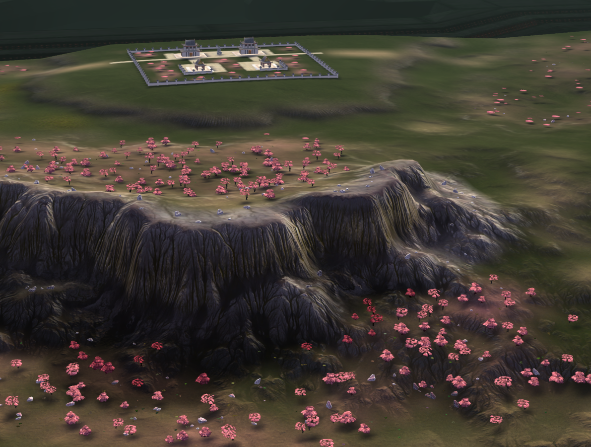
putting finishing touches on my map but I'd like to submit Adaptive Cherry Blossom Valley
-
Adaptive millennium valley. The map is being finalized.
-
Adaptive Gornyak
-
here's a link to my map read the readme inside the folder for instructions on how to get the custom props to show in game
https://drive.google.com/drive/folders/1kBVJweSFAX5pmoavzsLSq7rL8cuFapJz?usp=sharing
-
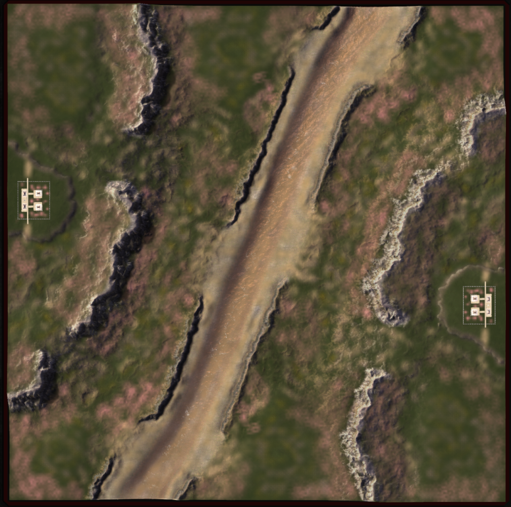
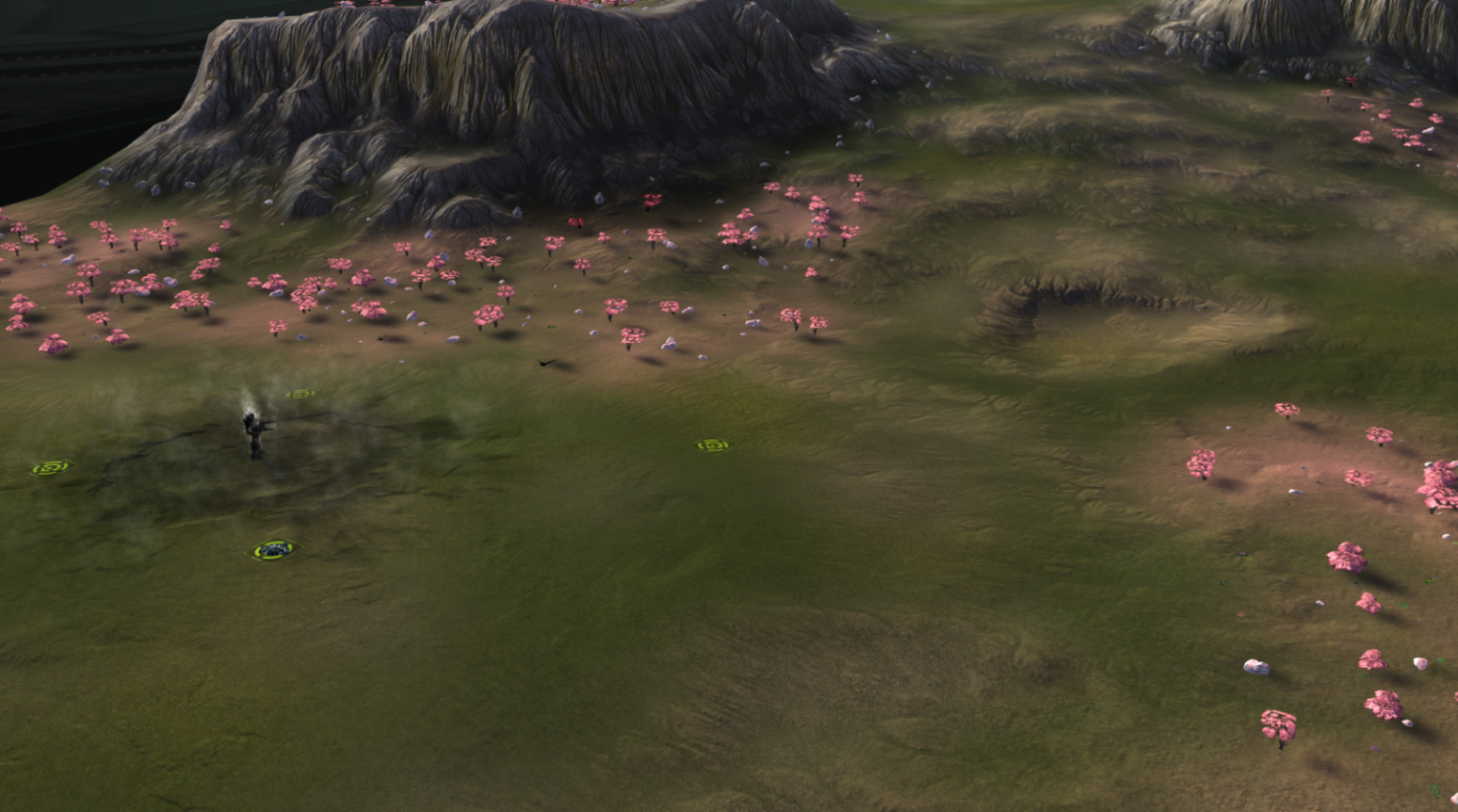
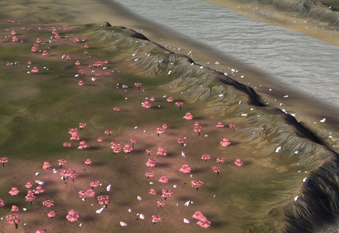
some screenshots from my map
-
Please have your submissions in by 25 hours by now.
If you have custom props in your map, please upload the map folder itself with said props here. Uploading a second version without any props to the vault is also fine.
-
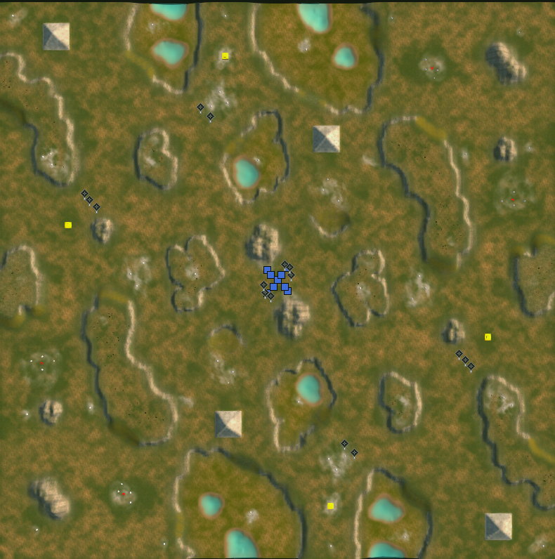
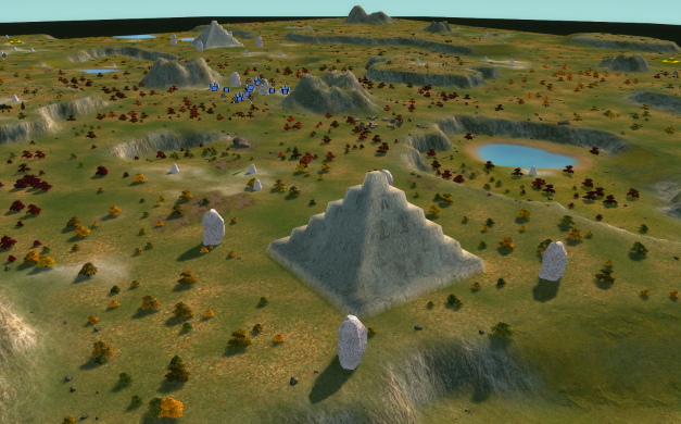
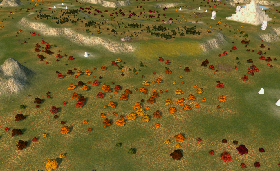
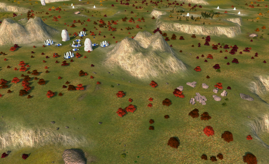
Fall Ziggurats
Download link with custom props: https://anonymousfiles.io/OJBl3GvD/
-
Submitting Kaali


All screenshots are taken in-game on highest settings (including bloom renderer). There are no custom props. The theme of the map is that a meteoroid introduced an alien pathogen, slowly consuming the environment as it spreads through the underground water reservoirs.
In turn, lower parts of the map are grey. Medium-high parts are green / brown / yellow and high parts are green. These serve as a visual cue to interpret the map easier.
In addition an experimental feature: cliff build locations. One can be seen on the left on the second image (preview-1). The idea is that it provides a guaranteed location for a factory to be buildable from across the cliff for a commander. Some are also buildable for engineers.
With thanks to @archsimkat for the extensive discussions and to @blodir for additional feedback. To give a glimpse of those the discussions, at some point Archsimkat even made these:
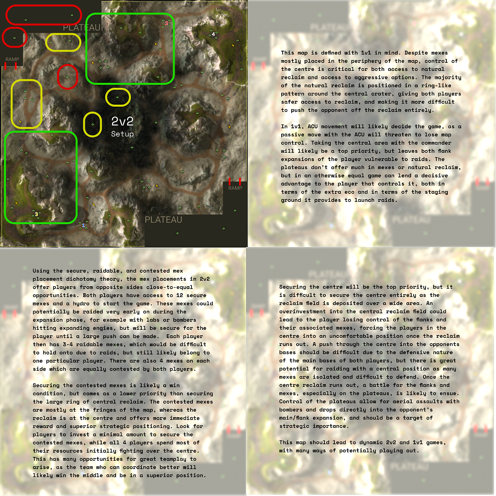
Where you can see the original design (without the water), that started as a 10x10 naval map

-
Hour or so late but the submissions are now closed.
I want to find a couple other people to give judgement so please be on hold for the results.
-
I know you're all waiting on the results, you probably thought this post was it, but it's just an update.
I have only one or two left to judge. My rationale has been more extensive than ever in order to compensate.
I'm still looking for more people to judge the maps so if you're interested (and have not assisted in any submission) please let me know. I hope to have the full reviews out very soon. Sorry about the wait.
-
I have a sceond judge with his own scores and reviews on the maps, so my posts are not going to indicate the final scores. I will get him to post his and then we will determine an average score based off the two of them.
Closing thoughts.
I'm thinking of banning adaptive maps from this tournament format entirely.
I've asked you to create something around a certain format, and you've given me something different entirely with a cope function to allow what i've asked.This makes for some of the most gimped ass maps that should not be considered tournament worthy.
Adaptive maps are a cancer upon making content that actually provides a good experience for your users, and you're seeing players revolt from author made maps entirely because of it.
You can check your reclaim counts in the Ozone Editor.
You're not using the GPG one like old man biass, so you should be taking advantage and not giving me maps with hundreds of thousands of reclaim more than any map reasonably should have. If you don't know what is a good amount, check other maps.Reviews below: (These are not in winning order)
Adaptive Millennium Valley
Aesthetics: 2.8
Fine, but ultimately inconsistent.
The first thing I want to mention is that while most of the ramps have been indicated on the map, a couple outside of the spawns have not. As if they had been forgotten about by the map author entirely.
This also appears evident in the use of props around those areas, as typically tree groups will have part of the group floating in the air when placed on a ramp.Textures are fine. They're above average for the FAF standard, but the choices used and some of the scaling is off.
Tropical textures like the ones used here are older supcom ones, let call them a 4 in resolution. Later FA textures are considered a 12.
You also didn't use one, but I assume you ran out of ideas on where to place it.
This is pretty common for rather generic themes, so I'm not going to care about it too much.Decals on this map are what I want to talk about the most here. Starting with that they're not considered enough for the majority of players to know a ramp exists where you place them. This is because many players don't play on the required graphics settings.
This is where I would have used that remaining texture layer.A network of canals? have been placed through the map and end up at the small bodies of water around the sides. Some bodies of water contain decals around the edges and some do not, presumably because they are not passable.
I would have done something different to the passable bodies instead of leaving them blank because the end result is subpar and inconsistent with the rest of the map.
The aforementioned canals have a second purpose, which is to break up the bodies of trees instead of leaving them in one large blob. This is a positive in my opinion.The mountains have two differing styles of decals applied to them, which I found strange.
First is the same (two, but in really only:) mountain decal used to cover the entirety of any above water cliff face. This method is a solid "okay" from me. If you were to do it again, I would recommend using a second (third?) decal to break up the repeating patterns that a single decal often creates.
The second is the use of a number of normal decals that bare a striking resemblance to my own methods.
However, they're ineffective without a precise placement of other factors such as your textures, secondary decals to break up patterns (what I spoke of earlier) and a good lighting setup.
I failed to notice them at first, to be honest.See attached. I changed the lighting on the RIGHT image.
I wonder which method you tried first?
The use of the Aeon decal on the plateau is incredibly weak, and shows me that you were failing to fill in space on what is a plain map. This is why it often helps to incorporate lore elements into your map to provide you a reason to fill the space.
The decal seems out of place and can block your ability to see the mass icon that it sits directly upon, which is very bad.Gameplay: 2
Badlands is a 4v4 map, and considered by many to have a large amount of reclaim. So much so that in 1v1 games, players typically require a special build order to utilize it. It has 20,117 mass, and 92,095 energy.The Bermuda Locket is a 20 km map that supports 2v2v2v2 gameplay. It also is a map that requires special build orders to utilize all the mass available. That map has 77,375 mass, and a small 8,390 energy.
This map, that're we are judging for 2v2, has a whopping 72,977 mass, and 151,512 energy. This a major pitfall of submitting an adaptive map that tries to cater to everything, in a tournament for ONLY curated 2v2 maps.
There is far too much reclaim and the entirety of the fighting on this maps will be revolved around it. This might be fine for the first 5 minutes of a game if you like that, but makes the rest of it very weak.
Map control along the mexes in the middle mean you only get +2 mass if you hold it because instead of any expansions for each player, there is only one mex. However if you're first there, you're pocketing over 1400 mass in large rocks.The rest of the mexes also follow the same pattern of being dispersed at random and are not grouped in any real way. Spamming will be king here, to the detriment of your other options. That's if you don't suicide over the mid mass first.
The plateaus do not add anything to the game, players will just edgebuild them.Variance: 2.
Same thing, you all in on the midmass and then spam tanks to control isolated mexes and reclaim. You might see a drop on the enemy plateau if one side has reclaimed enough to win air, but any more conservative strategy outside of spamming for 20 minutes is not worth it.Theme: 4.3
This is the full mark ill give you without any custom props. Any darker of a map overall and I would have penalized you for being too close to winter, though.To close, It's never going to be worth it to submit adaptive maps to tournaments. Curate your experience for the requirements that have been asked for.
-
Adaptive Gornyak
which is the name for several areas in Russia.
Aesthetics: 3.2
I'll start with what I like here, I can appreciate all the effort done in the civilian bases on this map, it's really well done and probably some of the best civ bases I've seen on FAF.
Second is the props, the wild nature of the placement is very well done around the centre, although I wouldn't do this for rocks as it will cause a gameplay hit.
Third is that I can see some attempts to decal ramps, which is good.However as I said in the Millennium Valley review, it needs to have more than just a decal. And some ramp areas lack this decal too, which is not good. Especially in the top right / bottom left expansion. It's nigh impossible to see the elevation change from a distance. You can see the water entrances because of the contrast to where you cannot, this is acceptable but not really optimal.
You haven't told me that I can even walk up onto the sand(?) hills at all. This will catch players off guard. You have not used two of your textures, and they should have been spent adding more detail to, and communicating more - the mountains on this map. If you add those textures, the mountains should hopefully match the detail of the ground. While i'm here, do mind the scaling on your textures. Values like 50 or 70 or even 120 are multiple times above what they reasonably should be. If you cannot find textures of a high enough quality I would recommend editing your own, or using some open source customs ones you can find on the internet.
The lighting on the mountains and some parts on the water in the middle are so bright they hurt my eyes. I'm writing this in a well lit room too. I think this is a case of having too much bloom on your map, but other places on the map are well lit so a balance needs to be struck. Or use darker textures here.
The large decals dispersed over the map are "okay" here. The lighting hides them well enough to not be too jarring.You've also done well to decal the moutains, but they're hidden.
I changed the lighting and the textures so you could see them (LEFT):Fix these and you'll have a good-looking map. Especially with those civilians. If they were not here the map will probably be a 2.8 or a 2.5 in aesthetics.
Gameplay: 3.
I can see what you're going for here. Move up to the natural expansion and then go for the corner or for the civ area. Seems fine to me. Fixing the issues with the ramps etc will up this score. I also appreciate that your spawn mexes are not in the default grid layout. Please be careful of the tree reclaim though. It looks nice but you will probably need to tone it back a bit.Variance: 3.5
Same thing as above. You also have some small ponds and plateaus for dropping and the like.Theme: 4.3
Same as AMV.If you fix these issues, please submit this to TMM.


