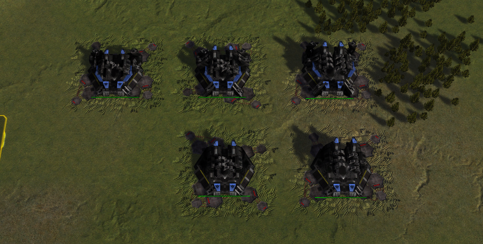
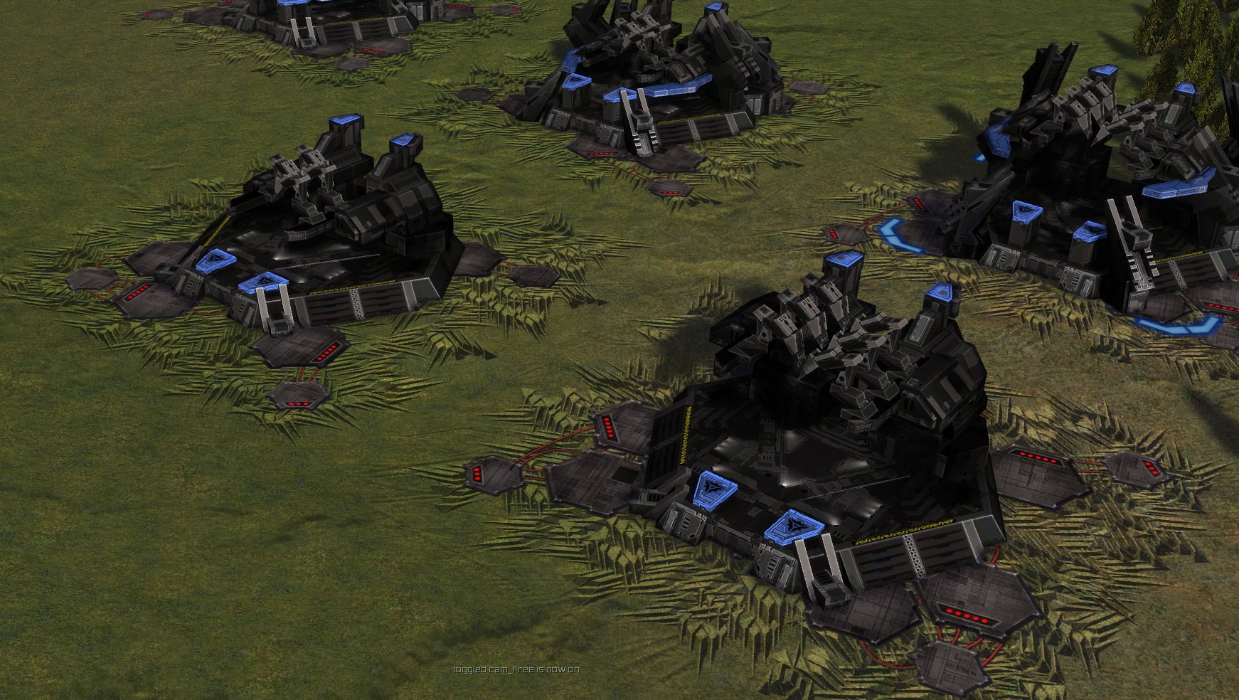
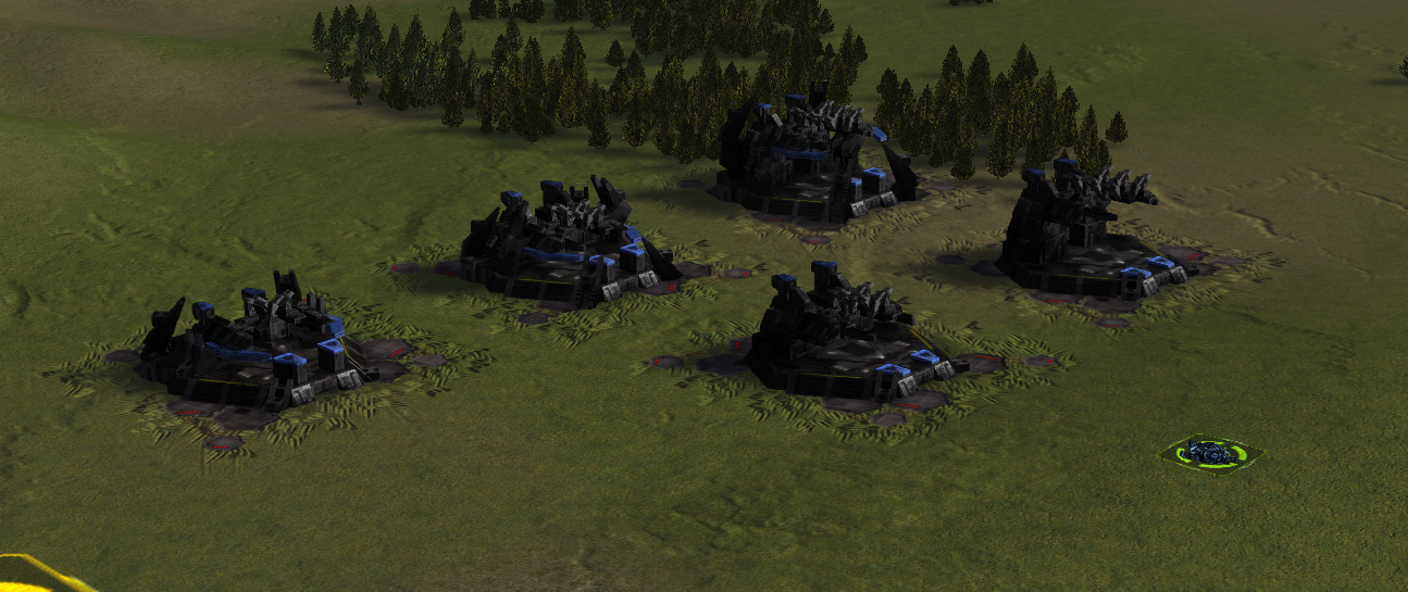
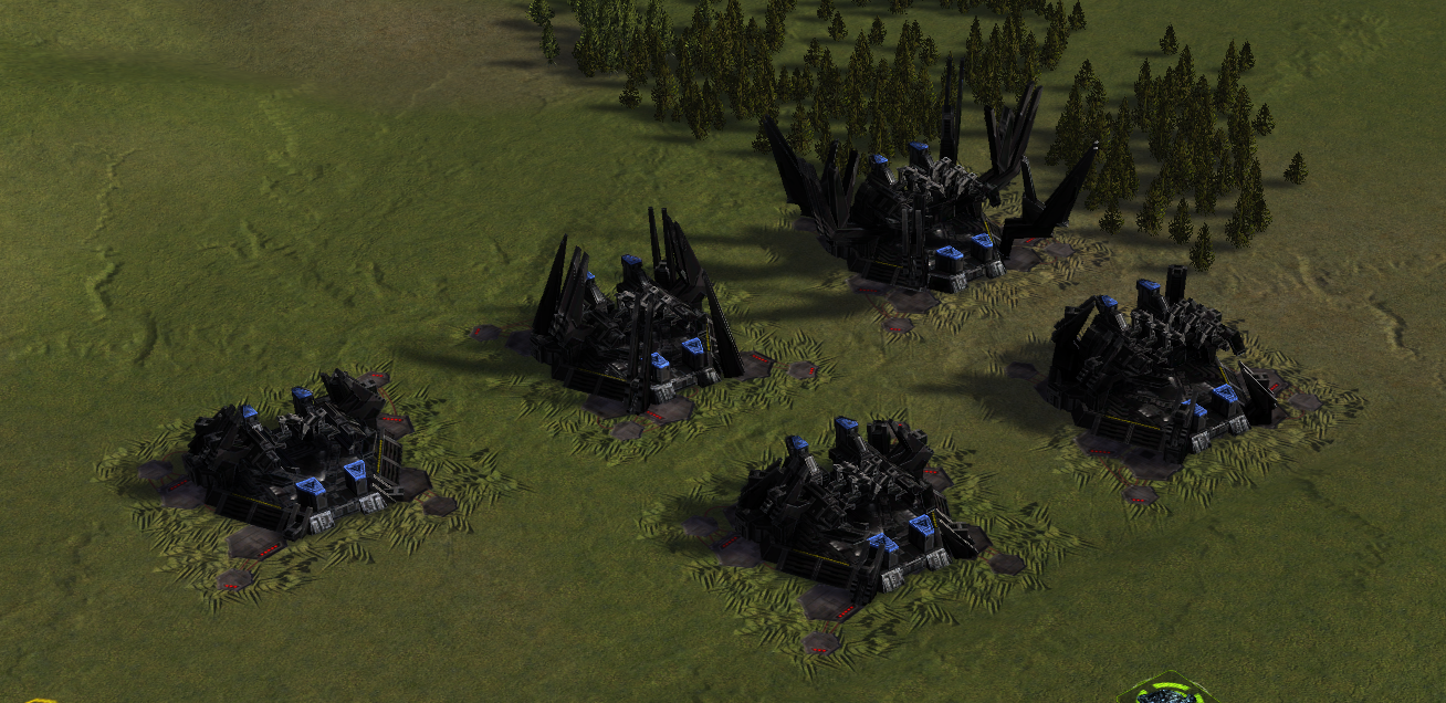
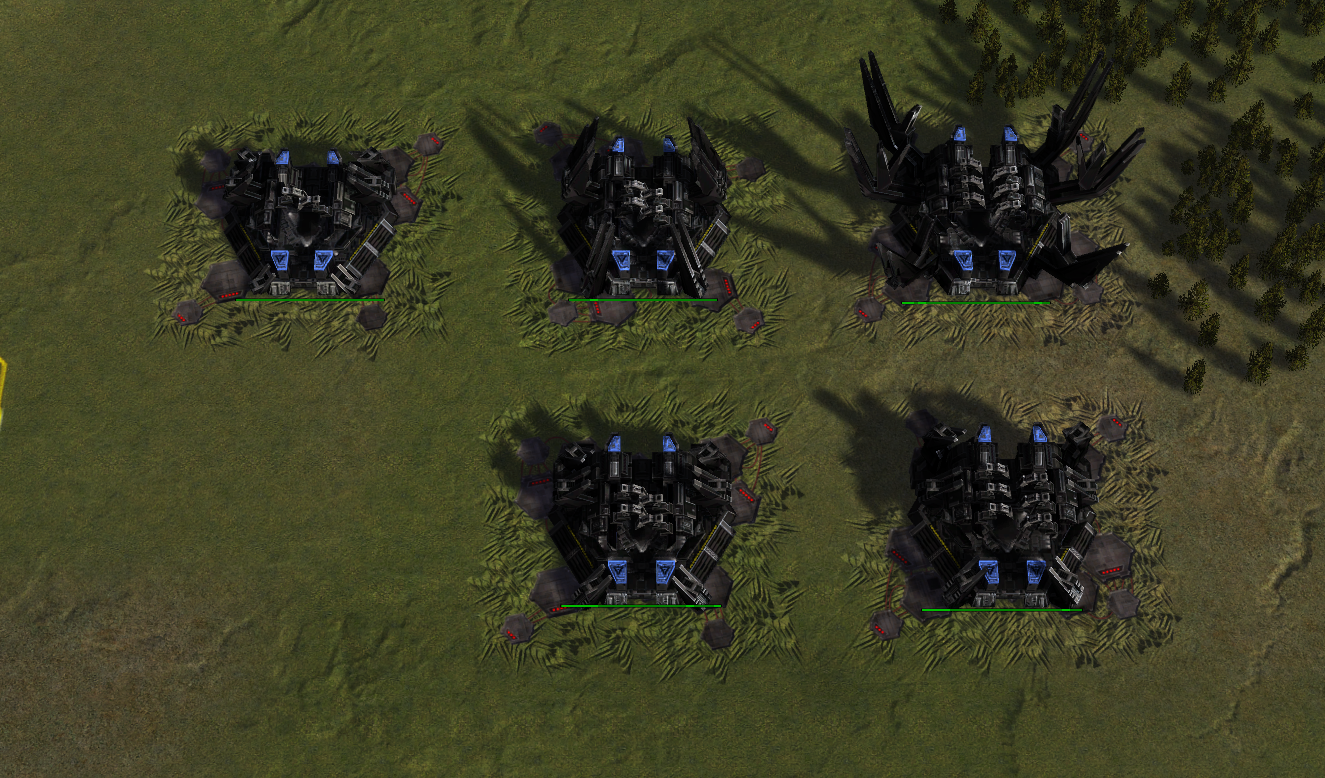
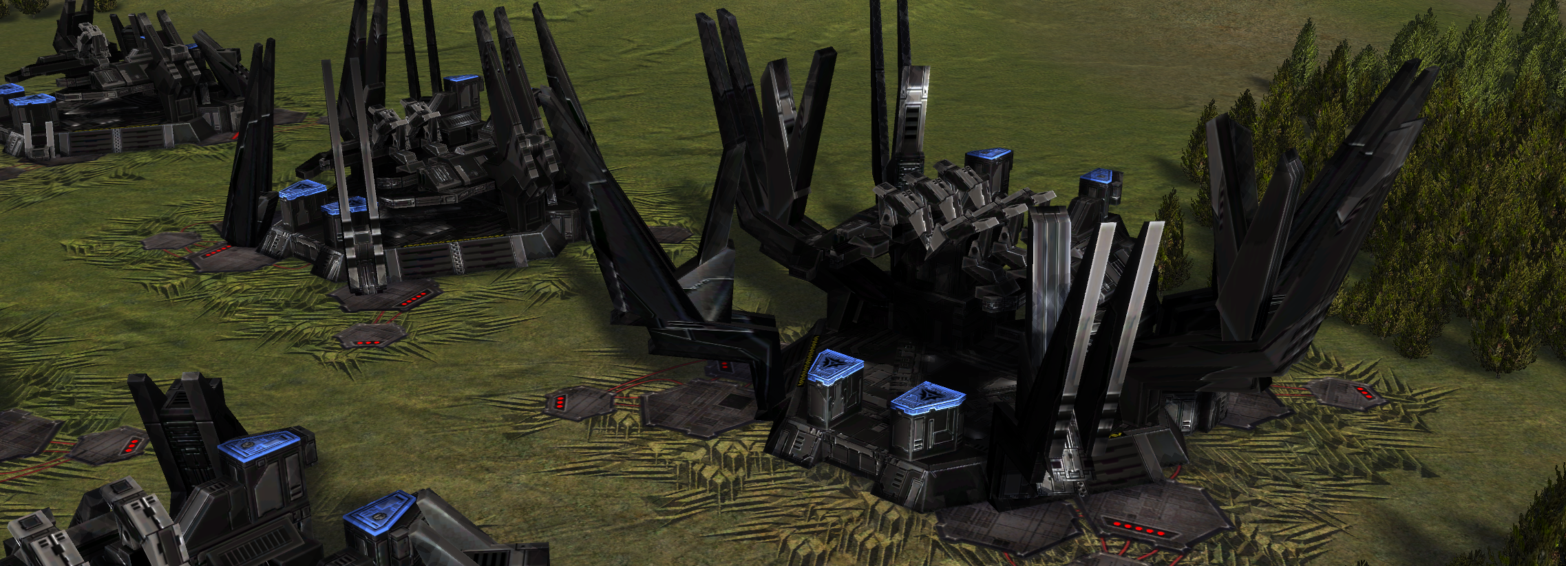
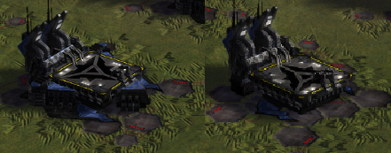
Redesign of the Cybran land factory
-
I also agree with @Chenbro101. I like the old design much better.
-
Can we add a tower for the HQ? I think generally we could make having a tower the differentiating feature between HQ and support factories if that’s possible.
-
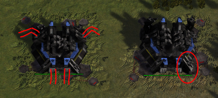
You would have to construct the tower out of existing parts of the model. Maybe we can copy some of these bracket-like things to make the factory look like it gets anchored to the ground by them. Here is a very basic drawing
-
I feel that while the new hq designs may look better, they look nearly indistinguishable from regular factories now, whereas the old design you could tell from a glance which was which.
So maybe adding something that sticks out more, or is more dramatically different might help.
-
I would miss my WiFi Router T3 HQ
-
This is not really a specific comment about cybran land hq but about the changes in general:
Firstly imo hq's should stand out. They are incredibly important buildings but the new hq's don't stand out at all. While the old hq's looked kinda scary and imposing (cybran) or more elegant (aeon t3 land) the new ones just seem very bland in comparison. It doesn't help that the new hq's look extremely similar (or are the exact same?) as the old support facs since after having played 5000 games with this look being the support fac it now all of a sudden is an hq.
The old hq's were also way easier to notice at a glance because of these features, which is important as a gameplay aspect as well. I have a way harder time noticing an hq now.
I dislike the more minimalistic support fac design because imo the smaller sized factories just look bad and off in a way. The air support facs in an air grid look out of place because they look so small. The aeon land support facs lost their nice circle shape and the cybran land facs became hexagon shapes. They all just look kinda squished (even they don't necessarily are) and it feels like they all lost nice details and in general just look worse imo.
t2 air facs are the best example of this imo. It just feels like it lost tons of nice detail and as a result looks more boring/bland.
I guess this is partially because i'm biased towards the old look since i'm used to playing with it but i still feel bad about the (imo) reduced quality of these structures, especially since i never noticed any issues with it so to me it feels kind of unnecessary.
-
New factories seem more reminiscent of total annihilation no? Style and all. Also, I do agree with others on every point made above. Keep the old stuff is my feeling.
-
The old hq's were also way easier to notice at a glance because of these features, which is important as a gameplay aspect as well. I have a way harder time noticing an hq now.
This is my biggest complaint and it affects the majority of the factory reworks. Updated shaders and texturing are nice up close but 95% of the time you're zoomed out, looking at the silhouette of the factory where it's substantially harder to tell the differences between HQ and Support from a distance.
-
the arguments about you can tell at a distance with the old factories is invalid as they didn't have lod1 models that represented the hq's they were both the same the new factories i have made have different lod 1 models so in theory you should be able to tell the difference from further away
-
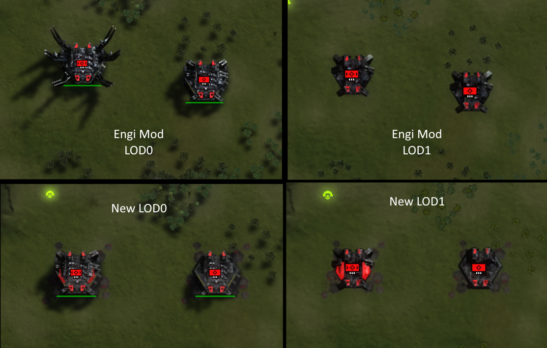 I know the new lod1 speck team needs tweaking
Hello! It looks like you're interested in this conversation, but you don't have an account yet.
Getting fed up of having to scroll through the same posts each visit? When you register for an account, you'll always come back to exactly where you were before, and choose to be notified of new replies (either via email, or push notification). You'll also be able to save bookmarks and upvote posts to show your appreciation to other community members.
With your input, this post could be even better 💗
Register Login