Redesign of the Aeon land factory
-
You can find out about why we're making these changes and what other factories we've tackled so far in the overview topic.
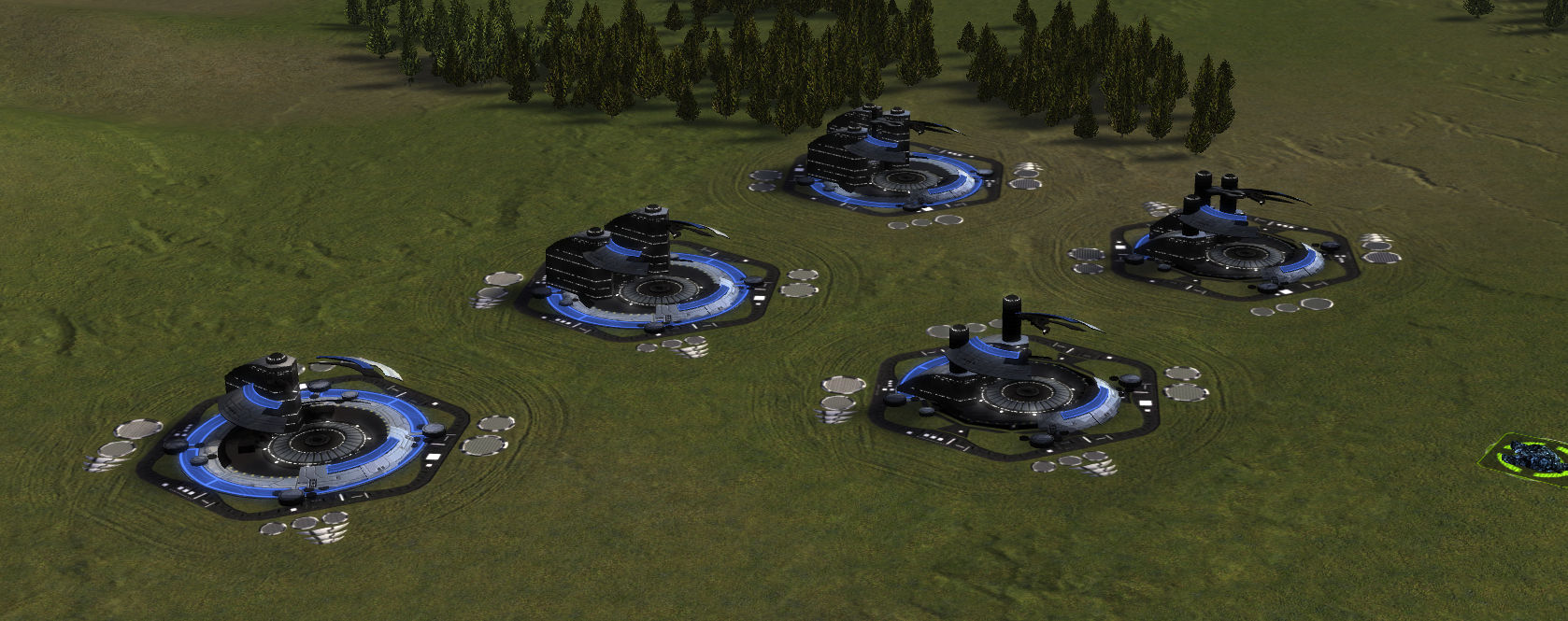
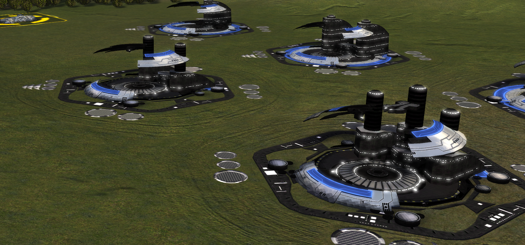
You can use this topic to discuss the design of the Aeon land factories. The HQ is the base factory that ships with Steam FA. The support factory is the same mesh, but trimmed down. The primary features to identify it are:
- (1) It is smaller
- (2) Lacks the outer circle
- (3) The building pillars are lower
Summary of feedback
No feedback so far.
Old design
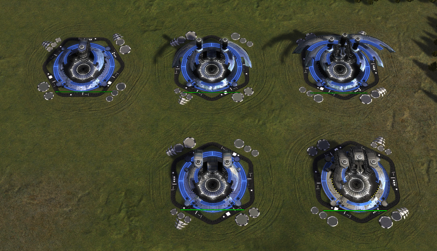
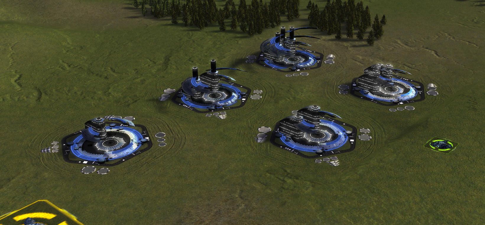
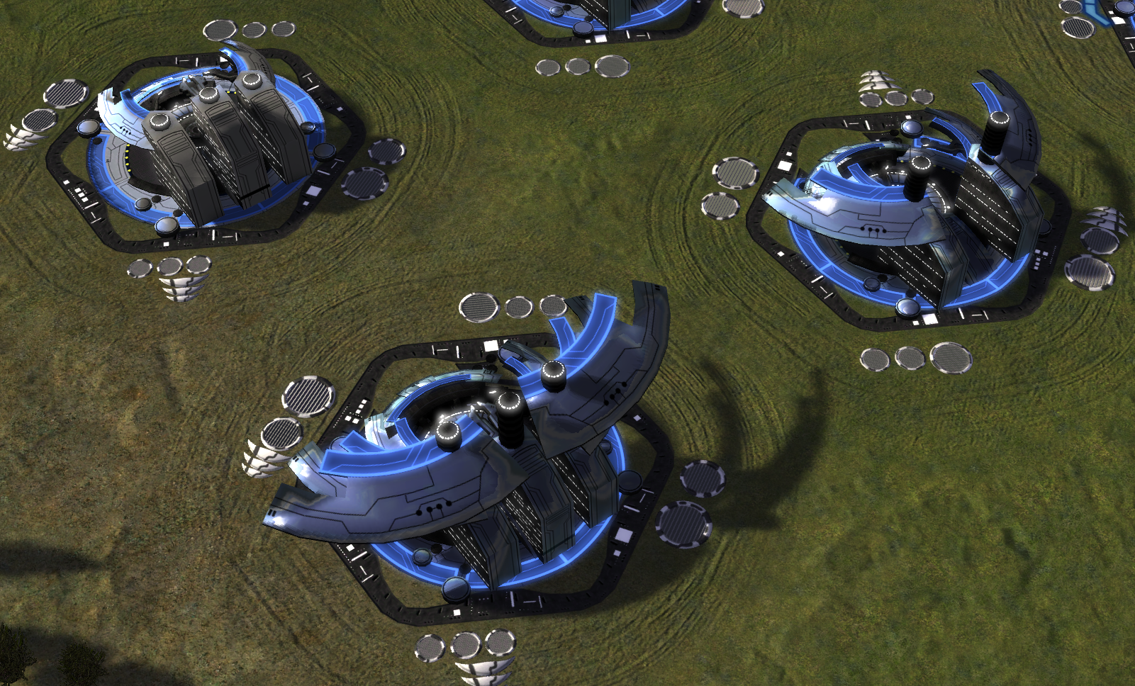
New design
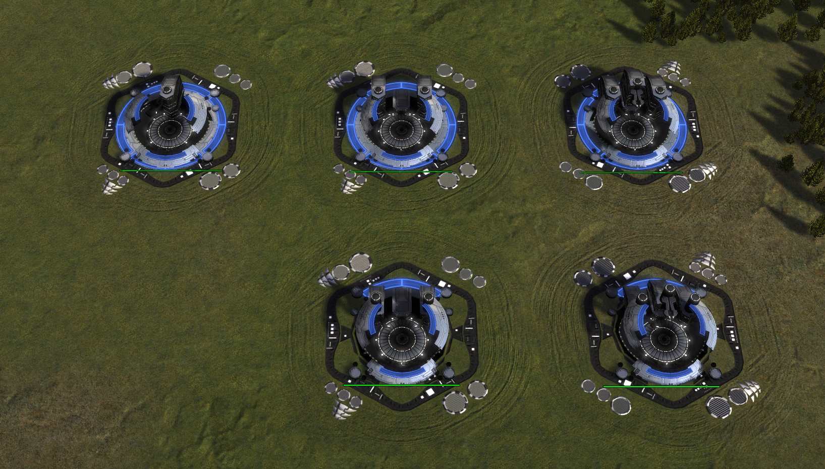
-
 J Jip referenced this topic on
-
 J Jip referenced this topic on
-
 J Jip referenced this topic on
-
 J Jip referenced this topic on
-
 J Jip referenced this topic on
-
 J Jip referenced this topic on
-
 J Jip referenced this topic on
-
 J Jip referenced this topic on
-
Those floating parts just look wrong, how about making part of the pillars blue and remove the blue color from the ring on the support factories similar to what I suggested in the aoen air factories thread?
-
What floating parts are you referring to?
-
@jip said in Redesign of the Aeon land factory:
What floating parts are you referring to?
Last picture of your post. It looks like part of the platform was elevated, I.e floating.
-
Can you point at it with an arrow*? I don't think anything is floating
-
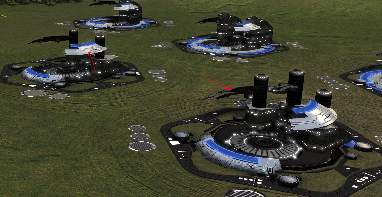
This is what I mean by floating. The pieces are just taken from the ground and put hanging in the air. -
That is part of the original design of the factory, they're attached to the black pillars
-
Hm, then I would suggest letting the pillars stay in the ground

-
But they are in the ground?
-
@jip I see yes. I guess removing one of the designs layers is what made me think they were rising. The other models still have a full circle at the base.
-
Maybe we can give the HQ one extra blue ring that raises from the ground during construction?
-
I like the wings. It makes it easier to tell which target to prioritize when I have tanks in their base.
-
Not a big fan of this one. It feels weird that a feature in the T1 factory gets removed in the support factories.
-
The mat black on the redesigned support factory pillars which support the fins over the build area looks wrong. At least add the lighting effects of white dots from the original model to break up the ugly texture.