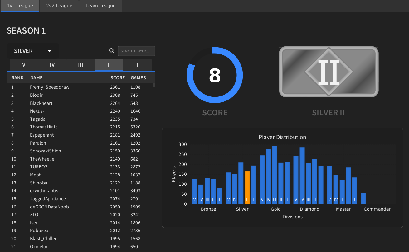
Graphic Artist Wanted
-
simple and efficient. what would the two next tiers and the final tier look like?
-
I do like Petrics Desgin but for me the Gold and Broze look a bit too simular from a quick glanse
-
i much prefer wassermelon kiss (keep it simple stupid) approach the other designs look to busy apart from askaholic's early draft
-
@tatsu I was thinking of replacing Diamond with Crystal just for fun :D. I have a few drafts for the two higher tiers but the final tier is still in the idea phase.
Crystal/Diamond:

Master/Maybe some other gemstone:

Coloring not final
-
I can dig that.
what about grand-master?
don't you think they'd look much better if they weren't a single stone slab/ thinner?

and then you would have two axi of progression : color and thickness, grandmaster being the full block.
@IDontKnow said in Graphic Artist Wanted:
I do like Petrics Desgin but for me the Gold and Broze look a bit too simular from a quick glanse
I don't get that feeling at all. bronze (or rather copper) clearly looks like copper and gold clearly looks like gold, look:


maybe gold could be a brighter hue, a bit more reflective? copper looks fine to me though.
-
Please keep in mind that we also need a big version. I don't think that a quite simple icon would look that good when it is ten times the size.
-
@BlackYps I have done a color remaster of the icons for the large verison. I am tinkering with adding some more detail for the larger version.

-
Issue i've with petric ones, is that it looks shitty for avatars
-
@WasserMelon progress but doesn't look good enough, I think you'll have to push this waaaaaaaaay way further.
try photorealistic silver and gold ect :

you need to occupy the pixels otherwise it'll look way too bland. -
@keyser said in Graphic Artist Wanted:
Issue i've with petric ones, is that it looks shitty for avatars
the 20x40 size, you mean?
yeah I agree, but wasn't the implication that Aeolus avator base size would be increased or did I missunderstand?
-
@tatsu said in Graphic Artist Wanted:
@keyser said in Graphic Artist Wanted:
Issue i've with petric ones, is that it looks shitty for avatars
the 20x40 size, you mean?
yeah I agree, but wasn't the implication that Aeolus avator base size would be increased or did I missunderstand?
I'm uncertain if the avatar size in aeolus can be increased, and to be honest, it's probably not a good idea.
Icons in the actual TMM party tabs as shown in screenshots around here is fair game.
-
@tatsu I've made some progress with photorealistic textures as you sugested, I enjoy the outcome but would be great if the change is begin made from 40x20 to 80x40. And perhaps do you know when the deadline is?
I have to correct some stuff to make the ranking a bit more clear. Here is how they would look.
40x20

300x200

-
I still think these lack in shape.
it's a bit of a shame to use 100% of the allotted space save for rounded borders instead of playing a bit more with empty space as the above examples have done.
-
Why is there still discussion about existing proposals that aren't Petric's?
-
@archsimkat said in Graphic Artist Wanted:
Why is there still discussion about existing proposals that aren't Petric's?
I don't have a dog in this fight (although I should tbh) - I think Petric's designs are nice, but are too busy. They force the eye to make sense of them, and that's less optimal.
.
.
.
.
.
.
.
.
.PS. Did anybody ever play the arcade game Rygar? Hint hint...
-
Isnt busy the entire point of the damn Icons
-
Surely not?
-
Anyone know what kind of time frame is left to submit something?
I'd like to submit something but think it is alittle to ambitious for the time remaining.
Thanks
-
-
@Azraeel Busy would be nice if was animated, and animated would be nice if it was responsive.
Busy was nice in the 90s.
I still think there is just something simpler.
In the end, as long as there is a good winner doesn't matter how it's won, it's still for FAF!