Sunlight Mapping Tournament (#7, 2v2, 10km)
-
Kaali
which probably references the group of nine meteorite craters in the village of Kaali.
Aesthetics: 4.1
My opinions on this map are the same as my opinions on Cherry Blossom Valley. Ultimately they're derived from the same method, and thus I still have the same concerns.
Furthermore as this might be regarded as a "higher quality" world machine output - rightfully so as you're the one who created the method, the concerns grow with it.Of course, the map wide decals provide a far superior output compared to what can be done with the limited resolution on a regular sup com mask file. You'll not find anyone who can outpaint this when you can export files at 8 times the resolution. It was possible when WM use went as far as erosion, because it still had to be added to the same old sup com layer file. But it won't be the same for decals like these. It even forced me to budge from my old man biass "wm is bad" hill.
But you've still relied on them to the detriment of all other factors, and that's why despite such high praise for the WM files, the aesthetic score is not as high as it really could be.
Now I might be aware that some other competing interests may perhaps incline you to focus on certain factors rather than others. You've still posted this map to a tournament regardless, and I expect all factors of a map to be taken care of with love and attention.The first thing I want to point out the attention of is the theme of the map, this will begin my series of thoughts relating to "things dealt with after the fact". Items that look like they were afterthoughts and that damage the map as a whole.
The map supposedly is that some sort of alien pathogen, meaning either a bio weapon or some kind of invasive flora as "infected this map" from the impact of a meteorite. This meteorite impacted the ground at a dead right angle to the surface and thus has left a perfectly circular hole in the exact map centre.
It looks like it was supposed to have killed off the grassy areas, leaving the majority of the map in a gray tone. This would imply that that area is a "reservoir" as the theme implies. But why would the previously underwater area have growing trees on the surface? Where did the water go exactly? Why are the tress still standing around there when the meteor did enough damage to alter the terrain a foot next to them? What i'm trying to get at here is that the centre hole looks like an afterthought to the rest of the map. As if the terrain was made and then something needed to be added to the middle afterwards.
Thematic elements only tend to work well when tied into the map as a whole. That's why on something like Fall Ziggurats, the cube pyramids that look like they were made in 5 seconds gain points because they have a purpose and that purpose is multiplied by the primitive buildings etc.
I understand that I asked for an evergreen map but if you're going to have a theme like this it should have an impact. That or you choose a different idea entirely. Right now is not well communicated, and lacks confidence.Second, the edge building. Or more specifically the methods used to indicate them. You may have differing opinions on if it should really be added at all. It is technically an exploit and is a far inferior game mechanic than transports.
It's also really fucking buggy, and thus I do have a video I want to show you where my engineer just drives up the side of a mountain. https://www.youtube.com/watch?v=O2PNHEXuAXM
This isn't the only place where this is possible. Ensure the mountain is thin enough to allow edge building without breaking into "exploit" territory. It also doesn't entirely correspond to the actual range ring of the engineer. Which is why I assume these elements needed to be created in the first place. As for their execution? It looks like an afterthought.A lot of visual communication relies on the premise that you should "show, not tell" things to your audience. For example instead of writing "apple juice" it's better to put an image of an apple and the customer can figure it out. Now it's not that you've used literal text to indicate the edge build spots, but you've essentially "told" me where they were. You haven't done anything to the map itself to "show me" that an edge build might be possible here. The mountains in those areas are the same as everywhere else, and no extra thematic elements are around to drive the point home. Many people have mentioned using civs to show it off and I do agree with them.
Decals, same as in cherry blossom valley, are nil. Outside of the map wide decals of course. My critique there still applies to this map, as the methods are still the same. Lacking any form of hand placed decals is extremely noticeable on the top of plateau areas, where world machine notices the angle is not high enough to continue with it's texturing process and then cuts out.
This leaves a very uncanny difference in detailing that normally is not a huge problem in maps of lesser mountain quality. This also has a negative impact on ramps, wherein either the ramp is too steep and the mountain texture is applied, or it's too shallow and nothing is placed there at all.Tree groups, as is also a problem on Mauve, are often entirely floating in the air due to the erratic changes in elevation due to world machine. The rocks too are the same single rock placed in 90% of the cases. And with no real extra elements around them tieing them into the map. A lot of them are also floating off the ground entirely.
The lighting is also very dark, and I struggle to classify this as a map that follows the "vibrant" themes asked for. Like CBV, it also contains a light map and like CBV, your lighting setup is very boring. I think things like these should be stretched to their limit but right now it's hard to really say it's added any value.The civilians on this map are extremely weak. They also appear like an afterthought, and maps such as Adaptive Gornyak have absolutely decimated you in this department, regardless of their impact on gameplay. AA guns don't need to be walled as they don't profit much from the wall bug. It looks stupid for the ai to be abusing a hitbox bug anyway, as this is supposed to be a depiction of reality.
Also, a texture layer isn't even used, and I don't understand why.
My closing thoughts are really as follows. It's clear you've skyrocketed above a lot of map creators because of your work on technical artistry. However that is only one aspect of creating a map. Make sure you spend the time to ensure all elements of your work are up to the standard you've set with worldmachine, or they'll prove to be a massive bottleneck. The road is long and there is still a lot more to go.
After all these world machine outputs are above what a lot of people can run, and when they need to remove them in order to play - what are they left with?
Make sure to not create an over reliance and make sure you check your map in the game engine.

You should also experiment with more maps that are not evergreen.
Gameplay: 2.9
The concept of "what makes a good map" in the higher level playing community is not a consensus. Certain sects of players enjoy different things and thus consulting with the same players may result in similar maps.
I'm not a fan of placing only 3 mexes in your spawn because with less resources available, you need to be very careful with how they're spent. This means having a build order means a lot, and with everyone "claiming" that they want to play mapgen due to this, it seems like a strange idea to do it here.Other than that, it's very consistent with every other map in this tourney that you move up to a natural expansion and then you contest things of little value. The bottom left will be a race for those two mexes on the side. Whoever owns them owns the other two on the plat and the bottom left spawn could not possibly want to enter that terrain - which is so much better for the top right player - to claim a single mex and a hydrocarbon. Edge building seems irrelevant here and I argue that it should not exist here at all. The mid mass and reclaim in general seems fine, at least only because the competition has sent me 5v5 maps with some spawns cut out.
I've also seen the 3rd version (this is version 2) because the client forced me to play on it. I would suggest that instead of gimping the map to have nothing to contest, create different choices of equal value. This creates variance.
Ultimately I think this was made almost like it was done by a system of checks rather than taking an idea and pushing it. It will go into TMM and people will like it or hate it depending on if suits their skillset.Variance: 2.9
I don't really have anything to say about this. You'll probably find that a lot of the games on TMM will be decided on who played the map beforehand rather than any form of strategic choices that are dominant for this map specifically.Theme: 4.3
Full marks for no custom props as indicated in AMV.It's good, but considering your history I don't think this was particularly creative. Maybe this map was being made in reality for another game entirely, but maybe I would feel better if you were really testing how far you could go.
-
thanks for a very thorough write up harsh in places, but I think overall fair, I shall look into the improvement you have mentioned
-
@biass okay, I'll fix it in the near future
-
@biass Alright, so I've had time to make a proper response. We've already discussed some parts in private, I'll keep those short.
Before I start - thank you for your time on the elaborate feedback. It is so elaborate that reading the feedback of other maps is informative even though I did not make the map.
Of course, the map wide decals provide a far superior output compared to what can be done with the limited resolution on a regular sup com mask file. You'll not find anyone who can outpaint this when you can export files at 8 times the resolution. It was possible when WM use went as far as erosion, because it still had to be added to the same old sup com layer file. But it won't be the same for decals like these. It even forced me to budge from my old man biass "wm is bad" hill.
I'll take budging you as a compliment. The resolution difference is 32 times - not 8.
Furthermore as this might be regarded as a "higher quality" world machine output - rightfully so as you're the one who created the method, the concerns grow with it.
I understand - there is more than just a map-wide decal and world machine output. For now though I am still searching for the boundaries of what can be achieved with World Machine reliably - this map is part of that journey and it is reaching its limits. Neither editor is equipped for the type of work that I want to be able to do.
The first thing I want to point out the attention of is the theme of the map, this will begin my series of thoughts relating to "things dealt with after the fact". Items that look like they were afterthoughts and that damage the map as a whole.
About the theme in general. The original map design had water in it, but the final map design did not except for the small patches of water that you see on the map right now. Therefore there is no previous underwater area. This is my mistake - I should've been clearer.
The theme of the map was that it was a beautiful valley but an alien pathogen was introduced. Whether this was via a meteorite is up to debate - as you mention the crash site is too perfect. But however it happened, the pathogen is introduced. Because of that parts of the map that are near water, or near the water level, slowly decay causing dead trees and other dead fauna. This is also used to color cue the map: high areas will have the lovely green bits, low areas will have the decaying bits.
In that sense: yes, the center of the map is a bit of an after thought as the theme of the map changed in the last few days. I was unable to produce a nice crater in the final hours reliably and the deadline was closing in.
I think I should've spent more time on it to indicate this properly. I've spent some time on the map yesterday to improve it using stratum layers.
Second, the edge building. Or more specifically the methods used to indicate them.
I've noticed after showing them in the discord channel that the opinions on this is rather diverse. As was with the heightmap lines I suggested in another topic.
We discussed the buggy part in private: you teleported the engineer on a location that was not pathable. Therefore, since it was already in a state it shouldn't be able to get in to, it was able to just traverse to the top. That said: that spot in the video was not accessible manually and that is on me. I've changed that for version 4.
These elements exist because people are having trouble determining where to do the edge building. Whether the mechanic is a gimmic or close to an exploit is not up to me. People do it, and they want to do it reliably. This is one solution. People suggested to make it less... artificial. By using a decal that is used underneath UEF buildings for example. I personally don't agree at the moment. But I'd love to hear what people think.
Decals, same as in cherry blossom valley, are nil.
The reason is time. That is not an excuse, just an observation. There was already over 50 hours spent on the map and spending another 20 hours on manually placing down decals was not going cut it in my opinion. In the future, when I've made my own decals, I may do so still but then the decals will cover more ground, making the entire process easier.
Tree groups, as is also a problem on Mauve, are often entirely floating in the air due to the erratic changes in elevation due to world machine.
I noticed this issue right after submitting it. I've checked this before submitting, but I may have been time drunk. I still missed a lot. That is fixed for version 4.
The civilians on this map are extremely weak.
Weak is a big word, but I agree they are not as solid as in the map of Robustness. I'll add a ravager to make them stronger
 .
.My closing thoughts are really as follows. It's clear you've skyrocketed above a lot of map creators because of your work on technical artistry. However that is only one aspect of creating a map. Make sure you spend the time to ensure all elements of your work are up to the standard you've set with world machine, or they'll prove to be a massive bottleneck. The road is long and there is still a lot more to go.
I agree - I could've spent more time on other elements. That is why I appreciate the feedback a lot
") .
.After all these world machine outputs are above what a lot of people can run, and when they need to remove them in order to play - what are they left with?
This is cheaper in practice than having 400+ decals on screen. Do you have statistics on this?
I've also seen the 3rd version (this is version 2) because the client forced me to play on it. I would suggest that instead of gimping the map to have nothing to contest, create different choices of equal value. This creates variance.
I'm open for suggestions. As with any map, I'm not a tournament player and I don't have a checklist to check. I rely on the opinion of others a lot more than I want to admit.
Overall - thank you for your feedback and I'm going to improve Mauve a bit too this week
. -
Hi all, second judge here (finally). I’m generally a more forgiving (albeit less experienced) critic than biass, so I have to say overall I liked the maps, wouldn’t even mind playing them !
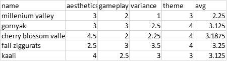
Here is a table summarizing the results:
I should make it clear that I gave every map a score of 3 in the Theme category if it didn’t obviously go against the theme rules (which none did), with bonus points for nice props etc.
Millenium Valley
I think this map looks nice but has an absolute ton of reclaim. I'm not overly against in maps like ditch etc, but here it's either around the back of the map/spawns or right in the middle, so not much interesting stuff can happen. You use the reclaim behind you to make a ton of facs to rush mid, then whoever wins mid will probably win from there. I would suggest at least making the “default option” for reclaim to be much lower, so that it could be in tmm without this amount. Or if you want to have a mega mass map like ditch, try to break up the terrain a little so you don’t just make 100 factories and rally in enemy base. Daroza for example has a lot of terrain and the reclaim is very spread out – this forces you to fight for every inch of the map.Gornyak
I think this seems quite interesting – I like the civs and expansion paths. The gameplay will probably lend itself to gun + t2 push a lot of the time, but there are at least enough directions to go and opportunities to try something else. The colouring is nice but the random sand mountain looks out of place – maybe if it was a valley it could clash less with the existing mountain theme? In any case it isn’t clear enough that it’s pathable to the top. The reclaim amount is quite high and spread in smaller mass rocks, so I think games will scale quite fast – some people may not like this (and call it a rock clicker map). I don’t mind it, but if you wanted to reduce the reclaim I don’t think it would hurt gameplay at all. Overall I like the terrain and mex placements, so I wouldn’t mind getting this map in tmm someday.Cherry Blossom Valley
Obviously looks great, the pink trees are super nice and the decals overall are hd and pretty. However, I'm not so sure on gameplay, seems like each dude has one side to spam down and that's it. Not quite a 1 lane map but it's almost that. I’d have to play it, but I feel like slots 2/3 (also these would be broken for tmm) would be gimped a bit vs slots 1/4. Mid river is way too small for meaningful navy, and I think 8 naval mexes is 8 too many – especially when you can barely fit a navy fac in. This map would definitely be improved a lot if this river simply wasn’t there, it would allow for a lot more interaction and strategy between the players. I can see the painstaking work that went into the aesthetics of the map but I do think the gameplay has been left in the dust a bit.Fall Ziggurats
I like the terrain and mex placements, but I have to say the ramps look pretty ugly. If you just use a similar terrain to the rest of the ground it should be clearly pathable. Custom props are nice and I think the amount of reclaim is nice overall (little less than open palms). However, it’s really not clear to players that the large trees are functionally worth the same as the tree groups of another map. I think it would be better if these were actual groups of the smaller trees, as these look nice and would not require some secret inside knowledge from players about the map. I also like that the reclaim isn’t just arbitrarily placed in mid for muh fast gameplay.
The ziggurats are kinda quirky butI think they would work better without civ pds on them, the aa is also pretty unnecessary and annoying (four of them??). Would definitely not mind getting this map in tmm (mb remove those aa's), seems like you could have some interesting games. Overall I give the win to this, because I think the gameplay and variance are the strongest.Kaali
Kaali obviously looks great as well, but I gotta say it looks quite similar to mauve and autumn. Would be nice to see you experiment with different biomes and themes (although obviously an "evergreen" tourney is not the place for it, so I won’t be too harsh). I’d love to see what you could do with an ice, desert or rocky themed map. I'm also really not a fan of the weird decals to show you where to cliffbuild, otherwise this would be a 4.5 on aesthetics. Not sure if this makes me an elitist but these big yellow boxes just seem patronising- might as well have big arrows saying EXPAND TO HERE. Maybe just a factory decal would be a more subtle way, or even better a mountain that looked like you could cliffbuild up it. The other point is on a map that is otherwise designed to be very realistic, it kind of kills the sense of immersion for me.Seems like a ton of mexes placed fairly randomly, with a few in actual expansions (I know you’ve since reduced mex count.) To be as harsh as possible, it feels like some sort of algorithm designed this map based on all other 10km 2v2 maps - there doesn't feel much that's new about it, outside of the texturing and mask. I know I'm being harsher than on other submissions but I would just want some more creativity in the gameplay area, in terms of gameplay I really can't differentiate this map from some of your other maps at all. Overall good map and it will probably get into tmm with the changes made to it, I look forward to getting it.
Closing Thoughts
I like a lot of these maps and it was impossible to pick one that was clearly better than the rest. I know biass has given a lot of useful feedback, so with that and my humble opinions, I'm hopeful that a lot of these maps will transform into something players will love.Edit: I should add that my scores may change ever so slightly, namely the "Theme" score, to be standardised with biass' score. This will allow scores to be averaged without clashing too much.
-
@boom said in Sunlight Mapping Tournament (#7, 2v2, 10km):
The ziggurats are kinda quirky butI think they would work better without civ pds on them, the aa is also pretty unnecessary and annoying (four of them??). Would definitely not mind getting this map in tmm (mb remove those aa's)
Hey, thank you for your feedback. I will definitely look into improving those ramps and submitting this to tmm. I actually did set those civ PD's/AA's to be off by default though (so they don't exist on the map for purposes of this tourney).
-
Thus, I take boom's average, my average, and make an average from them both.
This gives me the following score:
- Kaali: 3.3375
- Adaptive Gornyak: 3.310625
- Adaptive Cherry Blossom Valley: 3.30625
- Fall Ziggurats: 3.3
- Adaptive Millennium Valley: 2.5125
As you can see, it's real damn close.
Rowey handed off the prize money to FtX, it's on you Jip to contact him and ask for it (link this post as proof)
Runners up 2 and 3 can both claim their avatars from either FtX or a moderator.Once again, thanks for joining the tourney.
We will hopefully do something like this again when things calm down around here. -
Close comp. Congrats Jip!
-
Congrates Jip, Thank you for all who took part
-
Thank you both - and (again) thanks to biass and boom for providing their feedback. There is a new version of Kaali in the pipeline that has some of it applied
 !
! -
One thing that would be nice in this thread is a small video showing all of the maps - zooming in, showing the features.
-
I've updated Kaali based on some of the feedback of biass and boom:
- Lighting is changed: it is not as bright as in biass' example. I made the assets slightly brighter - otherwise trees / units would be overlit.
- Stratum layers are changed: added more fidely. Tree zones are now clearly marked. Cliffs have a different color tone applied when they recede (e.g., they become flat again)
- I've fixed the single unreachable edge building location
- I've removed some of the edge building locations - they felt redundant and it allows players to go 'aha!' after I've taught them about the feature with the other locations
Hello! It looks like you're interested in this conversation, but you don't have an account yet.
Getting fed up of having to scroll through the same posts each visit? When you register for an account, you'll always come back to exactly where you were before, and choose to be notified of new replies (either via email, or push notification). You'll also be able to save bookmarks and upvote posts to show your appreciation to other community members.
With your input, this post could be even better 💗
Register Login