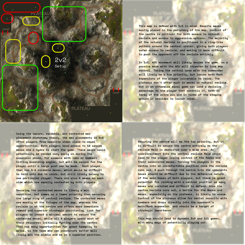
Sunlight Mapping Tournament (#7, 2v2, 10km)
-
Yes, but please make sure that I know it's free model content.
-
Up to what extent can you ask help from other (potential) competitors? I am asking because I've asked someone to edit a few buildings into props and that person happens to be a competitor too.
-
If they're aware that their advice may damage their chances, meaning they know this is for a submission, it's fine
-
9 days remain, make sure you post the name into this thread before said date, even if youre finished already.
-
putting finishing touches on my map but I'd like to submit Adaptive Cherry Blossom Valley
-
Adaptive millennium valley. The map is being finalized.
-
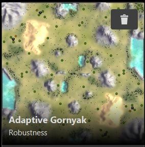
Adaptive Gornyak
-
here's a link to my map read the readme inside the folder for instructions on how to get the custom props to show in game
https://drive.google.com/drive/folders/1kBVJweSFAX5pmoavzsLSq7rL8cuFapJz?usp=sharing
-
some screenshots from my map
-
Please have your submissions in by 25 hours by now.
If you have custom props in your map, please upload the map folder itself with said props here. Uploading a second version without any props to the vault is also fine.
-
Fall Ziggurats
Download link with custom props: https://anonymousfiles.io/OJBl3GvD/
-
Submitting Kaali
")


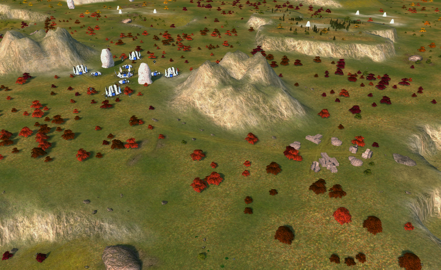
All screenshots are taken in-game on highest settings (including bloom renderer). There are no custom props. The theme of the map is that a meteoroid introduced an alien pathogen, slowly consuming the environment as it spreads through the underground water reservoirs.
In turn, lower parts of the map are grey. Medium-high parts are green / brown / yellow and high parts are green. These serve as a visual cue to interpret the map easier.
In addition an experimental feature: cliff build locations. One can be seen on the left on the second image (preview-1). The idea is that it provides a guaranteed location for a factory to be buildable from across the cliff for a commander. Some are also buildable for engineers.
With thanks to @archsimkat for the extensive discussions and to @blodir for additional feedback. To give a glimpse of those the discussions, at some point Archsimkat even made these:
Where you can see the original design (without the water), that started as a 10x10 naval map
-
Hour or so late but the submissions are now closed.
I want to find a couple other people to give judgement so please be on hold for the results.
-
I know you're all waiting on the results, you probably thought this post was it, but it's just an update.
I have only one or two left to judge. My rationale has been more extensive than ever in order to compensate.

I'm still looking for more people to judge the maps so if you're interested (and have not assisted in any submission) please let me know. I hope to have the full reviews out very soon. Sorry about the wait.
-
I have a sceond judge with his own scores and reviews on the maps, so my posts are not going to indicate the final scores. I will get him to post his and then we will determine an average score based off the two of them.
Closing thoughts.
I'm thinking of banning adaptive maps from this tournament format entirely.
I've asked you to create something around a certain format, and you've given me something different entirely with a cope function to allow what i've asked.This makes for some of the most gimped ass maps that should not be considered tournament worthy.
Adaptive maps are a cancer upon making content that actually provides a good experience for your users, and you're seeing players revolt from author made maps entirely because of it.
You can check your reclaim counts in the Ozone Editor.
You're not using the GPG one like old man biass, so you should be taking advantage and not giving me maps with hundreds of thousands of reclaim more than any map reasonably should have. If you don't know what is a good amount, check other maps.Reviews below: (These are not in winning order)
Adaptive Millennium Valley
Aesthetics: 2.8
Fine, but ultimately inconsistent.
The first thing I want to mention is that while most of the ramps have been indicated on the map, a couple outside of the spawns have not. As if they had been forgotten about by the map author entirely.
This also appears evident in the use of props around those areas, as typically tree groups will have part of the group floating in the air when placed on a ramp.Textures are fine. They're above average for the FAF standard, but the choices used and some of the scaling is off.
Tropical textures like the ones used here are older supcom ones, let call them a 4 in resolution. Later FA textures are considered a 12.
You also didn't use one, but I assume you ran out of ideas on where to place it.
This is pretty common for rather generic themes, so I'm not going to care about it too much.Decals on this map are what I want to talk about the most here. Starting with that they're not considered enough for the majority of players to know a ramp exists where you place them. This is because many players don't play on the required graphics settings.
This is where I would have used that remaining texture layer.A network of canals? have been placed through the map and end up at the small bodies of water around the sides. Some bodies of water contain decals around the edges and some do not, presumably because they are not passable.
I would have done something different to the passable bodies instead of leaving them blank because the end result is subpar and inconsistent with the rest of the map.
The aforementioned canals have a second purpose, which is to break up the bodies of trees instead of leaving them in one large blob. This is a positive in my opinion.The mountains have two differing styles of decals applied to them, which I found strange.
First is the same (two, but in really only:) mountain decal used to cover the entirety of any above water cliff face. This method is a solid "okay" from me. If you were to do it again, I would recommend using a second (third?) decal to break up the repeating patterns that a single decal often creates.
The second is the use of a number of normal decals that bare a striking resemblance to my own methods.
However, they're ineffective without a precise placement of other factors such as your textures, secondary decals to break up patterns (what I spoke of earlier) and a good lighting setup.
I failed to notice them at first, to be honest.See attached. I changed the lighting on the RIGHT image.

I wonder which method you tried first?
The use of the Aeon decal on the plateau is incredibly weak, and shows me that you were failing to fill in space on what is a plain map. This is why it often helps to incorporate lore elements into your map to provide you a reason to fill the space.
The decal seems out of place and can block your ability to see the mass icon that it sits directly upon, which is very bad.Gameplay: 2
Badlands is a 4v4 map, and considered by many to have a large amount of reclaim. So much so that in 1v1 games, players typically require a special build order to utilize it. It has 20,117 mass, and 92,095 energy.The Bermuda Locket is a 20 km map that supports 2v2v2v2 gameplay. It also is a map that requires special build orders to utilize all the mass available. That map has 77,375 mass, and a small 8,390 energy.
This map, that're we are judging for 2v2, has a whopping 72,977 mass, and 151,512 energy. This a major pitfall of submitting an adaptive map that tries to cater to everything, in a tournament for ONLY curated 2v2 maps.
There is far too much reclaim and the entirety of the fighting on this maps will be revolved around it. This might be fine for the first 5 minutes of a game if you like that, but makes the rest of it very weak.
Map control along the mexes in the middle mean you only get +2 mass if you hold it because instead of any expansions for each player, there is only one mex. However if you're first there, you're pocketing over 1400 mass in large rocks.The rest of the mexes also follow the same pattern of being dispersed at random and are not grouped in any real way. Spamming will be king here, to the detriment of your other options. That's if you don't suicide over the mid mass first.
The plateaus do not add anything to the game, players will just edgebuild them.Variance: 2.
Same thing, you all in on the midmass and then spam tanks to control isolated mexes and reclaim. You might see a drop on the enemy plateau if one side has reclaimed enough to win air, but any more conservative strategy outside of spamming for 20 minutes is not worth it.Theme: 4.3
This is the full mark ill give you without any custom props. Any darker of a map overall and I would have penalized you for being too close to winter, though.To close, It's never going to be worth it to submit adaptive maps to tournaments. Curate your experience for the requirements that have been asked for.
-
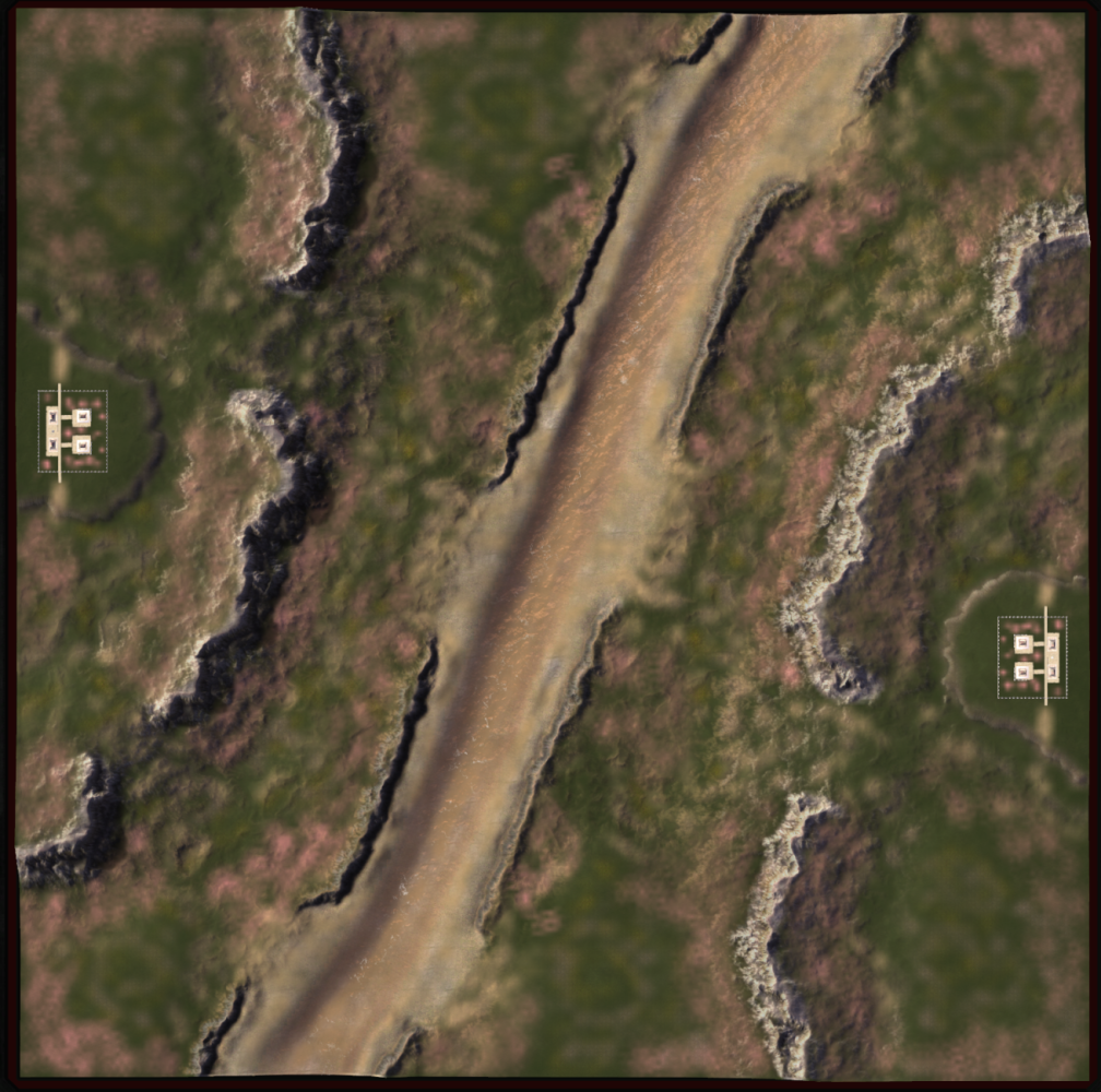
Adaptive Gornyak
which is the name for several areas in Russia.
Aesthetics: 3.2
I'll start with what I like here, I can appreciate all the effort done in the civilian bases on this map, it's really well done and probably some of the best civ bases I've seen on FAF.
Second is the props, the wild nature of the placement is very well done around the centre, although I wouldn't do this for rocks as it will cause a gameplay hit.
Third is that I can see some attempts to decal ramps, which is good.However as I said in the Millennium Valley review, it needs to have more than just a decal. And some ramp areas lack this decal too, which is not good. Especially in the top right / bottom left expansion. It's nigh impossible to see the elevation change from a distance. You can see the water entrances because of the contrast to where you cannot, this is acceptable but not really optimal.
You haven't told me that I can even walk up onto the sand(?) hills at all. This will catch players off guard. You have not used two of your textures, and they should have been spent adding more detail to, and communicating more - the mountains on this map. If you add those textures, the mountains should hopefully match the detail of the ground. While i'm here, do mind the scaling on your textures. Values like 50 or 70 or even 120 are multiple times above what they reasonably should be. If you cannot find textures of a high enough quality I would recommend editing your own, or using some open source customs ones you can find on the internet.
The lighting on the mountains and some parts on the water in the middle are so bright they hurt my eyes. I'm writing this in a well lit room too. I think this is a case of having too much bloom on your map, but other places on the map are well lit so a balance needs to be struck. Or use darker textures here.
The large decals dispersed over the map are "okay" here. The lighting hides them well enough to not be too jarring.You've also done well to decal the moutains, but they're hidden.
I changed the lighting and the textures so you could see them (LEFT):
Fix these and you'll have a good-looking map. Especially with those civilians. If they were not here the map will probably be a 2.8 or a 2.5 in aesthetics.
Gameplay: 3.
I can see what you're going for here. Move up to the natural expansion and then go for the corner or for the civ area. Seems fine to me. Fixing the issues with the ramps etc will up this score. I also appreciate that your spawn mexes are not in the default grid layout. Please be careful of the tree reclaim though. It looks nice but you will probably need to tone it back a bit.Variance: 3.5
Same thing as above. You also have some small ponds and plateaus for dropping and the like.Theme: 4.3
Same as AMV.If you fix these issues, please submit this to TMM.
-
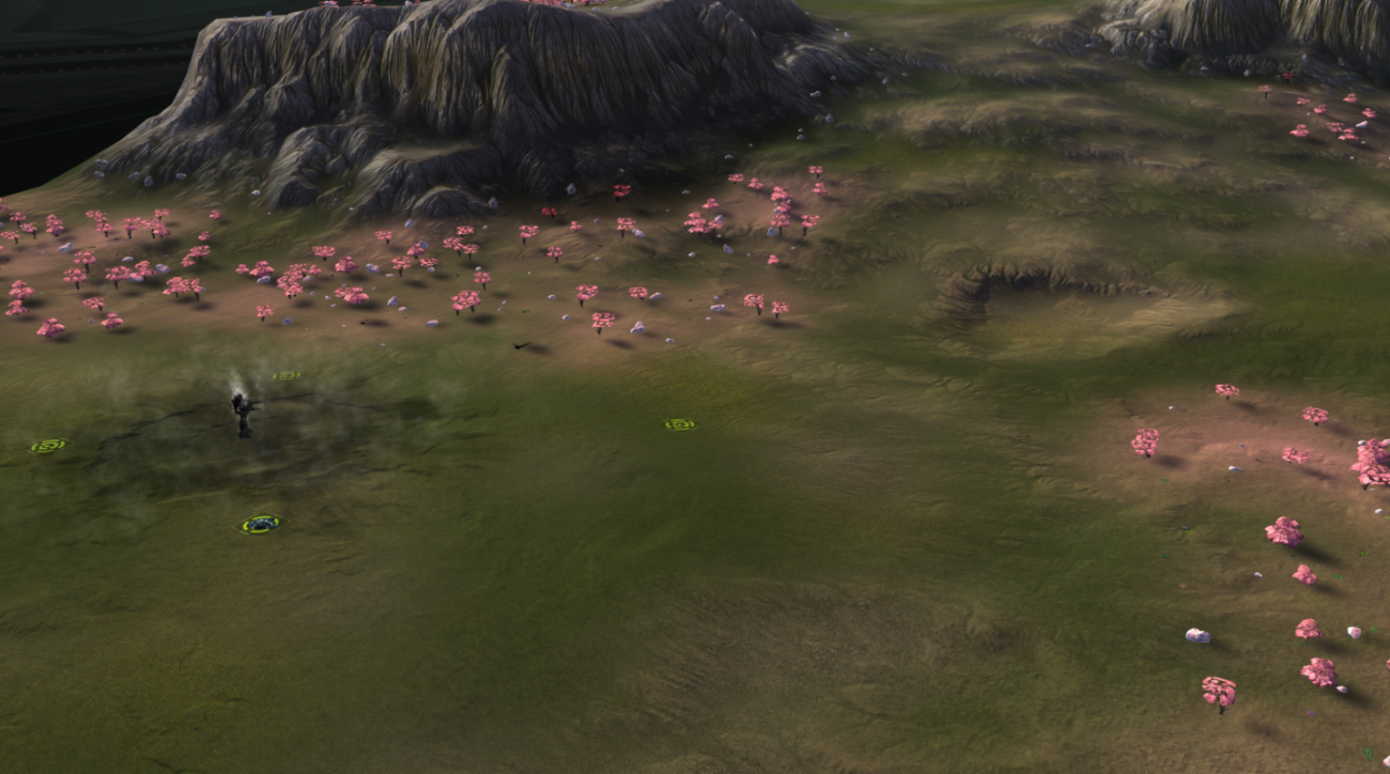
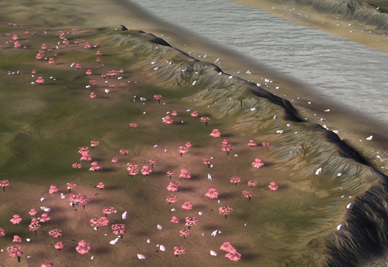
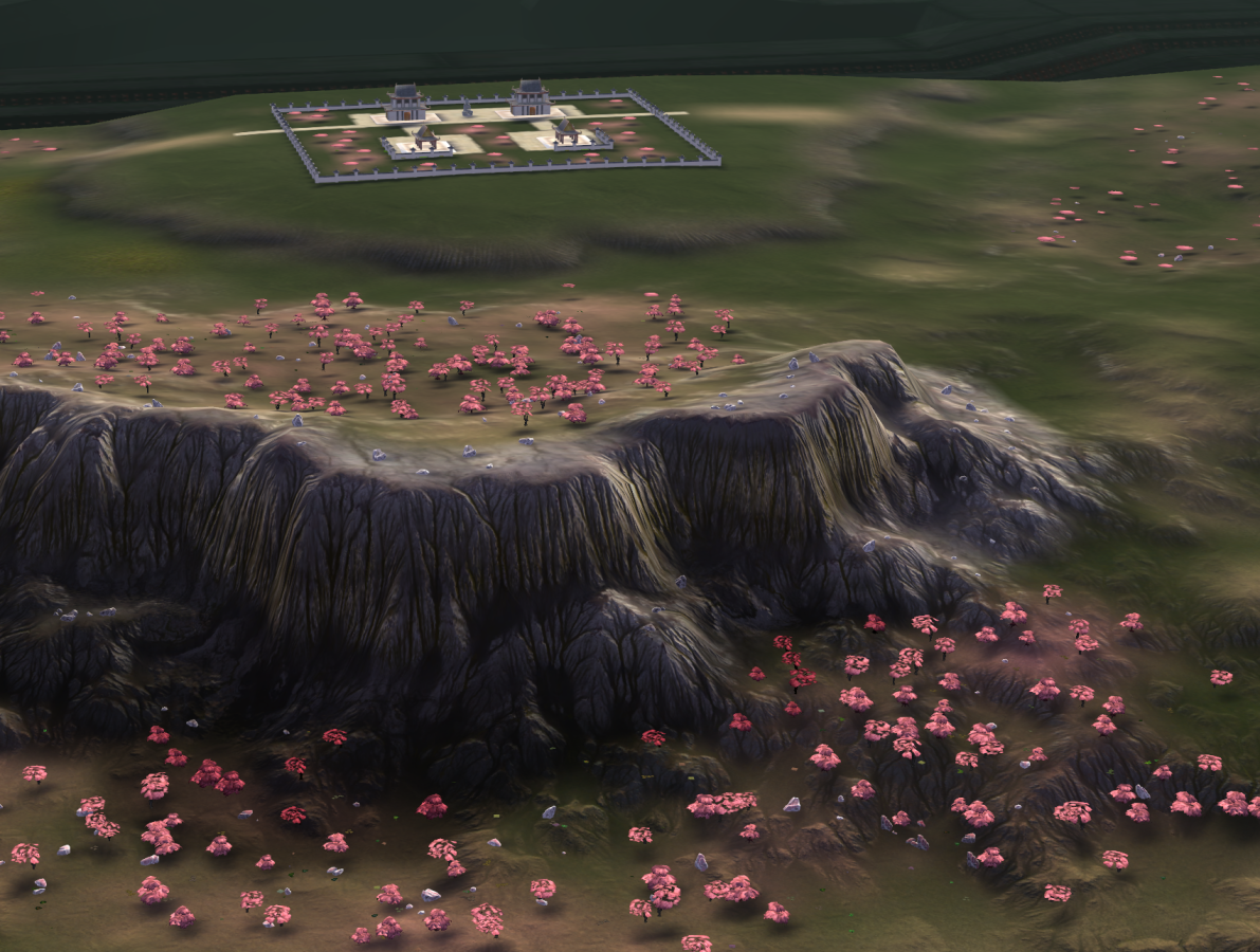
Adaptive Cherry Blossom Valley
thanks for the read me on how to see the props.
Aesthetics: 3.5
This is the first map of the couple in this tournament that have the new world machine outputs on the map. Which look great - as only the enhanced resolution of a decal (as opposed to painting on the map normally) can provide.
The problem you'll find with it however, is that it's very easy to be swept up in the outputs, and neglect the fact that this is still a game map, to be "lost in the sauce" perhaps. This is what I think has happened here.The major issue with this map is that the huge river through the middle looks like a complete afterthought. It doesn't even look like the middle of the river even had the WM maps applied to it (edit: it does, just not as much), which tell me you didn't have it until very late in the process and then added it due to either a lack of confidence or poor gameplay planning. It also completely breaks the natural nature of your map and how the elements combine, and is also poorly communicated. (I didn't know it was water until I opened the map.) The river goes so far as to "ruin" this map. The textures used around that area are also overscaled, which is something I didn't expect from you in particular. These needs fixing in my opinion.
Changes in elevation - and the clarity of which are considered an Aesthetics element - Are often given high priority in mapping endeavors due to their impact on gameplay. They're probably the number one most cried about thing in all of author mapping, which is hilarious that it's being ignored for mapgen. The Wm outputs are again cool, but the process which has been used to decorate the mountains, has bled out into the ramps next to them. This is less of a problem where the ramps display just black, but in certain places it almost looks impassable. Talking about the top right here. I would either trim down, or fade out (make less transparent) these parts on the ramps entirely. You don't need to rely entirely on technical artistry when making maps and can edit your outputs when you need to. Gameplay should come first.
There are multiple areas on what should just be flat ground where terrain is sporadic. This will likely make the map entirely unplayable if it impacts the ability to shoot other tanks - especially if players are playing on weak PC's and cannot see the decals. Now that you applied the WM outputs to this map, flatten the entire thing down to be smooth and playable again.There is a light map decal, which for uninitiated is a decal that replicates cast shadows like you see on the ground next to tanks, or your own body if you went outside on a sunny day. I would suggest if you used one and wanted to show it off, make your lighting more stylized instead.
These cast shadows don't cast onto props underneath the shadow, so you've compensated for that by making a second prop which is a darker version of the regular custom prop. I'll give you points for that.I don't think having these custom decals on your map is much of an excuse to avoid using other decals entirely, which is what you've done here. I know you’re someone who can decal maps, so I don't know why you decided to go all in on this.
A quick example, my version is on the LEFT

Hand placed decals will always serve a unique purpose and seek to prove the level of love and soul an author pours into this map, and can push your maps further when backed up with the WM outputs.
The props look good here but lack detail in their application. They look smudged over the map with a thick brush and mishaps can be seen when rocks sit on impassable mountains etc. The FAF editor is inferior to the GPG editor in applying props, use that instead.
The temple stuff looks fine here but I would consider tying them into the map more then just a single, isolated application. Maybe in the middle instead?The custom texture normal is subpar. I also would have perhaps taken a grass texture and then laid that pink element into that using photoshop, rather than having the pink be a linear application.
Overall good, hard carried by World machine though. You need to fix what I've spoken about here for the map to be playable.
Gameplay: 2
First; im taking points away for the erratic elevation changes. These need fixing as I've said.Second, I would not have bothered adding a third player here at all, it's cramped and fails to enhance the purely 2v2 gameplay that this tourney judges you on. I wouldn't even bother making your maps adaptive if you're going to submit here, as I said.
The river, that I mentioned before ruins the map, forces the game into 2 different 1v1s. The start of the game will be almost a setons style rush to suicide your ACU to the custom prop village, which is worth 10k!!! Mass each due to the walls there. Normal walls are worth 2 mass, these are worth 50/100.
Whoever wins that exchange also claims the three mass expansion next to the village, while the beta male who lost takes the expansion next to the river instead. From there not much is set out to happen. Whoever takes the river expansion needs to pull an all in, into one the bases to win with such a mass deficit.
Luckily the map is kind of set out that way. I would have cut the river and added something in the middle for players to contest, this would also raise the variance of the map as players have choices on where to go.There is also a stupidly large amount of mass reclaim here. The only issue with that is that the nature of it will probably take a long time to claim. You may consider this either a negative of a positive, please tone it down anyway.
Variance: 3.2
The things with maps that require all in plays, like Isis for example, is that the meta of the map can be played in your favor. If players lose mid mass they'll probably commit to some walk-into-base hilarity if they cannot be bothered playing, which could be cool.
You'll probably also see something relating to navy happening in the river at least once. If it isn't completely destroyed by spamming hover untis every game. The longer the game goes on the longer the variance will lower overall.Theme: 5
Pink cherry blossom trees are a classic mark of the arrival of spring. You've added the custom props so you get full marks here.To close, as far as I know this is your first WM map, at least for the use of Flow maps etc here. A lot of issues need ironing out here, so we'll see how it looks after a round or two of feedback.
-
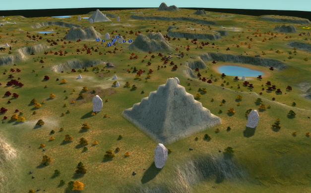
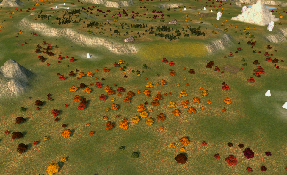
Fall Ziggurats
very literal.
Aesthetics: 2.7
Im going to come out and say that I think it looks like you made this with some sort of script, or tool perhaps. All is not lost however, and the theme keeps the map in check enough to be a flawed, yet acceptable map with some good points.
In lieu of any real focal points i'm just going to go over the good points and then the bad points first.First is the top of the plateaus themselves, which have had albedo decals applied to them. They're not of any particularly high quality, they're spammed down at random, and they're all pointing in the same rotation, the same area has all manners of trees applied, including trees of different colors, and some rocks on mud.
This has the benefit of creating a level of detail due to nothing other than noise. I suppose that's fine, but it's still far off any form of level of detail. It also contrasts itself from the ground layer, which is also fine.Second is the building props, which if i understand correctly are unskinned sup com props with a texture applied to them, and tied into some sort of general idea of this area being previously occupied by some form of primitive civilization.
Half made props are not good, of course but their placement is done well enough, and dirt trails lead back to an eon base in the center, which is also fine enough. Wall art typically completes civilian bases and none exists here, but it's otherwise not so egregious to take any points away, which is good.
Ziggurats? Or Pyramids are common on maps because they're sometimes easy to make and fill space, but tieing them together into that overarching theme provides them with a sense of purpose and improves their situation. The only thing to do from here is attempt to make them look like you didn't "place" them from the heavens.
That's tough to do, so these are currently also "fine" as it is. The tie-in to the theme of the map takes a number of "fine" elements and makes them better.The trees have their upsides and their downsides, they're in a range of different colors and are more or less distributed around the map in groups according to their colour. This means that there might be a section that looks red and orange and then fades out to a meek yellow and green. This looks great.
The downside is that the trees are more or less distributed in a linear pattern with no solid level of detail in their application. Which is subpar. I would also suggest that the trees get more green near the small random bodies of water instead of at random. But this is a nitpick.The fallen leaves texture is also fine here, but once the trees vanish you'll find it probably doesn't look too good.
As for the downsides. Ramps, are indicated well enough but look particularly ugly. I would argue a location where many things attempt to climb through and slip and fall - shouldn't be the most vibrant green grass on the entire map.
The choice of decals on the ramps, and on the rest of the map in general, are poor. Probably the weakest showing of the tournament. No care has been taken to the placement to ensure they actually stand out on the map with the lighting setup, so much so that one will probably not know of their entire existence unless they open the map in the editor.
This is very terrible, because there wouldn't be a point to placing them if they cannot be seen.Regarding the mountains, the overall shapes used on the map appear very square, this is why in the beginning I said the map looked like it was done by a tool. I'm not sure is this is because of that, or if it's due to perhaps using a square brush, but it looks very uncanny.
They have a custom texture applied in a linear pattern on it, with no variance. The point of a seamless texture is that you can't see where one "square" of the texture ends and the other begins, removing the pattern caused by applying it to the map.
This texture, which I've seen you use on a couple of maps now, has a strange circular pattern in the middle of the "square" which makes a pattern easily visible and voids the purpose of the seamless texture. Making the choice poor.
The way it's applied to the map is also weak, as it's done with a brush that is transparent on the sides and not in the middle, I wouldn't be able to see the exact rock pattern at half the transparency over the millions of layers of dirt and grass on top of it, so it looks very unnatural for use on rock specifically.The pattern problem is also on the other rock texture used, I would just find better choices, do be careful because as you know, snow maps are often so bright white that it becomes hard to see resource markers. White rock does the same thing. This is a nitpick though.
The water ponds are a strange choice, I would have tried to tie them into the map more, and decalled them. The mountains are also not the best in this same fashion.There are a couple of rocks with custom textures that fit the map well, but still have the textures from before that have the issues. This doesn't really count as a downside because the pros and cons balance out.
Overall this map is "okay". There isn't really a huge negative to comment on, but it's not got anything that propels it into being "good" without an attention to fine detailing.
Gameplay: 2.7
I need to explain this first part here, the trees. This map has custom tree props that are both at the regular size, and then a larger size too. This larger sized tree has a larger reclaim value due to its size, which makes it viable as an in between if you don't want to use a full tree group.
The map is mostly covered in the larger trees, so the map is a few points off being covered entirely in tree groups, in a flat linear application like I discussed in the aesthetics section.
Furthermore, we reduced the reclaim value of an oak tree 8 or so years ago. They used to be 1.5 mass and 15 energy before, and we lowered it to 0.8 and 8. But if you pull the blueprints from an unmodified installation, you can see the old values.
So, you take those large values and then you multiply them to suit the larger size of these "jumbo trees", and then you apply them all over your map. Suddenly you have 131,172 energy reclaim from mostly single trees. But only 30k or so mass.This isn't so much a design flaw than it is a mistake, but the map would still not be good if you covered the map in trees either. It is saved by not particularly being all in mid, but it will still damage gameplay in my opinion.
You also have 4 large rocks around the Ziggurat which are about 140 mass each, except one spawn gets them right outside their base and the other player needs to contest his in the far map corner, or make it up with other large rocks, that the first player can also get.
After this you take your two inherently natural expansions and then figure it out yourself, one player has an expansion on a plateau which is defended from raids, but the enemy on that side who got the reclaim would have enough of an advantage to steamroll your other one.
The mid mass is in different groups and not so insane, which is good.
I don't think the ponds add anything besides hiding your ACU from attack. It might be annoying to torpedo an ACU out of them if they hit the ground, which is why small hiding ponds like these are not advisable.It's a shame that the map gets penalized because of a slight mistake, but it's not particularly fair to judge the map if it gets fixed however many days after the submission date.
Variance: 3
I don't really see this map being so restrictive to deny any real plays here, nor do I think anything will be entirely dominant either. You'll probably see some edge builds instead of airplay here to claim the plateaus, and it would be funny if the small ponds were big enough to allow a factory.Theme: 5
Trees are good and fit the theme.Overall again, an okay map. You might find your score to be better than others because you haven't done anything so horribly wrong as to impact it. It's not like your old maps wherein the entire ground surface was covered in invisible terrain bumps that made it unplayable, so we can both breathe a sigh of relief.
If you fix the issues with the trees and perhaps be a bit more sparse and detailed in their placement, you'll probably find a few people who will like this map. -
Kaali
which probably references the group of nine meteorite craters in the village of Kaali.
Aesthetics: 4.1
My opinions on this map are the same as my opinions on Cherry Blossom Valley. Ultimately they're derived from the same method, and thus I still have the same concerns.
Furthermore as this might be regarded as a "higher quality" world machine output - rightfully so as you're the one who created the method, the concerns grow with it.Of course, the map wide decals provide a far superior output compared to what can be done with the limited resolution on a regular sup com mask file. You'll not find anyone who can outpaint this when you can export files at 8 times the resolution. It was possible when WM use went as far as erosion, because it still had to be added to the same old sup com layer file. But it won't be the same for decals like these. It even forced me to budge from my old man biass "wm is bad" hill.
But you've still relied on them to the detriment of all other factors, and that's why despite such high praise for the WM files, the aesthetic score is not as high as it really could be.
Now I might be aware that some other competing interests may perhaps incline you to focus on certain factors rather than others. You've still posted this map to a tournament regardless, and I expect all factors of a map to be taken care of with love and attention.The first thing I want to point out the attention of is the theme of the map, this will begin my series of thoughts relating to "things dealt with after the fact". Items that look like they were afterthoughts and that damage the map as a whole.
The map supposedly is that some sort of alien pathogen, meaning either a bio weapon or some kind of invasive flora as "infected this map" from the impact of a meteorite. This meteorite impacted the ground at a dead right angle to the surface and thus has left a perfectly circular hole in the exact map centre.
It looks like it was supposed to have killed off the grassy areas, leaving the majority of the map in a gray tone. This would imply that that area is a "reservoir" as the theme implies. But why would the previously underwater area have growing trees on the surface? Where did the water go exactly? Why are the tress still standing around there when the meteor did enough damage to alter the terrain a foot next to them? What i'm trying to get at here is that the centre hole looks like an afterthought to the rest of the map. As if the terrain was made and then something needed to be added to the middle afterwards.
Thematic elements only tend to work well when tied into the map as a whole. That's why on something like Fall Ziggurats, the cube pyramids that look like they were made in 5 seconds gain points because they have a purpose and that purpose is multiplied by the primitive buildings etc.
I understand that I asked for an evergreen map but if you're going to have a theme like this it should have an impact. That or you choose a different idea entirely. Right now is not well communicated, and lacks confidence.Second, the edge building. Or more specifically the methods used to indicate them. You may have differing opinions on if it should really be added at all. It is technically an exploit and is a far inferior game mechanic than transports.
It's also really fucking buggy, and thus I do have a video I want to show you where my engineer just drives up the side of a mountain. https://www.youtube.com/watch?v=O2PNHEXuAXM
This isn't the only place where this is possible. Ensure the mountain is thin enough to allow edge building without breaking into "exploit" territory. It also doesn't entirely correspond to the actual range ring of the engineer. Which is why I assume these elements needed to be created in the first place. As for their execution? It looks like an afterthought.A lot of visual communication relies on the premise that you should "show, not tell" things to your audience. For example instead of writing "apple juice" it's better to put an image of an apple and the customer can figure it out. Now it's not that you've used literal text to indicate the edge build spots, but you've essentially "told" me where they were. You haven't done anything to the map itself to "show me" that an edge build might be possible here. The mountains in those areas are the same as everywhere else, and no extra thematic elements are around to drive the point home. Many people have mentioned using civs to show it off and I do agree with them.
Decals, same as in cherry blossom valley, are nil. Outside of the map wide decals of course. My critique there still applies to this map, as the methods are still the same. Lacking any form of hand placed decals is extremely noticeable on the top of plateau areas, where world machine notices the angle is not high enough to continue with it's texturing process and then cuts out.
This leaves a very uncanny difference in detailing that normally is not a huge problem in maps of lesser mountain quality. This also has a negative impact on ramps, wherein either the ramp is too steep and the mountain texture is applied, or it's too shallow and nothing is placed there at all.Tree groups, as is also a problem on Mauve, are often entirely floating in the air due to the erratic changes in elevation due to world machine. The rocks too are the same single rock placed in 90% of the cases. And with no real extra elements around them tieing them into the map. A lot of them are also floating off the ground entirely.
The lighting is also very dark, and I struggle to classify this as a map that follows the "vibrant" themes asked for. Like CBV, it also contains a light map and like CBV, your lighting setup is very boring. I think things like these should be stretched to their limit but right now it's hard to really say it's added any value.The civilians on this map are extremely weak. They also appear like an afterthought, and maps such as Adaptive Gornyak have absolutely decimated you in this department, regardless of their impact on gameplay. AA guns don't need to be walled as they don't profit much from the wall bug. It looks stupid for the ai to be abusing a hitbox bug anyway, as this is supposed to be a depiction of reality.
Also, a texture layer isn't even used, and I don't understand why.
My closing thoughts are really as follows. It's clear you've skyrocketed above a lot of map creators because of your work on technical artistry. However that is only one aspect of creating a map. Make sure you spend the time to ensure all elements of your work are up to the standard you've set with worldmachine, or they'll prove to be a massive bottleneck. The road is long and there is still a lot more to go.
After all these world machine outputs are above what a lot of people can run, and when they need to remove them in order to play - what are they left with?
Make sure to not create an over reliance and make sure you check your map in the game engine.

You should also experiment with more maps that are not evergreen.
Gameplay: 2.9
The concept of "what makes a good map" in the higher level playing community is not a consensus. Certain sects of players enjoy different things and thus consulting with the same players may result in similar maps.
I'm not a fan of placing only 3 mexes in your spawn because with less resources available, you need to be very careful with how they're spent. This means having a build order means a lot, and with everyone "claiming" that they want to play mapgen due to this, it seems like a strange idea to do it here.Other than that, it's very consistent with every other map in this tourney that you move up to a natural expansion and then you contest things of little value. The bottom left will be a race for those two mexes on the side. Whoever owns them owns the other two on the plat and the bottom left spawn could not possibly want to enter that terrain - which is so much better for the top right player - to claim a single mex and a hydrocarbon. Edge building seems irrelevant here and I argue that it should not exist here at all. The mid mass and reclaim in general seems fine, at least only because the competition has sent me 5v5 maps with some spawns cut out.
I've also seen the 3rd version (this is version 2) because the client forced me to play on it. I would suggest that instead of gimping the map to have nothing to contest, create different choices of equal value. This creates variance.
Ultimately I think this was made almost like it was done by a system of checks rather than taking an idea and pushing it. It will go into TMM and people will like it or hate it depending on if suits their skillset.Variance: 2.9
I don't really have anything to say about this. You'll probably find that a lot of the games on TMM will be decided on who played the map beforehand rather than any form of strategic choices that are dominant for this map specifically.Theme: 4.3
Full marks for no custom props as indicated in AMV.It's good, but considering your history I don't think this was particularly creative. Maybe this map was being made in reality for another game entirely, but maybe I would feel better if you were really testing how far you could go.
-
thanks for a very thorough write up harsh in places, but I think overall fair, I shall look into the improvement you have mentioned
Hello! It looks like you're interested in this conversation, but you don't have an account yet.
Getting fed up of having to scroll through the same posts each visit? When you register for an account, you'll always come back to exactly where you were before, and choose to be notified of new replies (either via email, or push notification). You'll also be able to save bookmarks and upvote posts to show your appreciation to other community members.
With your input, this post could be even better 💗
Register Login