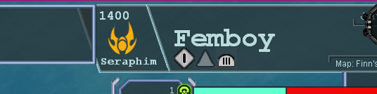
This is the UI (Its off-scale, clipping and messed up because my FAF UI being scaled to 150% throws the mod off, it will probably be fixed to scale adequately with UI)
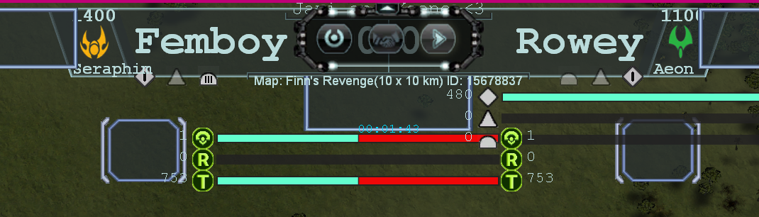
I would like opinions on what looks better between the land icon's bars and the navy ones. This feature will tell the tier level in land, air and navy. I'm updating the icons and I want to hear opinions on what do you think the new one (T1 LAND) looks compared to the old style (T3 Navy). I still have to adjust the air and naval icons/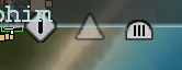
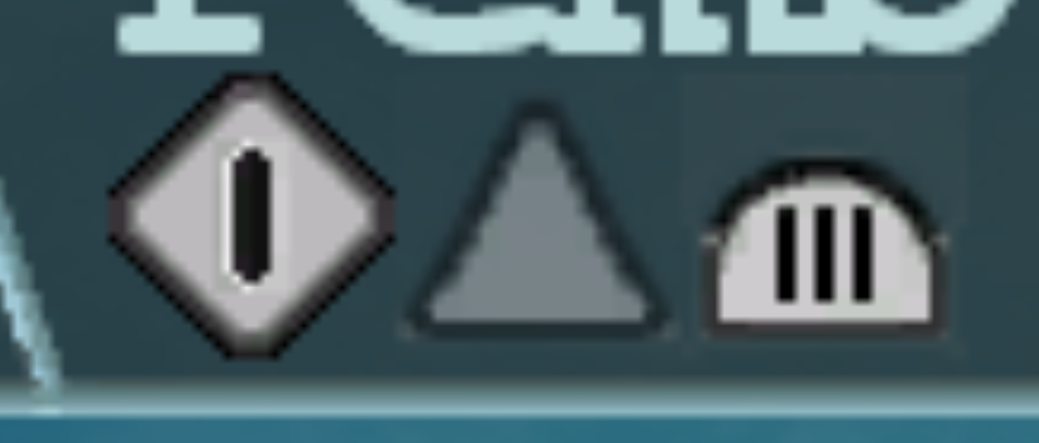
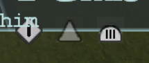
this one above has darker borders, is it better?
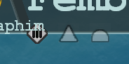
Also does T3 land's bars look like too much or is it good enough?